Kupu's thread
- Thread starter kupu
- Start date
You could sample them yourself in the latest dev build if you wanted.Jesus, i love it, can you share one with other hull colors too?
Just remember they're dev builds and potentially unstable. I wouldn't recommend playing with them, just steal the texture files from it
I will, later, and will post some pics kkkk (need to download some colorful ships)You could sample them yourself in the latest dev build if you wanted.
Just remember they're dev builds and potentially unstable. I wouldn't recommend playing with them, just steal the texture files from it
If you do post pics in this thread, could you please post them in spoiler. It just keeps things on topic a little easier.I will, later, and will post some pics kkkk (need to download some colorful ships)
Sure, i am not sure i will be able to take the pics in first placeIf you do post pics in this thread, could you please post them in spoiler. It just keeps things on topic a little easier.
I was taking a look, man you blow my mind away, every texture are so nice, looks so incredible, and i not even look then in game yet
where are you getting them? I checked the Dev builds and all I get are the ones we already have.
today dev's in the default texture folderwhere are you getting them? I checked the Dev builds and all I get are the ones we already have.
Hey kupu i got the game up and running, not the hight res i would like, but ig goes well. the most i see from the texture, the new hard hull looks kind of blocky when you get about 30 blocks away from then.
From the rest i still need to look at a planet and more other blocks, but i love all. the hulls look so nice and blend together
Last edited by a moderator:
Glad you like it. However he planets are not retextured yet.today dev's in the default texture folder
Hey kupu i got the game up and running, not the hight res i would like, but ig goes well. the most i see from the texture, the new hard hull looks kind of blocky when you get about 30 blocks away from then.
From the rest i still need to look at a planet and more other blocks, but i love all. the hulls look so nice and blend together
I'll be doing a terrain and flora overhaul later on as some new content will require different / new textures.
Last edited by a moderator:

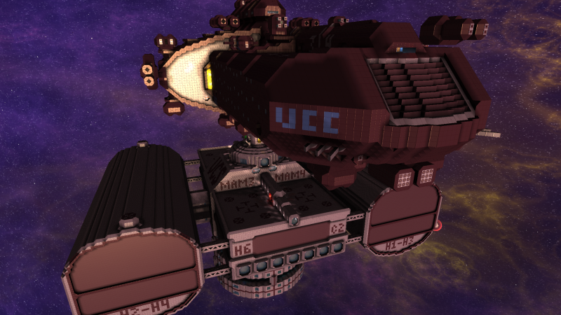
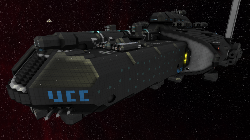
That should be black... I copied the new textures from the dev build into my current install and black shows up like this. Is there some incompatibility using the new textures with the older version of the game?
i can say that in the dev i tested i dont get that problem, and tested some ships with various hull colors, so one of your settings were off, or you did get a luck bug
Yeah my next step was to load it in the Dev build and everything looks fine there...i can say that in the dev i tested i dont get that problem, and tested some ships with various hull colors, so one of your settings were off, or you did get a luck bug
I have to say most of the textures look amazing (once I turn off that annoying compression thing)... I do feel that regular hull looks a little bland though at least on the one ship I had available that actually has regular hull.
Sven_The_Slayer I've no idea why it altered the colour so much?!
I've not experienced such a thing before. Although judging by the lack of black in the procedural background and it's brown tones, it seems like a shader or rendering problem. Not textural. :/
Yea, i'm aware regular hull will look more bland than before in massive sections. Although there are reasons! The awkward tiling is now gone. It's truly omnidirectional without being too busy, patchwork or looking like it's reinforced. Also i really wanted the 2 hulls to be able to be used in conjunction with each other. To work as a border, greeble or just be mixed however and still look ok. On top of that, i'm hoping in the future more deco blocks (like the new grills and mesh) will be available to help players build interesting ships and break up needlessly large panels or walls. However those that did want sleek long lines of hull now no longer have stripes or patchwork patterns breaking the lines of their ship.
We probably can't win them all and i'll keep checking player builds and feedback to make sure the textures suit the gameplay. But theres my reasons for the current iteration of hulls. Keep the feedback coming.
Last edited by a moderator:
I wonder if it's that shroomy ball of fire shader mod...Sven_The_Slayer I've no idea why it altered the colour so much?!
I've not experienced such a thing before. Although judging by the lack of black in the procedural background and it's brown tones, it seems like a shader or rendering problem. Not textural. :/
Yea, i'm aware regular hull will look more bland than before in massive sections. Although there are reasons! The awkward tiling is now gone. It's truly omnidirectional without being too busy, patchwork or looking like it's reinforced. Also i really wanted the 2 hulls to be able to be used in conjunction with each other. To work as a border, greeble or just be mixed however and still look ok. On top of that, i'm hoping in the future more deco blocks (like the new grills and mesh) will be available to help players build interesting ships and break up needlessly large panels or walls. However those that did want sleek long lines of hull now no longer have stripes or patchwork patterns breaking the lines of their ship.
We probably can't win them all and i'll keep checking player builds and feedback to make sure the textures suit the gameplay. But theres my reasons for the current iteration of hulls. Keep the feedback coming.

It looks better in the dev build... although the black seems a little too grey for my taste. The only other nitpicks I've got so far is I think I prefer the "realistic" personal computer over the new one and the fact that the gravity modules still have a different texture on one side so the aesthetic changes depending on where it's placed on a ship.
Last edited by a moderator:
Having observed everything being red without that mod, I can confirm that it is not.I wonder if it's that shroomy ball of fire shader mod...
- Joined
- Jan 22, 2014
- Messages
- 1,045
- Reaction score
- 299

