[64x64] DirtySpace
- Thread starter Azurite
- Start date
- Joined
- Feb 24, 2014
- Messages
- 284
- Reaction score
- 316
Thanks for the suggestions guys. And thanks a ton for the screenshots! Yeah I wasn't expecting black to be so grey! That's top priority as far as I see. As of now, it's unacceptable.Suggestions? I like that Black is Greyish but its a tad too grey I would take it darker just a tiny bit
I really like what you've got so far, but there are a couple things I think could improve.
- Black hulls need to be darker. They're not distinguishable enough from grey.
- Hardened hull could use a bit more variety in the panel lines. What you did on regular hull is spot on, maybe a more ordered pattern for hardened could make it look more interesting.
- With Gravity Units, you should put consoles on all of the sides, and something that looks like a plate of sorts on the top and bottom. Some people use gravity units as floor pieces because of how the realistic texture pack is textured.
- Engine blocks would look a lot nicer with some kind of exposed pipes/circuitry or something like how the power blocks look, maybe a maintenance console on the back or something.
- Weapon Blocks could use something on the sides and ends to distinguish them going forward after the weapon update, but keep it subtle. What you have now is good.
- Power blocks are seriously awesome. I think a couple flashing lights like on the power tanks would make them look really awesome.
- Yes. Totally agree. Had no idea they were that light! It's hard to tell what the game lighting will do to textures.
- Possibly. When I designed the two hulls, I also had the mod in mind. Now that I'm focusing mostly on the texture pack, it seems the default hulls will need a revamp.
- I'm adding ship flooring in the mod but I get that a lot of people won't use it. I'll keep your words in mind.
- That sounds cool. I'll see what I can do.
- Yeah. Weapons are giving me the most trouble. I like how simple they look but I understand that they lose usability as well.
- I originally had lights on them! I liked them too but the more I looked at it, the less I liked it. I'll add them in again and see what people think.
Thanks for the suggestions :D and keep those screenshots coming!
Last edited:
Reilly Reese
#1 Top Forum Poster & Raiben Jackpot Winner
- Joined
- Jan 22, 2014
- Messages
- 1,045
- Reaction score
- 299
These panels look really awesome in the screenshots. You set the bar so high for me with these.
I didn't try yours yet but here's what I found regarding colors (all numbers are hex values):
Everything above a grey value of 50 will make grey appear almost white under bad conditions. I believe you can weaken this effect buy reducing the blue component.
Black will have to be below 20, otherwise it will look like grey.
- Joined
- Feb 24, 2014
- Messages
- 284
- Reaction score
- 316
- Updated all regular and hardened hulls.
- Updated Gravity Unit.
- Updated Plex Lift.
- Updated Power Block.
- New Sand Block.
- New Cactus Block.
- HOTFIX: Fixed glass looking white.
This and all updates after will of course be downloadable just like the last alpha release. I'm not sure if I will release updates daily or weekly. You guys can decide what works best, as I know downloading an update every day could be a pain. Weekly updates would have more new stuff.
As for screenshots. Keep them coming! I ask If possible, for you guys to turn off texture compression in the launcher settings, as it mucks up the textures in game. Thanks! Comment and enjoy!
-Azurite
Last edited:
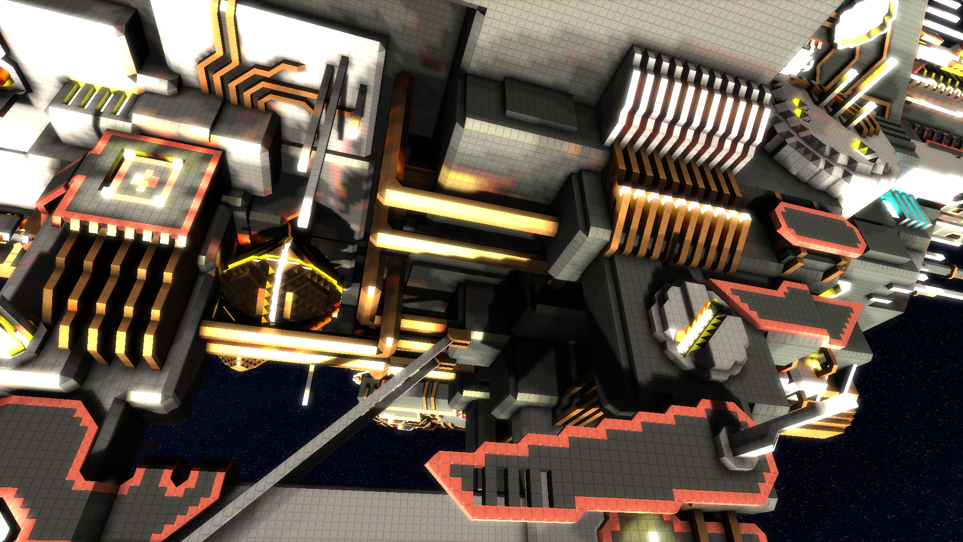
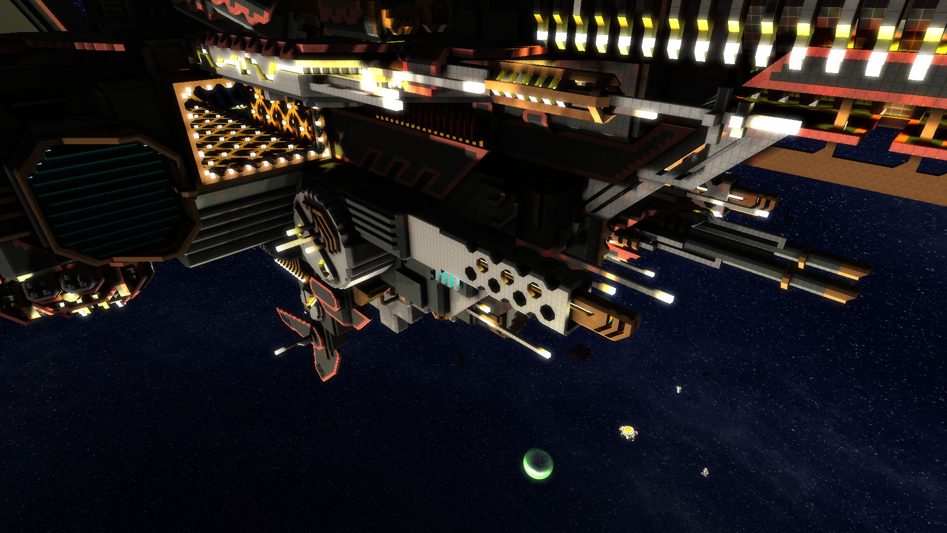
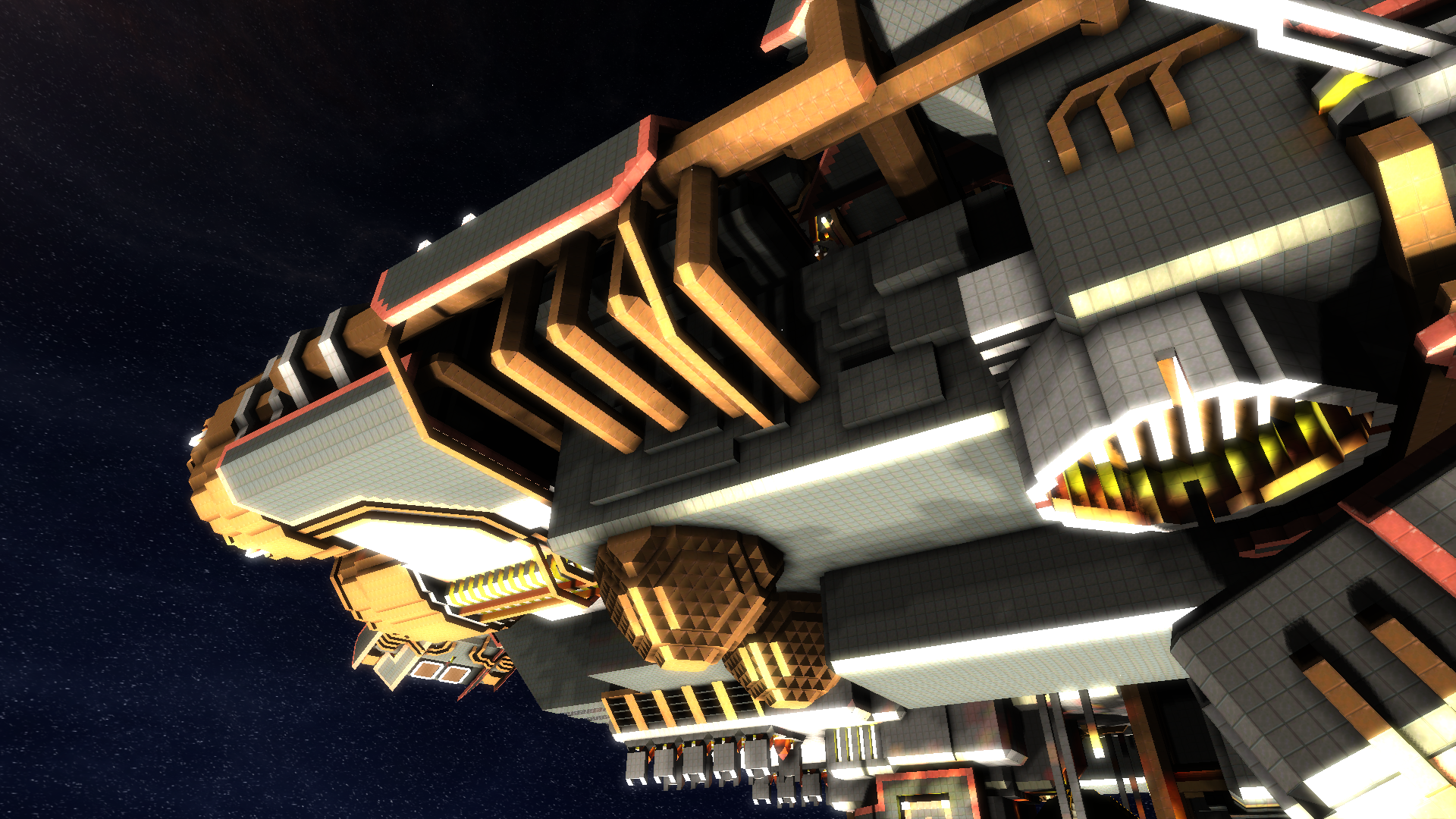
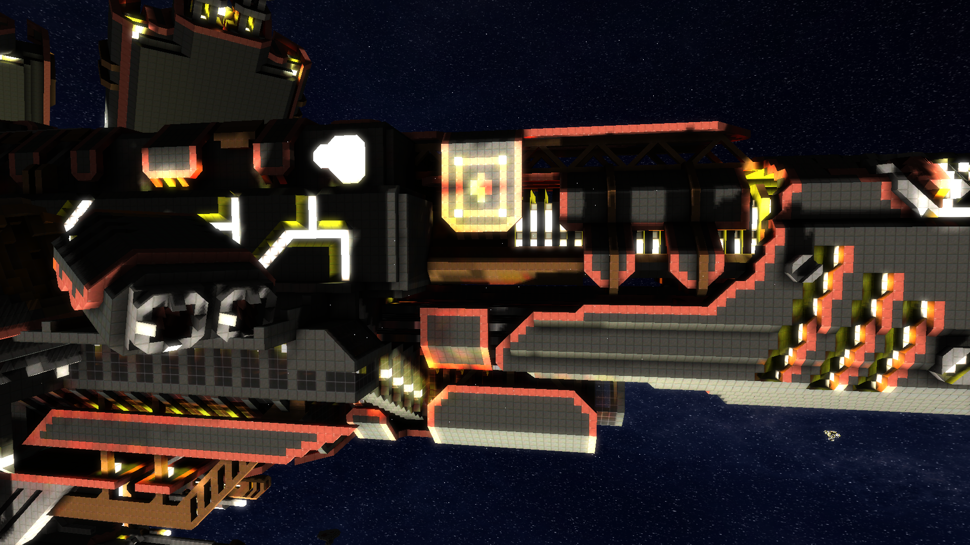
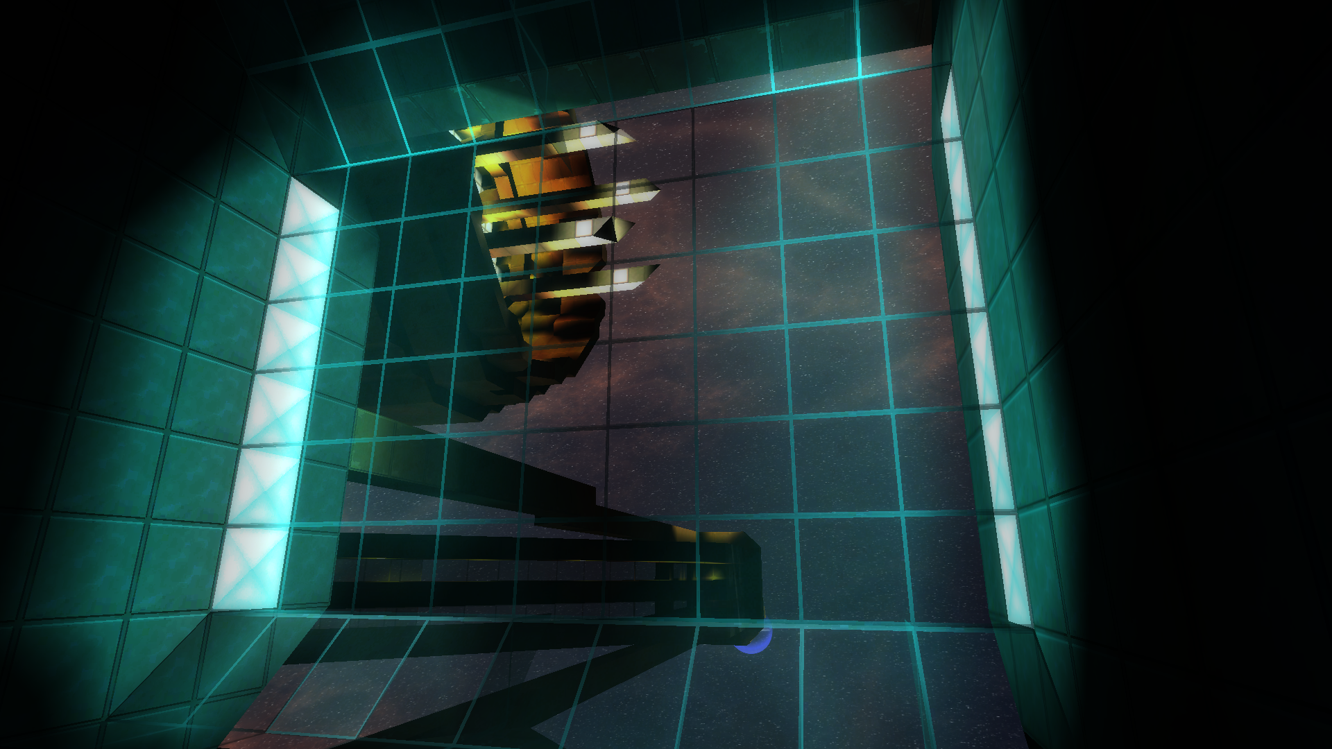
Hey there, I notice ther arent a great deal of pictures for people to get an idea of what the pack looks like in-game. So itook a few, though they are of the pack before the update, I think they're still relevant.
I really like this pack, by the way, are you intending to add the fancy-pants bump-mapping? Because that would look superb.
I tried tot ake pics of the really industrial parts of The Black, since this pack lends itself to the timeworn feel well applied to piping and the like. It wouldn't look right on something like the Eidolon.
Keep up the epic work!
- Joined
- Feb 24, 2014
- Messages
- 284
- Reaction score
- 316
- Joined
- Feb 24, 2014
- Messages
- 284
- Reaction score
- 316
kupu With the texture pack portion, very close. Still have quite a bit left to finish with it still. After that, I still have a reskinned GUI to conjure up and the mod. The mod will come whenever I have a chance to learn how to code the xml file properly (the block editor was bugged last time I checked). So quite a bit on my plate! :D
Last edited by a moderator:
Mered4
Space Triangle Builder
Another screenshot, of a recent addition to the ship catalog:
Acclamator Class Cruiser!
http://i.imgur.com/pRw1IhR.jpg
http://i.imgur.com/pRw1IhR.jpg
Reilly Reese
#1 Top Forum Poster & Raiben Jackpot Winner
- Joined
- Feb 24, 2014
- Messages
- 284
- Reaction score
- 316
- Adjusted Overall Color Pallet.
- New Terran Blocks.
- New Desert Blocks.
- New Red Blocks.
- New Alien Blocks.
- New Ice Blocks.
Comment and enjoy!
-Azurite
Last edited:
- Joined
- Aug 30, 2013
- Messages
- 1,743
- Reaction score
- 323
Latest update changed the color scheme. The only problems with that are: paint is not chipped anymore, huge blackish spot in the middle of every block, which creates a nasty effect from up close.
I hope you can find the balance between a smooth, blending texture, and the dirtyness and chunkyness you are trying to acquire. But too much of either is confusing.
Anyways, keep up the good work.
I hope you can find the balance between a smooth, blending texture, and the dirtyness and chunkyness you are trying to acquire. But too much of either is confusing.
Anyways, keep up the good work.
- Joined
- Feb 24, 2014
- Messages
- 284
- Reaction score
- 316
Not sure what you mean by huge blackish spot. Could you take a screenshot for me?
Concerning the new hulls, there still is chipped paint, the effect is just different and far less apparent. I may change it back at some point. What I did to "change the color pallet" was basically polarize the colors. The outcome is hard to explain. Basically it adds more variation of color. If you compare the earlier hulls with the new, the effect is noticeable. But it also comes at a price, as it can have a darkening or lightening effect to some colors. But it also gives a sort of Polaroid Picture effect, which I thought was pretty unique.
I'll try and fix those dark spots. I think it's just a victim of color replacement. Looking at t000 now, looks like the hulls were the only textures to have that strange outcome. Really the textures that got the most out of the replacement were the terrain. That's why I decided to go back and see if I could do the same with the hulls.
Anyway! Yeah, I was just experimenting. It's cool that you brought that to my attention. Wouldn't have known, otherwise. Thanks for telling me! I'll get on it :D


 Thanks for telling me!