[64x64] DirtySpace

    Joined
    Feb 24, 2014
    Messages
    284
    Reaction score
    316
    I'm confused on what you're saying. Weapons are tricky because you need them to look like weapons but people also need to be able to tell what they are, at least the ship builders do. I think the faces of the barrels will go untouched. I'm pretty happy with them. The sides need work. And maybe some sort of color coating on the back so builders can tell what weapons they put on their ship.

    I'm a little hesitant even worrying about these due to the fact that a weapon overhaul is not far from now and I may need to redo these textures anyway. Maybe a dev could PM me details on the upcoming changes to save me some time? ;)
     

    Reilly Reese

    #1 Top Forum Poster & Raiben Jackpot Winner
    Joined
    Oct 13, 2013
    Messages
    5,140
    Reaction score
    1,365
    • Legacy Citizen 8
    • Thinking Positive
    • Purchased!
    What I am saying is have warning stickers on the guns sides. Also manual controls like a screen and some buttons. The Rocket Launcher could have exhaust ports of some sort in the back to get rid of the heat created by the launching.
     
    Joined
    Jul 20, 2013
    Messages
    603
    Reaction score
    203
    • Legacy Citizen 2
    • Community Content - Bronze 2
    • Purchased!
    warning stickers
    Seconded. Tiny illegible warning signals and shapes are always cool.

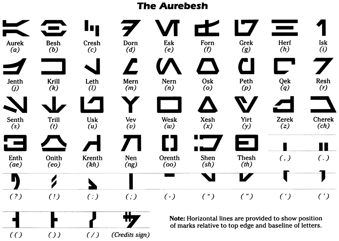
    I also think since your pack is based off of Star Wars, try including some tiny Aurebesh writing as the warning. That's the alien looking typeset they use in the movies and all media. Everything written in it equates to English, so it's more or less just straight up replacing english letters with their equivalent.
     
    • Like
    Reactions: TrainDodger
    Joined
    Feb 24, 2014
    Messages
    284
    Reaction score
    316
    Thanks for the suggestions guys!

    I considered adding Aurebesh for letters when I started the pack but chose not to when I started edging away from a 100% Official Star Wars Pack. I'd rather keep this pack reasonably ambiguous so even non-star wars fans could find it useful. Also, the thing about adding warning/hazard symbols is that it can just as easily muck up the tile. A lot of texture packs already use them so I decided against them intentionally, instead for a simple straight "gun" design. Also, whenever you see ship turrets in Star Wars, they usually don't have hazard stickers on them. ;)

    As for color, I could find interesting ways to add more but I think the weapons could be fine without it, as the ships themselves will hold most of the color, and the weapons will look realistically like weapons. I think it's a good mix. We will see. I'm doing all of this without testing it out in game because this computer can't run Starmade right now.

    EDIT: Forgot to mention I considered adding actual beam colors and missiles in the barrels at one point to help players tell what weapons they are. Would also add more color. Should I test it out?
     
    Joined
    Jan 22, 2014
    Messages
    1,047
    Reaction score
    299
    EDIT: Forgot to mention I considered adding actual beam colors and missiles in the barrels at one point to help players tell what weapons they are. Would also add more color. Should I test it out?
    Yes. It improves usability, as players can distinguish them from farther away. Maybe even add different textures. I'll post my take on proton torpedo launchers (SD KB) later today (basically a cylinder with a larger sphere at the center). SD-BB arrays will probably look like arrays (concussion missile launchers) and d1000's will have some flame exhausts at the sides (no real correspondence in the SW universe, as noone uses crappy unguided missiles there, too :D ).
     
    Joined
    Feb 24, 2014
    Messages
    284
    Reaction score
    316
    • New Thrusters
    Also tweeking weapons a bit. Will most likely update this post once those are done. Thrusters are least important due to the fact that many of us just use lights or crystals anyway, but for those who use them aesthetically, here you go. Not sure about the blue considering the effect in-game is red. Comment and suggest stuff, people!

    -Azurite
     
    Last edited:
    Joined
    Sep 30, 2013
    Messages
    67
    Reaction score
    20
    Hi ! I really love what your done , I hope you will continue like it (Be sure I will use it ;D ) .
    Good luck !
     
    • Like
    Reactions: Azurite
    Joined
    Jul 25, 2013
    Messages
    529
    Reaction score
    137
    • Purchased!
    • Legacy Citizen 3
    The blue does look good, but as you stated I don't know what it would be like with the red thruster plumes in game.
     
    Joined
    Feb 24, 2014
    Messages
    284
    Reaction score
    316
    Take a pic ingame
    This machine can't play StarMade (funny enough, it can run Photoshop). Screenshots are coming but most likely not from me. The alpha should be coming in a few days too. Hopefully some of you guys can send me some of your screenshots so I can post them on the thread! :D

    Yeah, come to think of it, it is strange that a texture artist is making a texture pack on a machine that can't run the game. I'll be getting a new machine shortly so it's no big deal right now. And I can edit the pack based off your guys' screenshots.
     
    Joined
    Feb 24, 2014
    Messages
    284
    Reaction score
    316
    • New Ship Core (One Repeated)
    • New Plex Door (Tiled)
    • Updated Plex Lights (Not Shown)
    • Updated Weapons (Not Shown)
    • Updated Thruster (Not Shown)
    • Updated Plex Beacon (Not Shown)
    Getting very close to being finished with all ship blocks. All that remain after that are terrain blocks and flora. Those will be added during my little "Alpha". So expect a download link within a day or so; make sure to take screenshots for me!

    -Azurite
     
    Last edited:

    Mered4

    Space Triangle Builder
    Joined
    Jan 12, 2014
    Messages
    662
    Reaction score
    190
    • Community Content - Bronze 2
    • Purchased!
    • Legacy Citizen 4

    • New Ship Core (One Repeated)
    • New Plex Door (Tiled)
    • Updated Plex Lights (Not Shown)
    • Updated Weapons (Not Shown)
    • Updated Thruster (Not Shown)
    • Updated Plex Beacon (Not Shown)
    Getting very close to being finished with all ship blocks. All that remain after that are terrain blocks and flora. Those will be added during my little "Alpha". So expect a download link within a day or so; make sure to take screenshots for me!

    -Azurite
    WOOHOOO
     
    Joined
    Jul 20, 2013
    Messages
    603
    Reaction score
    203
    • Legacy Citizen 2
    • Community Content - Bronze 2
    • Purchased!
    Can't wait until you make this public. I'll definitely take some screens for you.
     
    Joined
    Jul 20, 2013
    Messages
    603
    Reaction score
    203
    • Legacy Citizen 2
    • Community Content - Bronze 2
    • Purchased!
    I really like what you've got so far, but there are a couple things I think could improve.
    • Black hulls need to be darker. They're not distinguishable enough from grey.
    • Hardened hull could use a bit more variety in the panel lines. What you did on regular hull is spot on, maybe a more ordered pattern for hardened could make it look more interesting.
    • With Gravity Units, you should put consoles on all of the sides, and something that looks like a plate of sorts on the top and bottom. Some people use gravity units as floor pieces because of how the realistic texture pack is textured.
    • Engine blocks would look a lot nicer with some kind of exposed pipes/circuitry or something like how the power blocks look, maybe a maintenance console on the back or something.
    • Weapon Blocks could use something on the sides and ends to distinguish them going forward after the weapon update, but keep it subtle. What you have now is good.
    • Power blocks are seriously awesome. I think a couple flashing lights like on the power tanks would make them look really awesome.
    Here's a couple of screen shots.


    On a side note, I love the red and green you used for hulls.