[64x64] DirtySpace

    Joined
    Oct 11, 2013
    Messages
    797
    Reaction score
    441
    • Competition Winner - Stations
    • Master Builder Bronze
    • Thinking Positive
    Here are some screenshots do demonstrate the insane difference:


    The second set only really affects the hull, and gives a less sharp overall image. Also the whole is just less bright.
    A Polaroid-ish effect would only work if applied to a whole structure, and not a separate one for every single block. ;)
     
    Joined
    Feb 24, 2014
    Messages
    284
    Reaction score
    316
    Oh wow. Yeah that's not good at all :confused:

    I'll revert back before I made the color changes (at least on the hulls). The newer hull designs are fine, it's just the funky effect I added later that gives that strange dark spot. I know for sure because the new hulls use the same old texture as before.

    Thanks for the screens.

    EDIT: Going to mess around with the chipped paint as well.
     
    Joined
    Sep 30, 2013
    Messages
    67
    Reaction score
    20
    Wow man , so amazing ! You will do a GUI ?
    Good continuation .
     
    Joined
    Oct 11, 2013
    Messages
    797
    Reaction score
    441
    • Competition Winner - Stations
    • Master Builder Bronze
    • Thinking Positive
    I think the color palette (Including the yellow) is very unique. There's nothing I would want to change on that.
     
    Joined
    Feb 24, 2014
    Messages
    284
    Reaction score
    316
    Loving all of the support and feedback guys! This is awesome. While I mostly made this pack for myself, I literally am crippled right now, without your screenshots and suggestions (Can't run StarMade). So thank you :)

    Maybe do it a little bit more "yellow" ?...
    I did in fact add more yellow to the hull. I'm not ready to release the update yet, however. It's not a huge difference but it's a noticeable one.

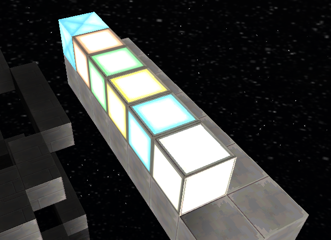
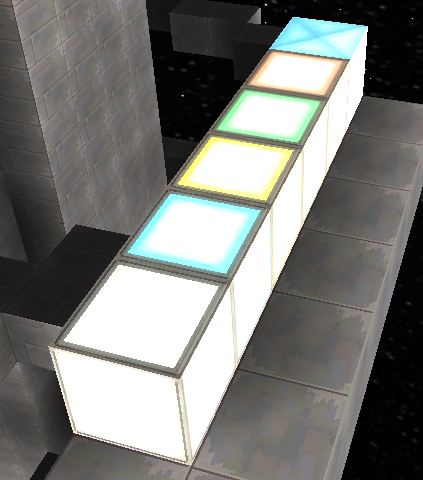
    I found the green lights are way too white for my personal taste though. It's hard to tell they are actually green.
    These are the types of screenshots I need! Thanks for this. You're right, it's hard to tell what color light that is. I went ahead and added that to my to-do list. Be on the look-out for more of that kind of stuff! :D
     
    Joined
    Jul 25, 2013
    Messages
    529
    Reaction score
    137
    • Purchased!
    • Legacy Citizen 3
    Azurite I'll see if I can try the other lights too at some point, the green ones were the only ones around at the time. :)
     
    Last edited by a moderator:
    • Like
    Reactions: Azurite
    Joined
    Jul 25, 2013
    Messages
    529
    Reaction score
    137
    • Purchased!
    • Legacy Citizen 3
    I tested all the lights. They are all (bar the white light) very white. I also included ice crystal. It does depend on where the light is shining on them though. These two pictures should demonstrate:


    Either way, it is hard to tell the colour, but one is significantly better than the other.
     
    Joined
    Feb 24, 2014
    Messages
    284
    Reaction score
    316
    It may be that the light emission is too strong ingame. I lowered the brightness and added more color to each light. Hopefully it will help. :D
     
    • Like
    Reactions: WolfChild
    Joined
    Feb 24, 2014
    Messages
    284
    Reaction score
    316
    • New Mine
    • New Water (not shown)
    • New Ice (not shown)
    • New Plex Storage
    • New Wood Block
    • New Leaves
    • Updated Plex Lights
    • Updated CPUs
    • Updated Plex Lift
    • Updated Gravity Unit
    • Updated Cockpit
    • Updated Hulls (not shown)
    • Updated Crystal (not shown)
    This is the third update. Been busy in real-life-land recently. Still got quite a bit done. Took some advice and made the computer screens yellow/orange. The buttons follow the same, with retro colors. Plex Lights should be a lot better. Hulls should be fixed as well. Overall, more color correcting, more polish, more tuning. Now that t000 is pretty much done and ready, I can start work on the other sheets with confidence.
    Have fun!


    -Azurite
     
    Last edited:
    Joined
    Oct 11, 2013
    Messages
    797
    Reaction score
    441
    • Competition Winner - Stations
    • Master Builder Bronze
    • Thinking Positive
    The big oily blob on the hull is still not gone :confused:
    Also, the updated Ice Crystals are a very bland and pale blue.

    Here are some more screenshots of how it looks like now:
    - The glass looks less clear, does give a nice effect, like they are covered in spacedust.

    - The ugly blobs on the hull survived. . .

    - Ships do look amazing from a distance.

    - But when the sun shines directly onto it, the blobs are unraveled.


    I really appreciate your efforts in continuing the pack, keep up the good work!
     
    Joined
    Feb 24, 2014
    Messages
    284
    Reaction score
    316
    Grrr. Those damned blobs! Any chance you still have texture compression on? Might be the source of it on your end.

    also, your ship does my pack much justice ^~^
     
    Joined
    Jan 22, 2014
    Messages
    1,047
    Reaction score
    299
    I just had the same thought, but it's not texture compression.

    Upper bridge level of my cruiser. Note that the gravity unit in the center has orientation issues.
    80.png

    The glass texture has aliasing issues. This is probably due to the darker surroundings in the texture file.
    starmade-screenshot-0081.png

    Star Wars style fighter (if we have thruster shots here, I forgot about it).
    starmade-screenshot-0079.png
     
    Joined
    Feb 24, 2014
    Messages
    284
    Reaction score
    316
    Are you guys absolutely certain you don't still have "Texture Compression" set as true in the game's launcher settings? (Go to advanced settings to find it). I'm still thinking so, because in your screenshots, the decorative panels don't look the same as when I made them. This could be why colors looks strange.

    As for the orientation issues, I gotta fix that. That was my bad :p Apologies for that.

    I'll also mess with glass some more later on today.
     
    Joined
    Oct 11, 2013
    Messages
    797
    Reaction score
    441
    • Competition Winner - Stations
    • Master Builder Bronze
    • Thinking Positive
    The color compression set to false did indeed banish the ugly blobs. However, the effect is still slightly visible with the black hull.
    Also, Ice Crystals are really bland:


    And the screenshots keep on flowing:
    - Ships still look great from a distance

    - And the bloom effect works really well with it.


    I am so glad the textures are back to normal again :D
     
    • Like
    Reactions: Rumcajz
    Joined
    Feb 24, 2014
    Messages
    284
    Reaction score
    316
    The ice crystals were WIP from the start. Never liked the texture it had previously and wasn't sure about the temporary one it has now. Will have to experiment. Thanks for showing a screenshot of them though! Really helps.

    The "blobs" are somewhat intentional, as they give a dirty and metallic effect. But it doesn't seem to work well with the black. Seems to me like everything else is fine.

    Back to work! :D

    EDIT: going to start posting screenshots on the original post, soon. Going to add fancy borders and such :3