StarMade v0.199.357 - Texture Update
- Thread starter schema
- Start date
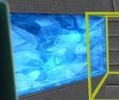
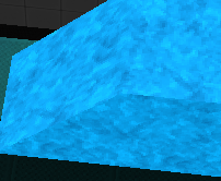
shh,they are perfect now!I really loved the old crystal texture.
Ray shield hangar doors,blue/red/etc sky in ships/stations now possible!
the crystal became more cloudy. The old crystal had more depth and felt transparent (which we know they arent).
sky in ship/station was already possible with ice and lightings. I do not know why they are all turned into this foggy thing. It no longer feels like a beautiful block of crystal.
This is the old picture

New one

Was this necessary?
sky in ship/station was already possible with ice and lightings. I do not know why they are all turned into this foggy thing. It no longer feels like a beautiful block of crystal.
This is the old picture

New one

Was this necessary?
kupu
Colouring in guy.
I'll let the community answer this one, they pushed hard for a change in this direction. ^^'the crystal became more cloudy. The old crystal had more depth and felt transparent (which we know they arent).
sky in ship/station was already possible with ice and lightings. I do not know why they are all turned into this foggy thing. It no longer feels like a beautiful block of crystal.
Was this necessary?
Kupu this update looks great, spent a whole evening just goofing around looking at the new textures , only thing unliked is astrotech module doesn't have the "galaxy" graphic anymore so will have to find a substitute.
Ithirahad
Arana'Aethi
The issue with the old crystals was that they did not look good when placed in groups. Many builders expressed a desire to have a solid, glowing coloured material for their ships, and so it was changed so that it would work that way. They might not look quite as nice as single blocks now, but they definitely work better in groups.the crystal became more cloudy. The old crystal had more depth and felt transparent (which we know they arent).
sky in ship/station was already possible with ice and lightings. I do not know why they are all turned into this foggy thing. It no longer feels like a beautiful block of crystal.
This is the old picture

New one

Was this necessary?

nightrune
Wizard/Developer/Project Manager
He's got his own thread now!lovely changes. much better, i can use system blocks for decor without cringing a little. BTW whats new with sabers 3d work. anything shaking over there..
Saber's Thread
A contrast increase (with a corresponding saturation decrease) may help, though that may also increase the appearance of the repeating pattern of light/dark areas that is now more apparent with the seamless texture. (I experimented with adding an emissive map based on the white crystal texture, which helped restore depth in shadowed areas. This essentially increased the rendered contrast.)the crystal became more cloudy. The old crystal had more depth and felt transparent (which we know they arent).
I also enjoyed the visual depth and didn't mind the beveled edges (which I think helped contribute to the crystalline appearance). Maybe kupu will be able to tweak the crystals further as more feedback comes in from folks who requested this change.
Lone_Puppy
Me, myself and I.
Water worlds, or at least moons or stations are now possible to.shh,they are perfect now!
Ray shield hangar doors,blue/red/etc sky in ships/stations now possible!
[doublepost=1483345560,1483344953][/doublepost]Wow, I just took a look at the demo of these textures. They are stunning!
So many ideas coming to me now.
[doublepost=1483345630][/doublepost]Can't wait to see what you do with LoD objects.
- Joined
- Dec 12, 2015
- Messages
- 22
- Reaction score
- 1
is there a setting I'm missing for the display module? Every time I leave a section of my ship, all the screens go gray. I have to fly away and come back to get them to come back on.
nightrune
Wizard/Developer/Project Manager
Could you start a thread in Game Support and upload your logs and graphicslog.txt from the logs folder? We can try to help you trouble shoot there.is there a setting I'm missing for the display module? Every time I leave a section of my ship, all the screens go gray. I have to fly away and come back to get them to come back on.
OMG OMG. those pipes are sexy. next update pweeease :P
moin kinnings,
entschuldigt bitte, dass ich in erster line auf deutsch schreibe.
Vom aktuellen Texturupdate hatte ich mir mehr erhofft.
Zum einen, dass Logikblöcke für die AND- und OR-Gatter ein verständlicheres Symbol bekommen und zum anderen dass Blöcke die für optische Effekte genutzt werden, nicht derart gravierend verändert werden.
Logikblöcke (AND/OR)
Schade nur, dass man sich an ein faktisch neues Design der Fuktionsblöcke gewöhnen muss. Was zur folge hat, dass Designs -Räume mit diesen Blöcken über den haufen geworfen werden - Thruster-Kochplatte lässt grüßen.
Eine~zwei Bitten hab ich noch
Trigger Area und Cargo Space (leer)
===========================================================================
Hi little citizens,
that's translation (with help of goo...-translator) of the german post on the top
From the actual Texturupdate I had hoped more.
On the one hand, logic blocks for the AND and OR gates get a more understandable symbol and, on the other hand, blocks that are used for optical effects are not changed so significantly.
Logic blocks (AND / OR)
Too bad, that you have to get used to a new design of the function blocks. As a result, Designs-Rooms are thrown over these heaps - thruster-cooking-plate lets greet.
I have one~two more petitions
Trigger Area and Cargo Space (empty)
entschuldigt bitte, dass ich in erster line auf deutsch schreibe.
Vom aktuellen Texturupdate hatte ich mir mehr erhofft.
Zum einen, dass Logikblöcke für die AND- und OR-Gatter ein verständlicheres Symbol bekommen und zum anderen dass Blöcke die für optische Effekte genutzt werden, nicht derart gravierend verändert werden.
Logikblöcke (AND/OR)
- die symbole/blöcke sehen sich zum verwechseln ähnlich
- sind nicht trival zu erkennen
- hinzu kommt, dass es sich hierbei um die völlig veraltete ANSI/IEEE Darstellung dieser Logik-Gatter handelt (DIN EN ISO lassen grüßen)
- sehen inzwischen mit dem update richtig dreckig und herunterge kommen aus
- einige Teile meiner Schiffe (Triebwerksdesign) sehen jetzt entschrechent richtig mistig aus
Schade nur, dass man sich an ein faktisch neues Design der Fuktionsblöcke gewöhnen muss. Was zur folge hat, dass Designs -Räume mit diesen Blöcken über den haufen geworfen werden - Thruster-Kochplatte lässt grüßen.
Eine~zwei Bitten hab ich noch
Trigger Area und Cargo Space (leer)
- sehen immer noch identisch aus
- zumindest den Triger Step On grün machen
===========================================================================
Hi little citizens,
that's translation (with help of goo...-translator) of the german post on the top
From the actual Texturupdate I had hoped more.
On the one hand, logic blocks for the AND and OR gates get a more understandable symbol and, on the other hand, blocks that are used for optical effects are not changed so significantly.
Logic blocks (AND / OR)
- The symbols / blocks look similar to each other
- Are not trivalable
- In addition, this is the completely outdated ANSI / IEEE representation of these logic gates (DIN EN ISO leave greetings)
- Look meanwhile with the update properly dirty and drowned out
- Some parts of my ships (thruster design) now look quite distracted
Too bad, that you have to get used to a new design of the function blocks. As a result, Designs-Rooms are thrown over these heaps - thruster-cooking-plate lets greet.
I have one~two more petitions
Trigger Area and Cargo Space (empty)
- Still look the same
- At least make the Triger Step On green
Ithirahad
Arana'Aethi
That block is a placeholder for something that isn't implemented the game yet... You are not supposed to be able to see it yet, but for some reason the block configuration file allows us to see it. It is basically a glitch.Zum Schluss noch die Frage: Was ist ein Blueprint Empty Block?
Apologies, I know this is a translation error and I do not mean to make fun of your language skills but, this sounds like you're saying farts are better with the lights turned off"in the dark is good rumbling"
Ithirahad
Arana'Aethi
F1-F8.So its been awhile since ive been able to update, and i just did...but now Tab F8 doesnt teleport me into ships, i dont see its remove in the patch notes, am i perhaps missing something?
All TAB-commands are now F1-commands.


