I actually liked the new blast door texture.
Same, despite being mostly the same texture, it really does look so much better.
However, I'm very not fond of many of the other changes, partly from a "Kupu changed it, now it sucks" angle, (
Thruster[front, left, and right], Missile Tube[all sides], Jump Dirve Computer[top and bottom], Decorative Fan[why did you remove the hazard striping?]) but mostly from a few of the new textures looking quite cartoony. (
power reactor, too much black right around the central portion)
I quite liked the Build-block recieving a blinking light, but the actual effect is a bit too intense with the "old and worn" look the rest of the block got. Might even have been better as a pulsing light, instead of the hard on/off binking it currently is.
I allso liked the removal of the chickenwire grating on the factory enhancers, now I can see what the hell was moving back there.
They didn't need the light-color changed to green though, that was just ugly.
The Animation for the Decorative Screen (blue) was a welcome change, but maybe you could have gotten an option to either stop the animation, or to "turn off" the screen.
Anyway, I'm waiting on the rest of the decorative screens to get such a treatment.
Many, many of the minor changes (
to bring a block in-line with the "new look") are either things that have been needed for a while (
sides of computers being blurry), or just plain weird. (
why did you change the decorative server? that didn't keking need one!)
Sven_The_Slayer said:
Cargo blocks are weird, they are solid based on the rotation of the block. When they are invisible they are rotated a certain way and if you find the correct rotation you can place them as full blocks or any of the quarter variants.
So that's how they achieved that bit of wizardry. I'll have to write that down. Thank you for posting that!
- The top and bottom texture of scanner modules looks almost the same as hull which is kind of a waste.
You didn't notice that it allways looked a bit like hull/ADV armor? (
texture of Grey ADV, color of Grey Hull) Or is it just waaaaaaaay moreso now?
SchnellBier said:
- I can´t put my finger on it but i feel like the new scaffold is not as good as the old one. Maybe I´m wrong.
It looks a bit too clean in the middle of the braces, other than that it's basically identical. The slightly higher resolution is kinda keking with it,
SchnellBier said:
- The red forcefield is too blurry in comparison.
Yeah, that's clearly even worse than it used to be. Red has allways been an over-saturated blurry little shit.
mosimon2 That may be the nullpointer that is currently boning the Elwyn Returnity server. (it couldn't stay up more than a few minutes)


 T1539 Block lighting normalization issues
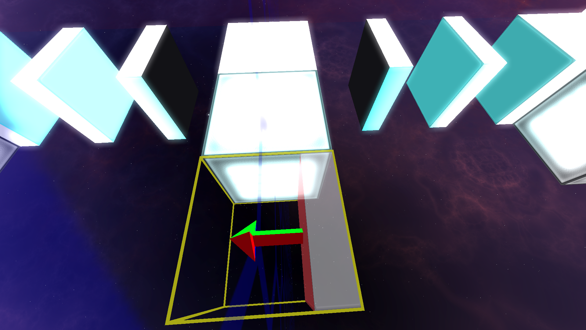

 )
)
")


