Kupu's thread

    Joined
    Dec 22, 2015
    Messages
    15
    Reaction score
    2
    What about making it look like an access panel? You know, with code entry field, a retina scanner etc.
    I don't think we have anything that fits that purpose yet and giving blocks more than one purpose saves block IDs... :)

    But of course, if we'd do that, the block would also need 24 rotations.
     

    nightrune

    Wizard/Developer/Project Manager
    Joined
    May 11, 2015
    Messages
    1,324
    Reaction score
    577
    • Schine
    • Top Forum Contributor
    • Thinking Positive
    What about making it look like an access panel? You know, with code entry field, a retina scanner etc.
    I don't think we have anything that fits that purpose yet and giving blocks more than one purpose saves block IDs... :)

    But of course, if we'd do that, the block would also need 24 rotations.
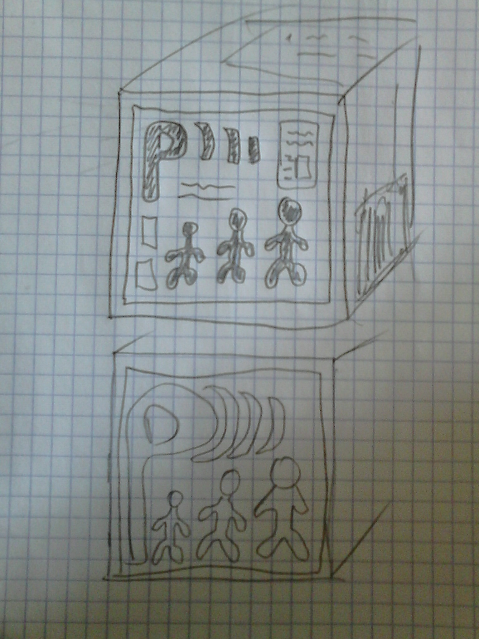
    This would be amazingly cool as well.
     
    Joined
    Aug 28, 2013
    Messages
    1,831
    Reaction score
    374
    • Legacy Citizen 2
    • Top Forum Contributor
    • Legacy Citizen
    What about making it look like an access panel? You know, with code entry field, a retina scanner etc.
    I don't think we have anything that fits that purpose yet and giving blocks more than one purpose saves block IDs... :)

    But of course, if we'd do that, the block would also need 24 rotations.
    Palm scanner might be the easiest thing to visually represent.
     
    Joined
    Jun 27, 2013
    Messages
    896
    Reaction score
    166
    What about making it look like an access panel? You know, with code entry field, a retina scanner etc.
    I don't think we have anything that fits that purpose yet and giving blocks more than one purpose saves block IDs... :)

    But of course, if we'd do that, the block would also need 24 rotations.
    Sounds good at first, but most of the time StarMade requires me to put my permission modules in places no sane person would put an access panel... if we had master/slave C-V connections, I'd say absolutely, that's the way to go.
    Something that is recognizable as a security component, but not something that requires being physically accessible. The current textures convey that quite well, although I do agree they would benefit from a redesign.
     
    Joined
    Aug 14, 2013
    Messages
    2,811
    Reaction score
    960
    • Councillor 3 Gold
    • Wired for Logic
    • Top Forum Contributor
    Sounds good at first, but most of the time StarMade requires me to put my permission modules in places no sane person would put an access panel... if we had master/slave C-V connections, I'd say absolutely, that's the way to go.
    Something that is recognizable as a security component, but not something that requires being physically accessible. The current textures convey that quite well, although I do agree they would benefit from a redesign.
    If the computer was only on a single face you should be able to use the block where you need it and not expose the face if need be. Right now I pretty much refuse to even consider using permission modules in any of my designs as there is no way to get around the fact that it is a giant P on every face. The only downside is you loose the big red flag saying "THIS IS PUBLIC". I personally would rather find other ways of marking publicly accessible options than being forced to do it the same as everybody else(with a giant P).
     
    • Like
    Reactions: nightrune

    kupu

    Colouring in guy.
    Joined
    Jul 4, 2013
    Messages
    1,405
    Reaction score
    1,560
    • Schine
    • Likeable Gold
    • Arrrty Gold
    Some quick thoughts reading over the latest discussion

    - Will palm scanners be mistaken for a block that activates?
    - Would loosing the big P flag have a downside for easily identifying public functions?
    - Would another computer interface blend in too much.
    -
    Would retina scanners and security interfaces make sense for a public space?

    One thing i will be sure to do is have the block orientable so you may "hide" whatever interface is there and be left with blank plates if you so wish. I think the original grievance posted here has merit. You don't want a huge glowy P showing it's face at every turn within a station or ship.
    But it could be useful in some places...


    Why not have it look like a weapons computer but the screen-side would look like the current block. This way players could have them blend in much easier!
    I think this is quite a sensible idea. We could perhaps combine a few of the ideas here and present a single interface on 1 side of a block that rotates. That screen shows a P somewhere much like it does now, with the added bonus of some "security" fluff surrounding it.

    Feel free to keep suggesting options, it's much appreciated.
     
    Joined
    Aug 14, 2013
    Messages
    2,811
    Reaction score
    960
    • Councillor 3 Gold
    • Wired for Logic
    • Top Forum Contributor
    Some quick thoughts reading over the latest discussion

    - Will palm scanners be mistaken for a block that activates?
    - Would loosing the big P flag have a downside for easily identifying public functions?
    - Would another computer interface blend in too much.
    -
    Would retina scanners and security interfaces make sense for a public space?

    One thing i will be sure to do is have the block orientable so you may "hide" whatever interface is there and be left with blank plates if you so wish. I think the original grievance posted here has merit. You don't want a huge glowy P showing it's face at every turn within a station or ship.
    But it could be useful in some places...


    I think this is quite a sensible idea. We could perhaps combine a few of the ideas here and present a single interface on 1 side of a block that rotates. That screen shows a P somewhere much like it does now, with the added bonus of some "security" fluff surrounding it.

    Feel free to keep suggesting options, it's much appreciated.
    Very good points. A public access with all sorts of security would be a little off... If it's clearly marked I doubt it would be mistaken. I can't really say if ditching the big P has a downside because like I said it made me not use them even if I wanted to. How much text are you willing to put on textures? Could the higher resolutions have a computer with say, "Public Access" on them instead of just the "P"?

    One other thing if public access is changing, shouldn't the faction permission modules change as well? That block would make sense to be a palm or iris scanner. Even if not being used functionally I'm sure the decorative option would be appreciated.

    If permission modules were also able to do double duty and function as public activators that would solve a lot of issues too. I would love to see alternative activators and buttons so we can mix our controls up a little as well but that's another discussion all together.
     
    Joined
    Dec 22, 2015
    Messages
    15
    Reaction score
    2
    Some quick thoughts reading over the latest discussion

    - Will palm scanners be mistaken for a block that activates?
    - Would loosing the big P flag have a downside for easily identifying public functions?
    - Would another computer interface blend in too much.
    -
    Would retina scanners and security interfaces make sense for a public space?

    One thing i will be sure to do is have the block orientable so you may "hide" whatever interface is there and be left with blank plates if you so wish. I think the original grievance posted here has merit. You don't want a huge glowy P showing it's face at every turn within a station or ship.
    But it could be useful in some places...


    I think this is quite a sensible idea. We could perhaps combine a few of the ideas here and present a single interface on 1 side of a block that rotates. That screen shows a P somewhere much like it does now, with the added bonus of some "security" fluff surrounding it.

    Feel free to keep suggesting options, it's much appreciated.

    That's true.

    I think in this case we should change the public and the faction permission block to interface blocks, where the big P and F take up like a quarter of the screen.

    The faction permission block should get the security things. I think palm scanner are also ok, as long as they don't stand out to much. Like drawn with glowing light green lines on a dark green background or something similar.

    The public permission block is a little more complicated, as in reality you probably wouldn't have a feature to make a door being open. I think one possibility could be to take a "lighter" version of a security interface. Like having a code entry field and above it a big green status field that says: "OPEN". On the other hand that maybe makes the block look to much like an actual door lock.
    Another idea could be to step away from the actual functionality of the block and make look like some kind of public information terminal. A very clever idea would be to make it look like it was showing information about the room behind the door, but I can't think of any visual representation of that idea right now.


    PS: I think this goes roughly in the same direction. Like having the P in the corner and having some sort of diagram on a screen. Maybe with controls or without.
    What about some kind of computer screen a bit like that ? Little men could be alien outlines instead of human like figures...
     
    Last edited:

    Ithirahad

    Arana'Aethi
    Joined
    Nov 14, 2013
    Messages
    4,150
    Reaction score
    1,330
    • Purchased!
    • Top Forum Contributor
    • Legacy Citizen 8
    Public permission modules don't need to be anything fancy. Just two opposing sides that say "PUBLIC" with an unlocked lock symbol on a grid screen, and the other faces can be grey flat parts.

    Faction permission modules, however... Go nuts. Palm scanners, iris scanners, cameras, a locked lock symbol on a screen, switches, buttons, screws, panels, bar instruments... (Also, two opposing sides with plain grey surfaces like faction modules)
     

    kiddan

    Cobalt-Blooded Bullet Mirror
    Joined
    May 12, 2014
    Messages
    1,131
    Reaction score
    358
    • Top Forum Contributor
    • Legacy Citizen 4
    • Purchased!
    - Will palm scanners be mistaken for a block that activates?
    If I was a new player I'd be trying to use it like an activator.
    - Would loosing the big P flag have a downside for easily identifying public functions?
    Most likely, Public and Faction permission modules should be recognizable enough that a player doesn't have to get real close or use trial-and-error to figure out whether he/she may use a door, gravity module, etc.
    - Would another computer interface blend in too much.
    As long as the P or F or whatever is visible from far enough away (provided, the screen should have to be facing the player. If someone doesn't want the screen-side visible they should be able to rotate it so that another side is visible).
    - Would retina scanners and security interfaces make sense for a public space?
    For a Public faction module I feel an interface-ish look would be better, anyone may enter so why would it have retina scanners? Faction Permission Modules would look good as retina scanners, though!
     
    Joined
    Aug 30, 2015
    Messages
    167
    Reaction score
    164
    • Purchased!
    Is it possible to make the water blocks less transparent? I was trying to make a small water fountain on my hotel and restaurant ship today and I feel like it should be more thick and blue. It's too easy to see through.
     

    Lone_Puppy

    Me, myself and I.
    Joined
    Mar 12, 2015
    Messages
    1,274
    Reaction score
    529
    • Purchased!
    • Community Content - Bronze 2
    • Legacy Citizen 8
    Yea, understandable. It looked this way for two reasons. The permission blocks have always looked this way, even before my time (which admittedly is not always a good reason). Secondly, it was visually basic to help differentiate it's purpose really clearly. Almost like logic does (which has it's downsides as you noted).

    You're right, the new texture pack is the place to remedy this specific part of your request. Let's get some further thoughts on this from others.
    Please post your suggestions for permission textures please!

    Shall we keep something simple and easily representative? Or dress it up a little bit as an interface. Something more decorative?
    Like a computer screen displaying "ACCESS GRANTED" in flashing blue or something. The Faction version could have the same look, but "FACTION ACCESS ONLY" flashing green.
    [DOUBLEPOST=1462745774,1462745511][/DOUBLEPOST]Kupu, are we likely to see wedge and slab versions of lights?

    I use crystal wedges where I would prefer to use lights, mainly because of the look, but I would prefer a light that I can control with logic.
    Slab versions would be useful for interior lighting, tight spots and small craft.

    Otherwise, I would be happy to control the crystals light emitting properties with logic if that was possible.
     
    Joined
    Jul 1, 2013
    Messages
    28
    Reaction score
    13
    • Purchased!
    • Legacy Citizen 4
    I think that with the new texture pack in the making, it might be a good time to ask for stone improvements. Not the awesome and colorful ones, the standard, basic grey stone.

    We have all these cool colors, but we also need more natural looking stones for landscaping (am i the only one to do this in this game?) and while the white and black ones fit well, we need grey too. But the grey stone really need to be brought on par with the others. Just give it a cool name and a polished variant. (then it will eventually be able to be used as an asteroid material if these get reworked at some point.)

    And since we also have that other (Blue? Black? I'm pretty sure it changed color a few times) stone for red planets, it could be made brown (with again, cool name and polished block) because that's the most needed missing natural stone color.

    And will we eventually have stone bricks for planetary buildings? pls
     
    • Like
    Reactions: nightrune and Valck

    kiddan

    Cobalt-Blooded Bullet Mirror
    Joined
    May 12, 2014
    Messages
    1,131
    Reaction score
    358
    • Top Forum Contributor
    • Legacy Citizen 4
    • Purchased!
    Might not be a kupu thing, but could stone actually be named something more specific? It's weird to go from mining asteroid stone with names and then mine on a planet and it's just called "stone(rock?)" or "red stone(rock?)", maybe call it something scientific if it has no factory use, or make up one that goes along with the asteroid ones?
     
    Joined
    Sep 4, 2013
    Messages
    723
    Reaction score
    200
    • Purchased!
    • Legacy Citizen 5
    Maybe white walking man inside green circle?
    Something like that in spoiler but without stroke in the middle of sign and with colors I described above.

     
    Joined
    Jul 12, 2014
    Messages
    511
    Reaction score
    57
    • Purchased!
    • Legacy Citizen 5
    Some quick thoughts reading over the latest discussion

    - Will palm scanners be mistaken for a block that activates?
    - Would loosing the big P flag have a downside for easily identifying public functions?
    - Would another computer interface blend in too much.
    -
    Would retina scanners and security interfaces make sense for a public space?
    [text snipped]
    Feel free to keep suggesting options, it's much appreciated.
    How about a computer monitor screen that states "Public Access". Additionally that text could change depending on the permission settings of the block?
    A section on the monitor screen were the player / builder can add some extra text could be a nice touch as well. ;)

    Greets,

    Jan
     

    Keptick

    Building masochist
    Joined
    Sep 26, 2013
    Messages
    4,062
    Reaction score
    1,841
    • Councillor 2 Gold
    • Railman Gold
    • Thinking Positive Gold
    Quick question: Is there a reason for the bevels on the various crystal blocks? It looks very unnatural, and will do even more so if they're ever added as a part of world generated structures. Ice crystals don't have those bevels, and it looks vastly superior when used decoratively.
     

    therimmer96

    The Cake Network Staff Senior button unpusher
    Joined
    Jun 21, 2013
    Messages
    3,603
    Reaction score
    1,053
    • Legacy Citizen 10
    • Top Forum Contributor
    Quick question: Is there a reason for the bevels on the various crystal blocks? It looks very unnatural, and will do even more so if they're ever added as a part of world generated structures. Ice crystals don't have those bevels, and it looks vastly superior when used decoratively.
    He mentioned a few pages ago that they're going to be removed, presumably as part of the texture overhaul