Kupu's thread

    Joined
    Jul 7, 2013
    Messages
    472
    Reaction score
    156
    • Purchased!
    • Legacy Citizen 4
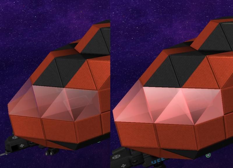
    I kinda want to see how that last frame looks when tiled before I support it. It looks cool, but I think going further with the second to last one would better suite a burned metal hull. It's like exactly what I suggested earlier and it looks great. Cracks do not really make sense to me, honestly.
    Ominous looking cracks would look extremely good on windows, reactor walls and conduits/pipes, but on normal metal surfaces I agree; the burnt, increasingly molten hole appearance looks better. Since we can't have different damage types for different blocks though, I'd have to go with the holes :)
    [DOUBLEPOST=1422801013,1422800760][/DOUBLEPOST]
    Question: Can we climb on scaffolding? I haven't gotten to test out the new version yet
    My compact ship designs are crying out for ladders or some similar sort of climbable surface. Save me having to keep putting in space-consuming stair-wells or expensive gravity lifts to get between floors.
     

    kiddan

    Cobalt-Blooded Bullet Mirror
    Joined
    May 12, 2014
    Messages
    1,131
    Reaction score
    358
    • Top Forum Contributor
    • Legacy Citizen 4
    • Purchased!
    Question: Can we climb on scaffolding? I haven't gotten to test out the new version yet
    Just tried them out while in the gravity of a ship, nope. :( But, hey! They look cool! :cool:
     

    Mariux

    Kittenator
    Joined
    Jun 20, 2013
    Messages
    1,822
    Reaction score
    658
    • Purchased!
    • Community Content - Silver 1
    • Legacy Citizen 8
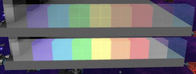
    Is it just me or are the crystal armor textures a little to bright compared to hull?
    Yes, they are a bit brighter now, and I personally like it the way it is now. Previously the colored crystal glass was a bit too dull.
     

    kupu

    Colouring in guy.
    Joined
    Jul 4, 2013
    Messages
    1,405
    Reaction score
    1,560
    • Schine
    • Likeable Gold
    • Arrrty Gold
    Yes, they are a bit brighter now, and I personally like it the way it is now. Previously the colored crystal glass was a bit too dull.
    Yes Sven_The_Slayer they have had a brightness increase. Had quite a few requests to do so so they stood out a little more. It's always an ongoing adjustment in and amongst larger projects, so it might change again in the near future.
     
    • Like
    Reactions: Mariux
    Joined
    Aug 3, 2013
    Messages
    383
    Reaction score
    114
    • Legacy Citizen
    • Community Content - Bronze 2
    • Community Content - Bronze 1
    well i for one like it, butt I do have one other request for the new UI, you know the animation for charging up jump drives and scanners?

    I have a hard time telling when they are charged because the two states aren't obvious enough its my one and only gripe with the new UI. I recommend something like a color change between the two, like having it start out a red color then half way charged it turns yellow, and finally green when fully charged, that way I can tell when they are charged.

    I also have one other request about the new scaffolds, could we get a wedge shape as well, it dosnt need penta and tetras or any of the others, just the wedge. it one and only hold back for using them is they have no wedge, like I said they don't need anything else just the wedge.
     
    Last edited:
    Joined
    Aug 14, 2013
    Messages
    2,811
    Reaction score
    960
    • Councillor 3 Gold
    • Wired for Logic
    • Top Forum Contributor
    I don't know if it's the shade or the fact that they are more opaque that bothers me but they just seem too "pastel" to me.


    I personally prefer the originals, the colors just seemed to match better. The default texture pack in general isn't very bright so having brighter windows just looks off, in my opinion anyway.
     

    therimmer96

    The Cake Network Staff Senior button unpusher
    Joined
    Jun 21, 2013
    Messages
    3,603
    Reaction score
    1,053
    • Legacy Citizen 10
    • Top Forum Contributor
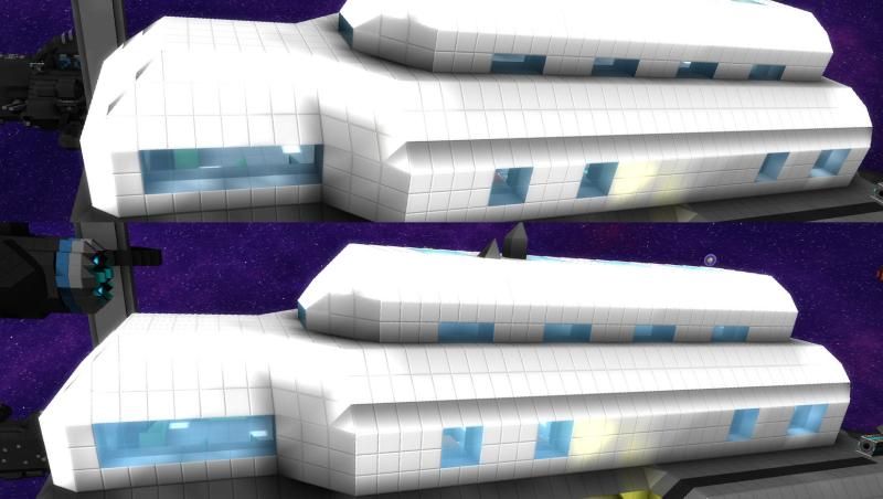
    I also dislike how blue normal glass is, it should more closely resemble the black/white glass.
     

    kupu

    Colouring in guy.
    Joined
    Jul 4, 2013
    Messages
    1,405
    Reaction score
    1,560
    • Schine
    • Likeable Gold
    • Arrrty Gold
    I also dislike how blue normal glass is, it should more closely resemble the black/white glass.
    You know it was the community that pressured me into our current glass? lol
    [DOUBLEPOST=1423256996,1423256907][/DOUBLEPOST]Sven_The_Slayer Yup, good comparison shots. It's opacity that was altered. I'll try editing the saturation to compensate for the change.
     
    Joined
    Aug 14, 2013
    Messages
    2,811
    Reaction score
    960
    • Councillor 3 Gold
    • Wired for Logic
    • Top Forum Contributor
    I also dislike how blue normal glass is, it should more closely resemble the black/white glass.
    I like the default glass, that's why I went with blue crystal for a lot of my ships, because it's armored and very similar to the glass. Now they just look weird.

    There is also not enough difference between white and black in my opinion. Black was always too bright and I ended up using white wherever I didn't use blue. I'll have to see what the next iteration looks like.
     
    Joined
    Jul 7, 2013
    Messages
    472
    Reaction score
    156
    • Purchased!
    • Legacy Citizen 4
    You know it was the community that pressured me into our current glass? lol
    Perhaps a poll would help settle the matter? Maybe produce 3 iterations and see what the majority thinks? :)
     

    Criss

    Social Media Director
    Joined
    Jun 25, 2013
    Messages
    2,187
    Reaction score
    1,772
    • Master Builder Bronze
    • Video Genius
    • Competition Winner - Stations
    My glass seems fine. Nowhere near the pastel colors your getting.
     

    kupu

    Colouring in guy.
    Joined
    Jul 4, 2013
    Messages
    1,405
    Reaction score
    1,560
    • Schine
    • Likeable Gold
    • Arrrty Gold
    My glass seems fine. Nowhere near the pastel colors your getting.
    Using different lighting samples and facing the sun probably bumps the saturation up way higher.
     
    Joined
    Jun 20, 2013
    Messages
    2,827
    Reaction score
    1,181
    • Video Genius
    • Legacy Citizen 4
    • Top Forum Contributor
    hey kupu, is it possible to mod the colour emmited by the sun?
     

    kupu

    Colouring in guy.
    Joined
    Jul 4, 2013
    Messages
    1,405
    Reaction score
    1,560
    • Schine
    • Likeable Gold
    • Arrrty Gold
    You may of noticed a minor thread clean-up.

    I will state again, this is not a place to put your suggestions, nor request "agrees" for them. There is a very specific sub-forum solely for that purpose.

    This is not, nor will ever become a snowballing pressure thread for your suggestions. It is a link between myself and the community to showcase developments, receive and respond to bugs, changes or critique.

    Thanks. ʕ•ᴥ•ʔ