The 17th Tactical Fleet Shipyard

    Joined
    Feb 26, 2014
    Messages
    270
    Reaction score
    54
    • Purchased!
    • Community Content - Bronze 1
    • Legacy Citizen 4
    Hello.This Shipyard is a post for the ships that i have been working on.
    Most of the ships will have had an exterior shell from elsewhere such as 1:1 Star Trek fleet (no interiors) Minecraft Project
    So i will not take credit for the shell.
    The reason why i use shells from elsewhere is because i am pretty terrible at making hulls and some of the larger ones i do not have the time to make .

    First off we have the USS Nebula NCC-90400 the Flagship of the 17th tactical fleet
    starmade-screenshot-0041.png starmade-screenshot-0042.png
    Since i Already have a large thread talking about this ship i will leave the link here
    Nebula class starship 1:1 now complete

    Next up Project Prometheus
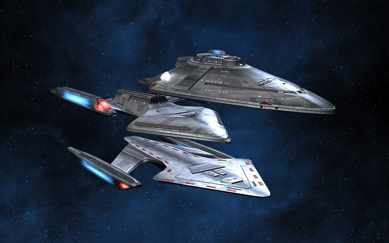
    Project Prometheus is a 1 to 1 scale Prometheus class starship that is MVAM capable (MVAM stands for Multi Vector Assault Mode) This was one of the ships that was aquired from planet minecraft.
    starmade-screenshot-0058.png
    The first image is the Prometheus when all are docked together
    starmade-screenshot-0059.png starmade-screenshot-0060.png
    a few different angles starmade-screenshot-0061.png
    Prometheus Beta's Shuttle bay
    starmade-screenshot-0063.png
    Prometheus Gamma's Bridge
    starmade-screenshot-0064.png
    Prometheus Alpha's Bridge
    starmade-screenshot-0062.png
    And Prometheus Beta's bridge
    This version of the prometheus is a combat focused variant so that is basical all of it's interior but there will be a more interior focused variant

    The ship you have been seeing in the background is the USS Homestead a Homestead class this was aquired from USS Mercury unfortunatly the creator has not been on in over a year.
     
    • Like
    Reactions: Rumcajz
    Joined
    Feb 26, 2014
    Messages
    270
    Reaction score
    54
    • Purchased!
    • Community Content - Bronze 1
    • Legacy Citizen 4
    The USS Homestead was developed from the USS Mercury as the 17th tactical fleets Diplomacy vessel it has a very minimal crew of 10 so the crew do not have much space.The ship has no weapons and is designed to be completely diplomatic starmade-screenshot-0068.png starmade-screenshot-0069.png
    It is not a very big ship at only 286 meters long some more detailed stats starmade-screenshot-0072.png

    Due to designing this ship to be diplomatic it has a rather large conference room starmade-screenshot-0065.png
    This ship has a very small shuttle craft Type three starmade-screenshot-0066.png
    The ship also has a transporter but i believe that every ship that can have shuttle should have a shuttle

    starmade-screenshot-0067.png
    The warp core unlike most star trek ships that have vertical warp cores this ship has a horizontal warp core starmade-screenshot-0070.png
    And the Bridge the main part of the ship, Uploads will come shortly
     

    therimmer96

    The Cake Network Staff Senior button unpusher
    Joined
    Jun 21, 2013
    Messages
    3,603
    Reaction score
    1,053
    • Legacy Citizen 10
    • Top Forum Contributor
    Bits of advice...

    Don't use adv armour for interior. It's nasty, shows the tiles and looks too bulky for an interior. Standard is much nicer as it tiles without boarders.

    Stop using the same colour for the entire interior. It looks like you whiteboxed it all. Everything is white, even tables and chairs. my current basic standards for normal 3 wide starfleet interiors are blue floor, white walls, dark grey ceiling, with the center of the ceiling being normal grey 3/4 slabs, creating an indent, with the white lights in that grey line, making them look separate from the rest of the ceiling. Tables should be brown too look wooden, or atleast grey. chairs tend to be purple because nothing else is. all of this standard armour.

    you really need to do better jobs of lighting the interior aswell. have the ceilings be lower, remember the astronauts are only 2m tall. if it looks right in build mode, it will probably look off in astro mode. 3 blocks is tall enough for most interior, allowing for proper ceiling lighting rather than having it all over the walls. also, turn up your light quality settings to max, makes light cast further so you don't need so many

    stop having the registry glow strange colours. they look perfectly fine as black text on hull. you can even use docking magic to get wedges in wedges now
     
    Joined
    Jul 29, 2013
    Messages
    1,173
    Reaction score
    494
    • Competition Winner - Small Fleets
    • Top Forum Contributor
    • Legacy Citizen 5
    Yeah, those interiors need work. I'm assuming you've seen Star Trek, but don't try to do it from memory, open a gallery of Starfleet interiors on your phone or second monitor and work from there.
     
    Joined
    Jun 26, 2013
    Messages
    247
    Reaction score
    359
    • Competition Winner - Small Fleets
    • Legacy Citizen 3
    • Community Content - Bronze 2
    Alright so to make these look much better I suggest you start detailing your ships. Federation ships have a crap ton of greebles so you have no excuses for just being lazy And having an all white hull.

    Right away, I'd say that the windows, aztecing and escape pod hatches should be a priority. Most federation vessels have different colors of hull plates on them from white, to grey, to beige.
    As for the interior, like the others have said, while the all white look is good for maybe an apple store, you need to mix it up and play around with different hull types and colors

    If you're just doing your own thing and not going off the official one thats cool, but I'd still advise you to play around with contrast and try to get a sweet interior.

    Use different hull colors and types. I normally like to do standard armor for "carpet" and basic hull for flat wall surfaces.
    If you need inspiration for living quarters, I made quarters based off those of the Enterprise-D

    Other than that, yea man, just detail your stuff and make it look sweet. Those are some awesome imports you have, they look really well done.
     
    • Like
    Reactions: Rumcajz
    Joined
    Jun 24, 2015
    Messages
    385
    Reaction score
    59
    Well well, a fellow Federation builder.
    Hidy Ho, Dragon2000

    Hmm, From my own efforts, I'll actually say "forget the aztec-ing", instead do panelling wherever you can. Make it look like large-ish sections of the hull are removeable panels, since azetec-ing is a colossal pain in 1-meter blocks (we'd really need 1/2 by 1/2 by 1/2 meter blocks, and about 4 different colors of "grey" for proper aztec-ing)

    Gotta agree with Jerry_Brinefield, remove the all advanced armor inside. Sure, keep the same shapes, sure, keep some of it as bulkheads or around genuinely critical systems, but most of it should be standard or Hull, for both the lightness (meaning you need less engine to move around) and ease-of-manufacture. (not that advanced is all that difficult, but standard is that much cheaper)

    Once it is no longer all advanced armor, it'll need moar color. Being a trek-build, blues, browns and greys are the best bets.

    I don't know about most of the community, but I run in maximum lighting quality (raycast at 256) all the time.
    Pure white builds give me snowblindness. :confused:(don't get me wrong, I hate pure black builds just as strongly)

    The hull-shape of the shuttle is nice, but I'm very curious as to why you've put rail-controllers in it?


    On the Warp-Core.
    Eh. I get the appeal of Horizontal cores, but that, ... doesn't quite look the part. maybe try building it a bit bigger, so you can "wrap" it in glass, preferably a ring of expanding wedge, ring of solid, ring of shrinking wedge, repeat ad-nauseum

    Kinda like this :
    /0\
    |0|
    \0/
    /0\
    But set on it's side.
     
    Joined
    Feb 26, 2014
    Messages
    270
    Reaction score
    54
    • Purchased!
    • Community Content - Bronze 1
    • Legacy Citizen 4
    Thank you all for the information I agree with a lot of what you have all said I will replace the white advanced armour around the ship I am thinking of replacing it with the centre floor as blue for carpet with a grey border and a black roof I will keep some of the white since I think it looks nice in some areas.The reason for the rail control is because that is what I use as a type 3 shuttle pod it was designed for use on the USS Dauntless I will post about that at a later date but suffice to say it had a very small shuttle bay and so the type three was developed from a type two it was made longer so the logic would fit and now the reason why there its nacelles can move in and out this was so it could fit in the Dauntless shuttle bay I may add exterior escape pods to one or two ships but they will not function.

    Again thank you all for you tips and recommendation i will implement them when I can.
    Q'apla
     
    Joined
    Feb 26, 2014
    Messages
    270
    Reaction score
    54
    • Purchased!
    • Community Content - Bronze 1
    • Legacy Citizen 4
    After taking into account what people have said i believe that the Homestead class is now ready for use it has an updated interior removing nearly all of the advanced armour except in places where i think it works and some areas where it needs to be.
    It has the same basic exterior as before but now with an insignia or two i am thinking of trying to design some escape pods for the exterior but i am not sure where to put them.
    starmade-screenshot-0075.png
    Some different viewpoints of the ship
    starmade-screenshot-0076.png
    The Insignia is very similar to the design my fleet on STO (Star Trek Online) uses a Black exterior with the red interior
    starmade-screenshot-0077.png
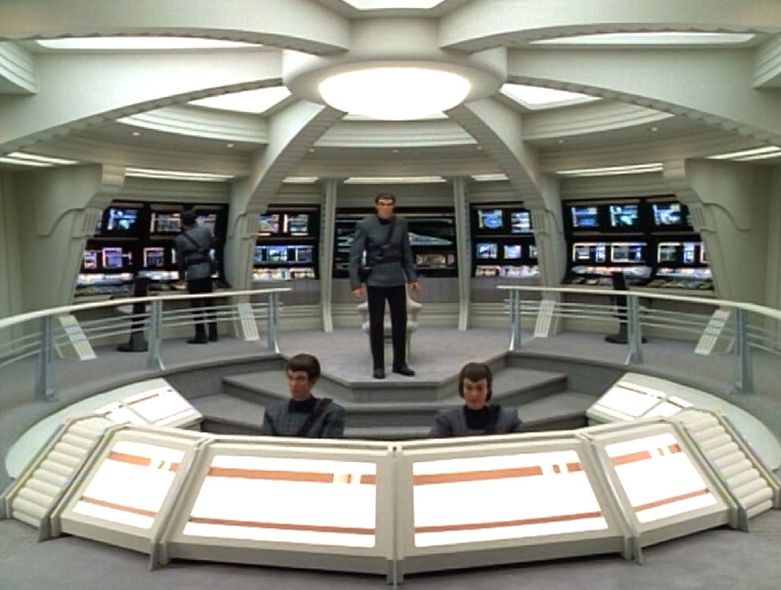
    The new more refined bridge i think it could still use some work though so some ideas would be helpful because it is a very small bridge
    starmade-screenshot-0078.png
    The Conference room with the new colours still a large ceiling but i think it works

    starmade-screenshot-0079.png
    An Exterior View of the shuttle craft and where is bay is.
    starmade-screenshot-0080.png Just a different perspective(good if you are wondering what the rail controllers were for).
    starmade-screenshot-0081.png
    And Finally the new style of corridor i must say they definitely look better than the old ones so thank you all for the advice about that.
    starmade-screenshot-0073.png

    So This was a small update for the Homestead class Most rooms now have blue carpet for the floor grey walls and black ceilings if you have anymore recommendations i would love to try and add them.
    Also i am now working as a Baron on the Titan Fleet server which is where i will be building new ships if i can or they will be bui8lt on single play feel free to say hello.
     
    • Like
    Reactions: Rumcajz
    Joined
    Feb 26, 2014
    Messages
    270
    Reaction score
    54
    • Purchased!
    • Community Content - Bronze 1
    • Legacy Citizen 4
    Greetings over the past few days i have been working on a new ship It is a Daedalus class starship it is Bigger than 1 to 1 because if it was it would be tiny so without furthre adue i give you
    starmade-screenshot-0085.png
    USS Daedalus I decided to go with a TOS style interior so it uses reds greys blues and blacks i think the bridge came out nicely
    starmade-screenshot-0086.png
    I tried to make a somewhat TOS style transporter room but i think that it went well
    starmade-screenshot-0087.png Finaly the ship itself For the record i did not have a hull for this so i made this from scratch so i am quite proud with how it came out
    starmade-screenshot-0088.png

    The ship comes equip0ed with 3 Ion phase cannons and 4 phase torpedoes over 4 million sheilds and powerful jumpdrive and scanner
     
    • Like
    Reactions: Rumcajz
    Joined
    Feb 26, 2014
    Messages
    270
    Reaction score
    54
    • Purchased!
    • Community Content - Bronze 1
    • Legacy Citizen 4
    Eww the Trek Daedalus...
    Whats wrong with it if its the sphere yeah that is not the best but it was the best i could get done in the time i made it and starmade limits a new ship i have been working on looks alot nicer in my opinion than the Daedalus.
     

    Reilly Reese

    #1 Top Forum Poster & Raiben Jackpot Winner
    Joined
    Oct 13, 2013
    Messages
    5,140
    Reaction score
    1,365
    • Legacy Citizen 8
    • Thinking Positive
    • Purchased!
    Whats wrong with it if its the sphere yeah that is not the best but it was the best i could get done in the time i made it and starmade limits a new ship i have been working on looks alot nicer in my opinion than the Daedalus.
    Just the ship in general is an ugly model from Trek in my opinion.
     
    Joined
    Feb 26, 2014
    Messages
    270
    Reaction score
    54
    • Purchased!
    • Community Content - Bronze 1
    • Legacy Citizen 4
    It has been a while since i last posted any ships here but i have been working on a few new ships first the Farrad class light escort this was a ship designed by me so it is a non canon design the ship is a tri neacelled ship. with torpedo roll bar linking from the neacell it is a relatively small ship designed for patrol missions due to its size it is not a dedicated combat ship but it is relatively speedy for what it is.


    starmade-screenshot-0110.png

    starmade-screenshot-0115.png
    The bridge is one of the limited interior of the ship it is a bit basic but it gets the job done when needed.
    starmade-screenshot-0114.png

    Next is the Fedaration class Dreadnought whitch i have found where the shell first came from so this is the link [TOS Federation Dreadnought] USS Federation Minecraft Project This was designed for combat it is a larger ship but it is quite good for what it is. It has a lot of different weapons including lock on torpedoes heat seeking torpedoes and pulse phasers it has an incredibly limited interior due to it being a warship with the only interior being a large hangar bay and a bridge with corridor leading to it. The ship also has a powerful jump inhibitor starmade-screenshot-0116.png starmade-screenshot-0117.png starmade-screenshot-0119.png

    And finally a ship that i need to work on some more because its power system is not strong enough yet The hubble class exploration cruiser starmade-screenshot-0120.png
    This ship is almost completely designed for RP it has very weak weapons and is not meant to be in a fight though it has a massive interior to get pictures of the interior would be difficult so that is why there are not any it has probably the second most expansive interior i have ever designed with the Nebula class command battlecruiser being the most. I may have went over the top with the shuttle bays since this ship has 5 shuttle bay including one that contains a danube class runabout (my reasoning is that and exploration cruiser would have a large amount of shuttles).
    starmade-screenshot-0121.png starmade-screenshot-0122.png
     
    • Like
    Reactions: Rumcajz