Texture Pack

    Joined
    Jun 22, 2013
    Messages
    29
    Reaction score
    0
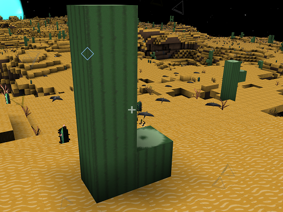
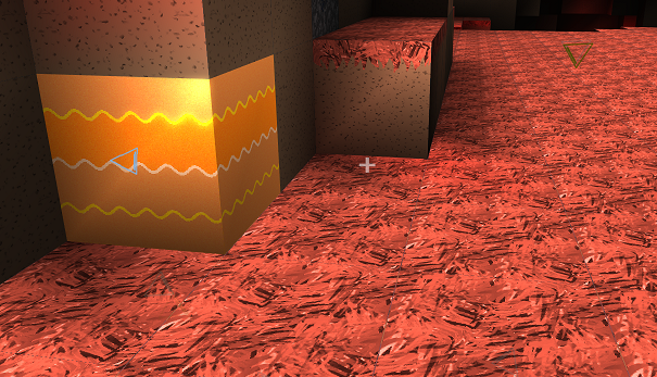
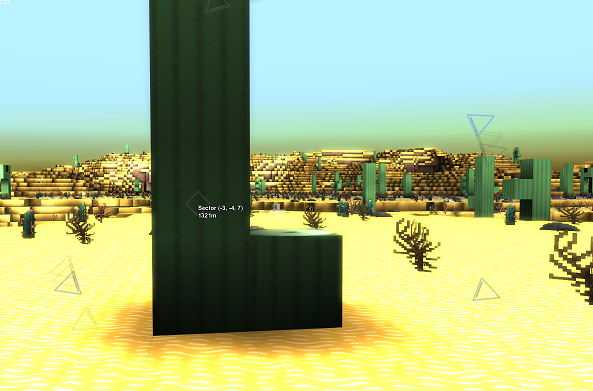
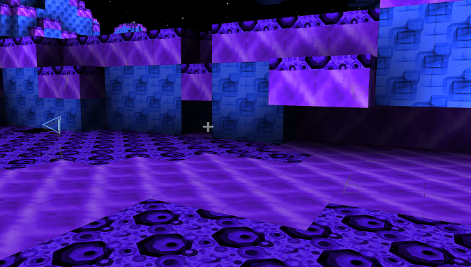
    Hey so I am working on another texture pack for starmade, I am still trying to decide on an artistic style to stick with. Suggestions definitely welcome. I am thinking of changing the red planet to a volcanic texture to make venus-ish style planets minus the sulphuric acid and lead melting tempretures ;)


    Joined
    Jun 22, 2013
    Messages
    29
    Reaction score
    0
    I have decided to go with making a mass effect texture pack. I\'m liking it so far.

    What do you think?
     
    Joined
    Jun 22, 2013
    Messages
    29
    Reaction score
    0
    A bit more work today, I got more to do but it\'s coming on well.
     
    Joined
    Jun 30, 2013
    Messages
    72
    Reaction score
    0
    In general I like this texture pack, but I don\'t like the sinusoidal lava layer in the rock on the volcanic planet.
     
    Joined
    Jun 22, 2013
    Messages
    29
    Reaction score
    0
    So I have been working on some new blocks and I really like how the cockpit has turned out.


    Front view of one cockpit


    The rear view of cockpits put together, can be used as a screen for your crew members of your ship :)


    The 3 different rocket types


    and last but not least the Bobby AI module, designed to look like EDI from Mass Effect.


    More to come
     

    kupu

    Colouring in guy.
    Joined
    Jul 4, 2013
    Messages
    1,405
    Reaction score
    1,560
    • Schine
    • Likeable Gold
    • Arrrty Gold
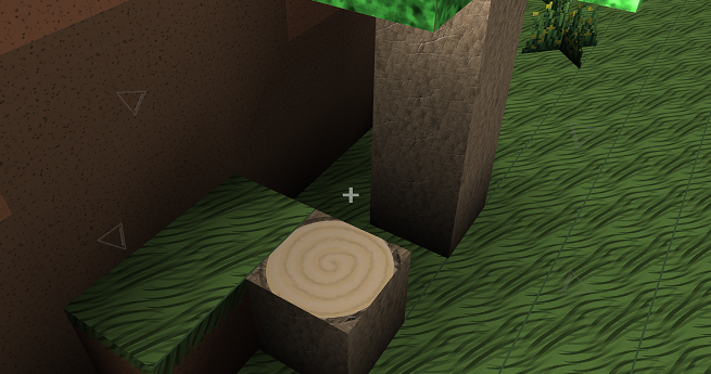
    Careful with your enviroment textures, you have a small black visible band around each block.

    You can fix this by making sure the textures are running right up to the \'bleed\'.

    Which texture on that ship is your standard hull? The wall of floors?

    Keep up the hard work!
     
    Joined
    Jun 23, 2013
    Messages
    295
    Reaction score
    0
    • Legacy Citizen 2
    • Legacy Citizen
    The use of that back of cockpit see through glitch is the closes thing to a \"Screen of what\'s outside\" hahah

    well, it might look weird in the middle of the ship though..
     
    Joined
    Jun 22, 2013
    Messages
    29
    Reaction score
    0
    hey kupu, the planet it textures I decided are not final, but I will definitely make sure they go to the bleed...I was getting fed up with those lines on the planets... The hull types I am also uncertain what should be what..at the moment the floor is the hardened hull and the walls are standard. Feed back about what way round people would like them would be cool :)


    EDIT: kupu the link to your texture pack is now on my starmade texture db
     

    kupu

    Colouring in guy.
    Joined
    Jul 4, 2013
    Messages
    1,405
    Reaction score
    1,560
    • Schine
    • Likeable Gold
    • Arrrty Gold
    Cheers pal, i saw it today. Thanks for that.

    I know that feeling chizilu! The hulls are something really hard to get right, everyone has a different idea of what it should be too. So go with what you like best!

    Your standard hull is looking nice and definately fits with your other textures. The transparency on your cockpit is a really nice touch. Very clever.

    Looking forward to seeing more.
     
    Joined
    Jun 22, 2013
    Messages
    29
    Reaction score
    0
    a small update on the textures


    This is the Gravity unit


    These are the rocket computer systems and their corresponding rockets.
     
    Joined
    Jun 22, 2013
    Messages
    29
    Reaction score
    0
    I\'ve been playing around with the hud..here is what I have so far.
     

    kupu

    Colouring in guy.
    Joined
    Jul 4, 2013
    Messages
    1,405
    Reaction score
    1,560
    • Schine
    • Likeable Gold
    • Arrrty Gold
    The new GUI really fits in with your textures. Nice one!