Hello,
Right now managing our fleet in Starmade is a bit weird and we usually hope for a better IA in the future that will fix everything, but today I will suggest a new view to manage our fleet that should help or at least look cool.
Basic idea:
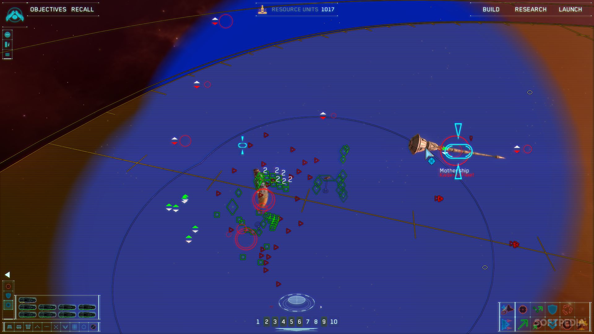
In Homeworld you can press Spacebar to switch between normal RTS view and really zoomed out view that show clearly where are your ships, the enemy that you can detect, asteroids, etc... in 3D. (It is called sensors manager ingame)
It looks like that:

And you can fully rotate in 3D, move using arrow or AWSD, and of course use your mouse to select ships and order them to move attack collect or anything !
I think the absence of menue interaction should make the game more fun and natural.
Also this view would be super efficient and could even replace the small mini map/radar thing we curently have.
A lot of Starmade player love the idea to pilot a mothership so this should help the player order to his fleet and come back to fight himself in no time.
Advanced idea:
It would look cool to have a Fleet Block in our ship that would display an hologram of this tactical overview.
You can imagine being able to enter this view by entering into this block like when you enter into weapon block.
You could be able to switch between galaxy view, system view, or sector view (however I have no idea what the size of a sector will be in the new universe update) to help manage your fleet and also naviguate when you don't have to fight.
Maybe Schine could use the works he has done on the radar/mini map to implement this view more easily. (but a big work would probably be needed to make it possible to select ships inside this view)
You could be able to connect your official scanner block with this fleet block to explain why you can see enemy ships and planets/asteroids.
And also to connect your fleet block with computers to manage the colors of your ships and maybe the size of the symbols or the whole hologram.
Right now managing our fleet in Starmade is a bit weird and we usually hope for a better IA in the future that will fix everything, but today I will suggest a new view to manage our fleet that should help or at least look cool.
Basic idea:
In Homeworld you can press Spacebar to switch between normal RTS view and really zoomed out view that show clearly where are your ships, the enemy that you can detect, asteroids, etc... in 3D. (It is called sensors manager ingame)
It looks like that:

And you can fully rotate in 3D, move using arrow or AWSD, and of course use your mouse to select ships and order them to move attack collect or anything !
I think the absence of menue interaction should make the game more fun and natural.
Also this view would be super efficient and could even replace the small mini map/radar thing we curently have.
A lot of Starmade player love the idea to pilot a mothership so this should help the player order to his fleet and come back to fight himself in no time.
Advanced idea:
It would look cool to have a Fleet Block in our ship that would display an hologram of this tactical overview.
You can imagine being able to enter this view by entering into this block like when you enter into weapon block.
You could be able to switch between galaxy view, system view, or sector view (however I have no idea what the size of a sector will be in the new universe update) to help manage your fleet and also naviguate when you don't have to fight.
Maybe Schine could use the works he has done on the radar/mini map to implement this view more easily. (but a big work would probably be needed to make it possible to select ships inside this view)
You could be able to connect your official scanner block with this fleet block to explain why you can see enemy ships and planets/asteroids.
And also to connect your fleet block with computers to manage the colors of your ships and maybe the size of the symbols or the whole hologram.
