NeonSturm
StormMaker
- Joined
- Dec 31, 2013
- Messages
- 5,109
- Reaction score
- 617
It looks better ")
But these images only show "round borders" not round elements. Let me give you a few hints in form of images:
http://wallpaperswa.com/Space/Stars...ip_1600x900_wallpaper_10621/download_1600x900
http://heavennetwork.org/languages/lcars-android
BTW: Even Windows copies from StarTrek: (?joke?)
But these images only show "round borders" not round elements. Let me give you a few hints in form of images:
More examples:

http://wallpaperswa.com/Space/Stars...ip_1600x900_wallpaper_10621/download_1600x900
http://heavennetwork.org/languages/lcars-android
BTW: Even Windows copies from StarTrek: (?joke?)
- Joined
- Jun 19, 2013
- Messages
- 42
- Reaction score
- 8
- Joined
- Jun 10, 2014
- Messages
- 18
- Reaction score
- 24
There are not many changes made on the default StarMade GUI, so a update seems for me unnecessary. But I always keep my eyes on the UI png files after an update so don't worry the updates will come, if needed.sooooooooooo updating for 0.19289 yet?
- Joined
- Jun 19, 2013
- Messages
- 42
- Reaction score
- 8
Well I suppose so. Although it is worth mentioning that I have noticed that the Rail Dockers do not have icons on the toolbar or in the weapons menu. There's just nothing besides their name; yet you can still drag and use them as normal, it just appears empty.There are not many changes made on the default StarMade GUI, so a update seems for me unnecessary. But I always keep my eyes on the UI png files after an update so don't worry the updates will come, if needed.
- Joined
- Jun 10, 2014
- Messages
- 18
- Reaction score
- 24
Oh, ok. Thanks for reporting me this. I didn't noticed this bug, yet. I will keep an eye on it and try to fix it.Well I suppose so. Although it is worth mentioning that I have noticed that the Rail Dockers do not have icons on the toolbar or in the weapons menu. There's just nothing besides their name; yet you can still drag and use them as normal, it just appears empty.
Reilly Reese
#1 Top Forum Poster & Raiben Jackpot Winner
- Joined
- Oct 13, 2013
- Messages
- 5,140
- Reaction score
- 1,365
The old shipyard GUI had this issue. New blocks were released and part of the hud he packaged had previous version build icons.
Just exclude the build icons or paste the new ones into the folder.
Just exclude the build icons or paste the new ones into the folder.
Last edited:
- Joined
- Apr 30, 2014
- Messages
- 19
- Reaction score
- 24
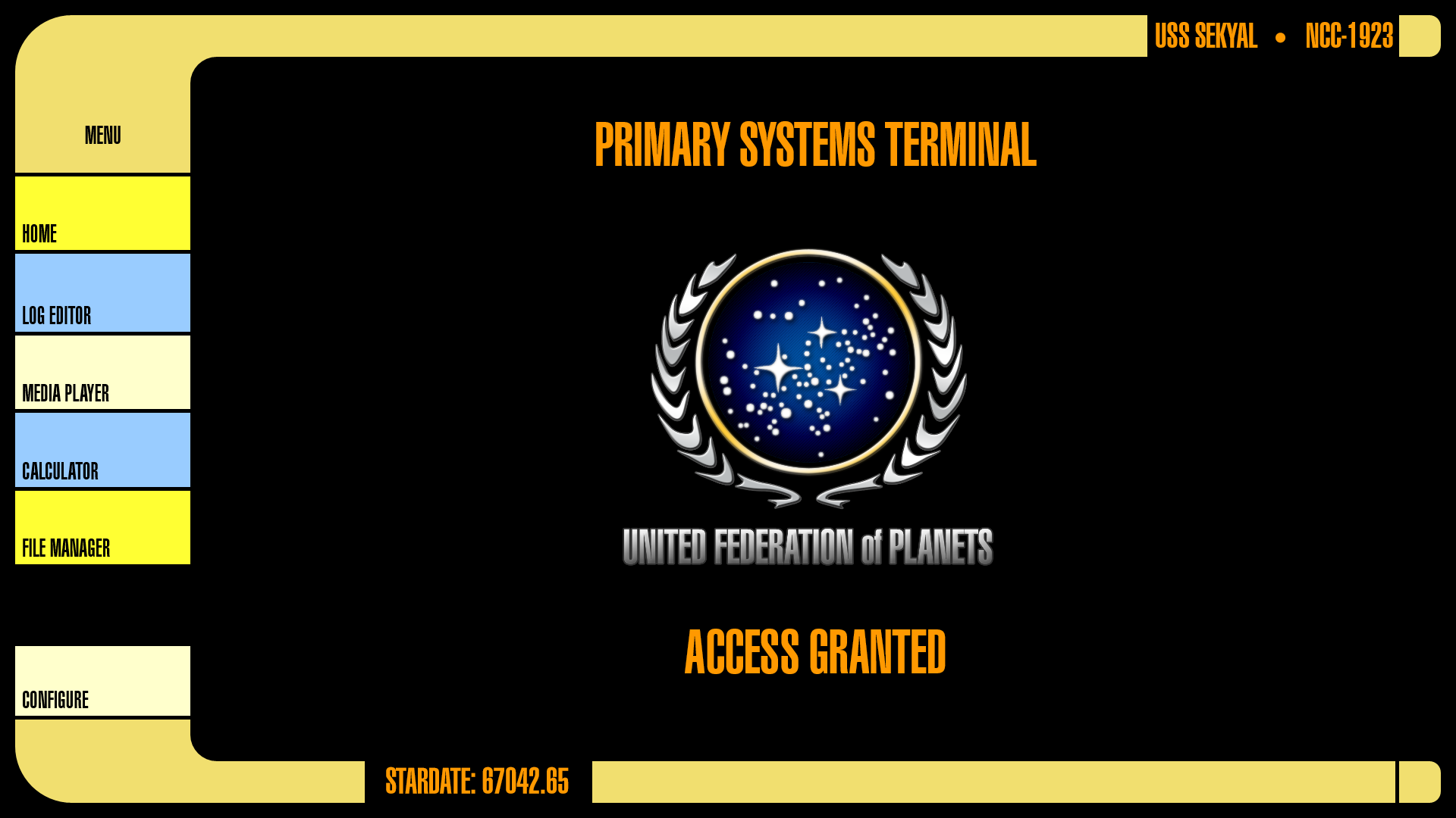
Okay, I've downloaded the new Voyager Blue GUI (v 3.0), and I feel like someone has to give a review. Since all three of the main GUIs are about the same, I have decided that, rather than three separate reviews, one on each page, I will post a single review here.
My review will touch upon three points: Aesthetics (how it looks and "feels"), Usability (How easy it is to use), and Canonicity (How it fits in with accepted Cannon).
Aesthetics:
The design of this iteration of the LCARS GUI looks good. The overall design tends towards simple shapes, making it one of the more modest of the designs out there. There are no real problems with the UI that I can think of that directly connect with the looks of it, and have no connection to the other two categories.
Out of three points in this category, I shall give it 3/3.
Usability:
The overall information structure is highly usable to a point. The sad thing is, esp. with the Voyager Blue GUI, is that the "Darker" texture used to show your selection is somtimes hard to notice if you're not looking for it. This could be rectified by changing the selection hue. Also, the sidebar doesn't allow you to scroll down to see all of the text in the shop or the "Show Block Information" Panel, but this is a problem I have with the StarMade interface itself. Overall, it's highly usable and I wouldn't mind recommending the Starfleet LCARS system to any user.
Again, I give this category 3/3.
Canonicity:
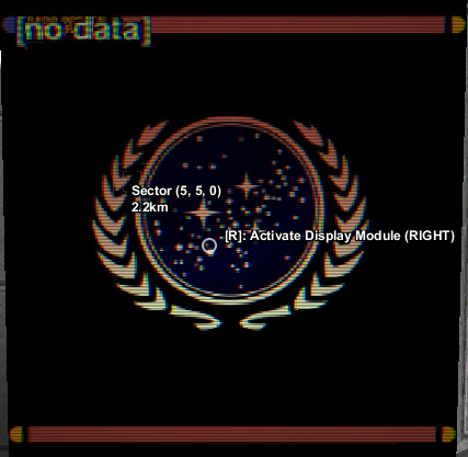
This is where I have to give some tough love to you. I'm sorry but the GUI still has some issues where it relates to the Canonicity aspects. I know that at least one other person (Shout out to NeonSturm) has posted pictures on this, and I will refer to his pictures as part of my review.
First off, canonically the LCARS system does not use rounded selection tabs except for when they are arranged vertically in a free-standing position (Meaning not connected to other system interfaces, as seen in the second picture posted by NeonSturm). It seems that this has been done so that you can have those separated bars from the last GUI update, which was kinda just...ridiculous...from a usability standpoint, esp. since they were technically in the wrong location (the bars separate entry selections, as seen in both pictures). Furthermore, the GUI shows little other connections to the LCARS interface, namely lacking the curving bars on the sides that the LCARS system is famous for having. Granted, this is only a StarMade GUI, but it would be interesting if the sidebars could be used as Power Bar indicators or at least link some sections of the interface together. Overall, not very canon, and as such it lacks in this area.
I have to give you some hard luck, and I'm forced to give you 1/3.
Final thoughts/Final score:
While I love this GUI practically to death, the Interface is sort of non-canon and that irks me. Granted, it's not enough to cause me to stop using it, but it's something that could be fixed with a little planning and a small amount of extra work.
Because of this, I'm giving you an extra point for putting up a valiant effort, for being kind, and for working so damn hard on this GUI. 1/1
This makes the total overall score 8/10 total. Granted, this GUI has it's flaws, but overall it's usable and looks a lot cooler than the standard StarMade UI, and I can still heartily recommend any one of these three to someone else to use.
This concludes my review.
My review will touch upon three points: Aesthetics (how it looks and "feels"), Usability (How easy it is to use), and Canonicity (How it fits in with accepted Cannon).
Aesthetics:
The design of this iteration of the LCARS GUI looks good. The overall design tends towards simple shapes, making it one of the more modest of the designs out there. There are no real problems with the UI that I can think of that directly connect with the looks of it, and have no connection to the other two categories.
Out of three points in this category, I shall give it 3/3.
Usability:
The overall information structure is highly usable to a point. The sad thing is, esp. with the Voyager Blue GUI, is that the "Darker" texture used to show your selection is somtimes hard to notice if you're not looking for it. This could be rectified by changing the selection hue. Also, the sidebar doesn't allow you to scroll down to see all of the text in the shop or the "Show Block Information" Panel, but this is a problem I have with the StarMade interface itself. Overall, it's highly usable and I wouldn't mind recommending the Starfleet LCARS system to any user.
Again, I give this category 3/3.
Canonicity:
This is where I have to give some tough love to you. I'm sorry but the GUI still has some issues where it relates to the Canonicity aspects. I know that at least one other person (Shout out to NeonSturm) has posted pictures on this, and I will refer to his pictures as part of my review.
First off, canonically the LCARS system does not use rounded selection tabs except for when they are arranged vertically in a free-standing position (Meaning not connected to other system interfaces, as seen in the second picture posted by NeonSturm). It seems that this has been done so that you can have those separated bars from the last GUI update, which was kinda just...ridiculous...from a usability standpoint, esp. since they were technically in the wrong location (the bars separate entry selections, as seen in both pictures). Furthermore, the GUI shows little other connections to the LCARS interface, namely lacking the curving bars on the sides that the LCARS system is famous for having. Granted, this is only a StarMade GUI, but it would be interesting if the sidebars could be used as Power Bar indicators or at least link some sections of the interface together. Overall, not very canon, and as such it lacks in this area.
I have to give you some hard luck, and I'm forced to give you 1/3.
Final thoughts/Final score:
While I love this GUI practically to death, the Interface is sort of non-canon and that irks me. Granted, it's not enough to cause me to stop using it, but it's something that could be fixed with a little planning and a small amount of extra work.
Because of this, I'm giving you an extra point for putting up a valiant effort, for being kind, and for working so damn hard on this GUI. 1/1
This makes the total overall score 8/10 total. Granted, this GUI has it's flaws, but overall it's usable and looks a lot cooler than the standard StarMade UI, and I can still heartily recommend any one of these three to someone else to use.
This concludes my review.
- Joined
- Jun 10, 2014
- Messages
- 18
- Reaction score
- 24
Wow, thats a huge review. After reading this very detailed and constructive review and tried to translate some of your words with google translator, i still don't understand what canonicity is.Okay, I've downloaded the new Voyager Blue GUI (v 3.0), and I feel like someone has to give a review. Since all three of the main GUIs are about the same, I have decided that, rather than three separate reviews, one on each page, I will post a single review here.
My review will touch upon three points: Aesthetics (how it looks and "feels"), Usability (How easy it is to use), and Canonicity (How it fits in with accepted Cannon).
Aesthetics:
The design of this iteration of the LCARS GUI looks good. The overall design tends towards simple shapes, making it one of the more modest of the designs out there. There are no real problems with the UI that I can think of that directly connect with the looks of it, and have no connection to the other two categories.
Out of three points in this category, I shall give it 3/3.
Usability:
The overall information structure is highly usable to a point. The sad thing is, esp. with the Voyager Blue GUI, is that the "Darker" texture used to show your selection is somtimes hard to notice if you're not looking for it. This could be rectified by changing the selection hue. Also, the sidebar doesn't allow you to scroll down to see all of the text in the shop or the "Show Block Information" Panel, but this is a problem I have with the StarMade interface itself. Overall, it's highly usable and I wouldn't mind recommending the Starfleet LCARS system to any user.
Again, I give this category 3/3.
Canonicity:
This is where I have to give some tough love to you. I'm sorry but the GUI still has some issues where it relates to the Canonicity aspects. I know that at least one other person (Shout out to NeonSturm) has posted pictures on this, and I will refer to his pictures as part of my review.
First off, canonically the LCARS system does not use rounded selection tabs except for when they are arranged vertically in a free-standing position (Meaning not connected to other system interfaces, as seen in the second picture posted by NeonSturm). It seems that this has been done so that you can have those separated bars from the last GUI update, which was kinda just...ridiculous...from a usability standpoint, esp. since they were technically in the wrong location (the bars separate entry selections, as seen in both pictures). Furthermore, the GUI shows little other connections to the LCARS interface, namely lacking the curving bars on the sides that the LCARS system is famous for having. Granted, this is only a StarMade GUI, but it would be interesting if the sidebars could be used as Power Bar indicators or at least link some sections of the interface together. Overall, not very canon, and as such it lacks in this area.
I have to give you some hard luck, and I'm forced to give you 1/3.
Final thoughts/Final score:
While I love this GUI practically to death, the Interface is sort of non-canon and that irks me. Granted, it's not enough to cause me to stop using it, but it's something that could be fixed with a little planning and a small amount of extra work.
Because of this, I'm giving you an extra point for putting up a valiant effort, for being kind, and for working so damn hard on this GUI. 1/1
This makes the total overall score 8/10 total. Granted, this GUI has it's flaws, but overall it's usable and looks a lot cooler than the standard StarMade UI, and I can still heartily recommend any one of these three to someone else to use.
This concludes my review.
First of all I am very grateful about your review and of the good feedback you give me. I love everyone, who likes the GUI and gives me some feedback and suggestions.
About the canonicity: As an german student I can't speak english perfectly. And the word "canonicity" isn't known to me. I understood that you mean, that the GUI isn't completely accurate to the LCARS system from Star Trek. If so I am still not sure, which of the textures should be improved. It would be great if you just send me some images (pn or here in the thread) of this textures and write, what should be changed. This could be easier for me to understand.
Also if anyone thinks, that a texture should be improved just send me a pn with the file name of the texture and describe how it should look or send me an image of it. I will post the edited texture right in this thread, to see if the community likes it. If not I can send you an "personal LCARS GUI", with the changes you wanted
Thanks a lot CAPTAINZACH for this great review and suggestions. I hope I can make the GUI perfect for you and the community and get a 10/10 rating.
- Joined
- Aug 29, 2014
- Messages
- 16
- Reaction score
- 10
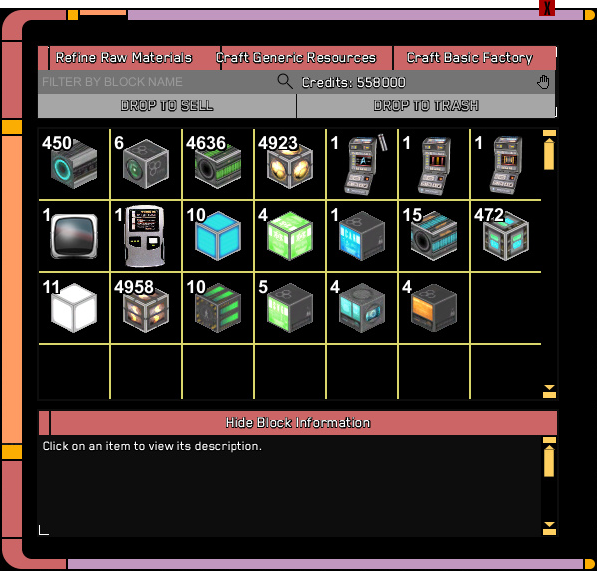
I believe he posted his first few LCARS GUIs on the StarMade Multiverse.The actual inventory needs some cleaning, but the flight HUD is perfect. The rounded edges for the hotbar might need a bit of tweeking to not make other icons overlap it, but for the rest it indeed is perfect.
What I meant by cleaning:
It looks a bit busy right now. Some things also aren't properly smoothed, like the actual inventory. It currently is a bit jagged by the edges.
But this is a first version, and keeping that in mind it is really, reslly nice. Keep the general style, it is unique and very nice to look at.
- Joined
- Jun 10, 2014
- Messages
- 18
- Reaction score
- 24
You are finally here! Wuuhuuu! <3I believe he posted his first few LCARS GUIs on the StarMade Multiverse.
This guy is creating some damn good skins! You all should love him for his nice work!
I am sorry that I can't upload on StarMade Multiverse anymore, but I think the community here is closer than on Multiverse, where many download, but no one reviews.
Welcome back to the StarMade Dock ZephaniaNoah! :D