LCARS GUI

    Do you like the new VOYAGER BLUE GUI?

    • Yes, it looks nice! I want to see more LCARS GUIs!

    • Yes, looks good, but I don't need more LCARS GUIs.

    • No, I don't like it!


    Results are only viewable after voting.
    Joined
    Jun 10, 2014
    Messages
    18
    Reaction score
    24

    Welcome Trekkies!

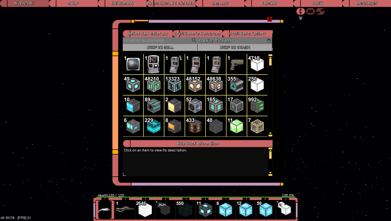
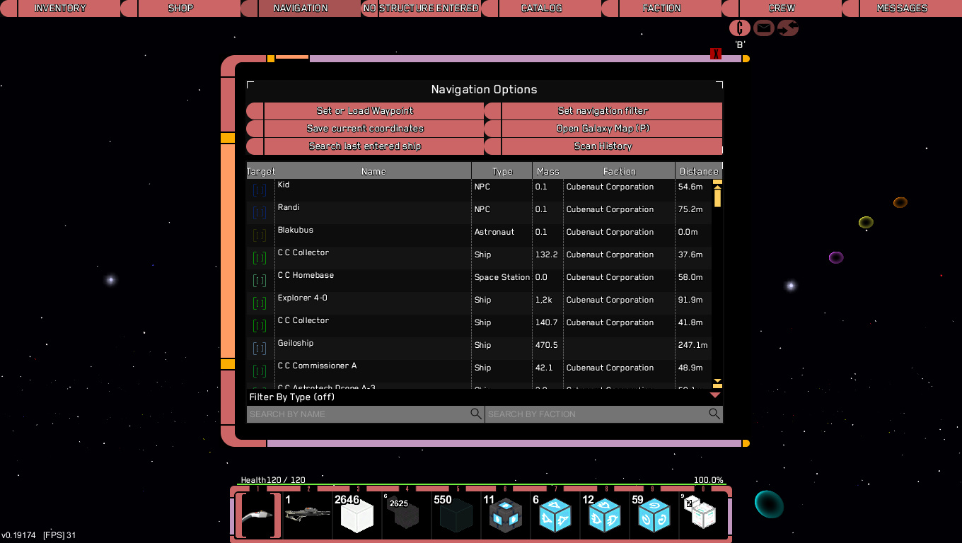
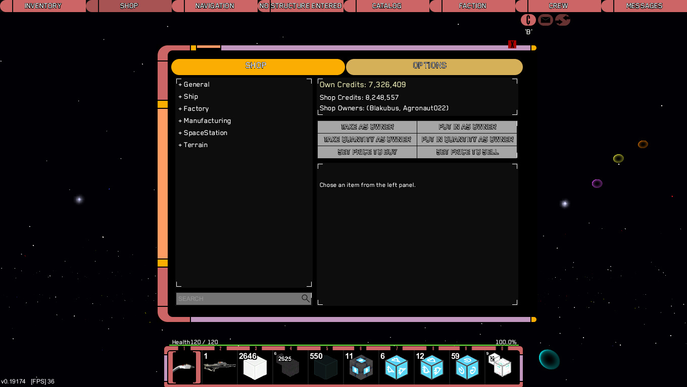
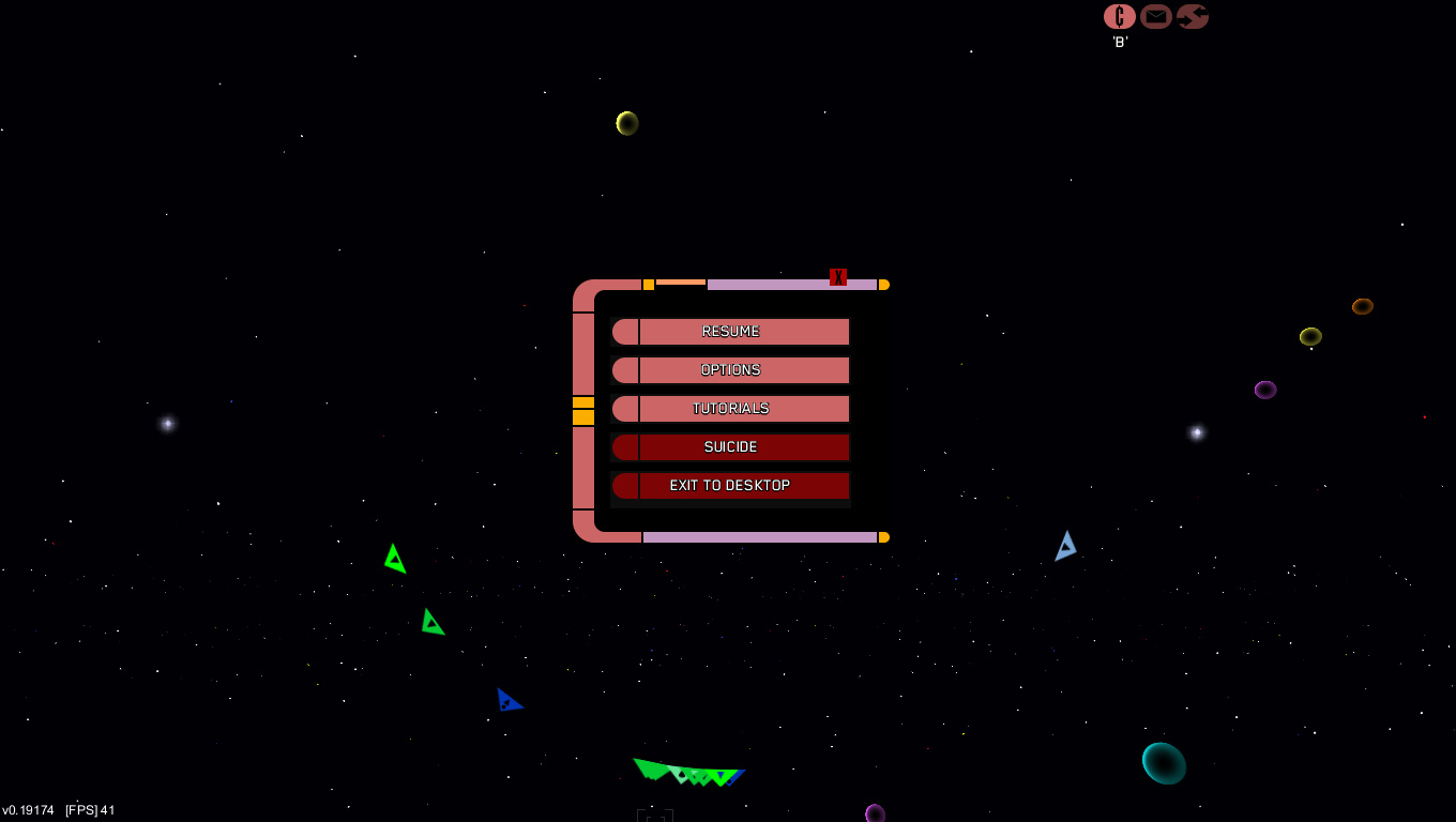
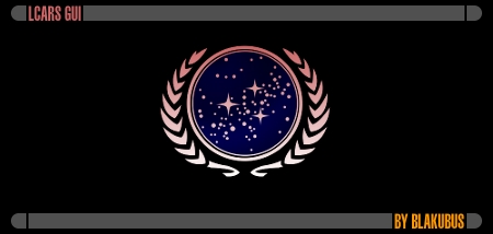
    This thread is about my three LCARS GUIs based on the LCARS system from Star Trek.

    At first there is the original LCARS GUI.
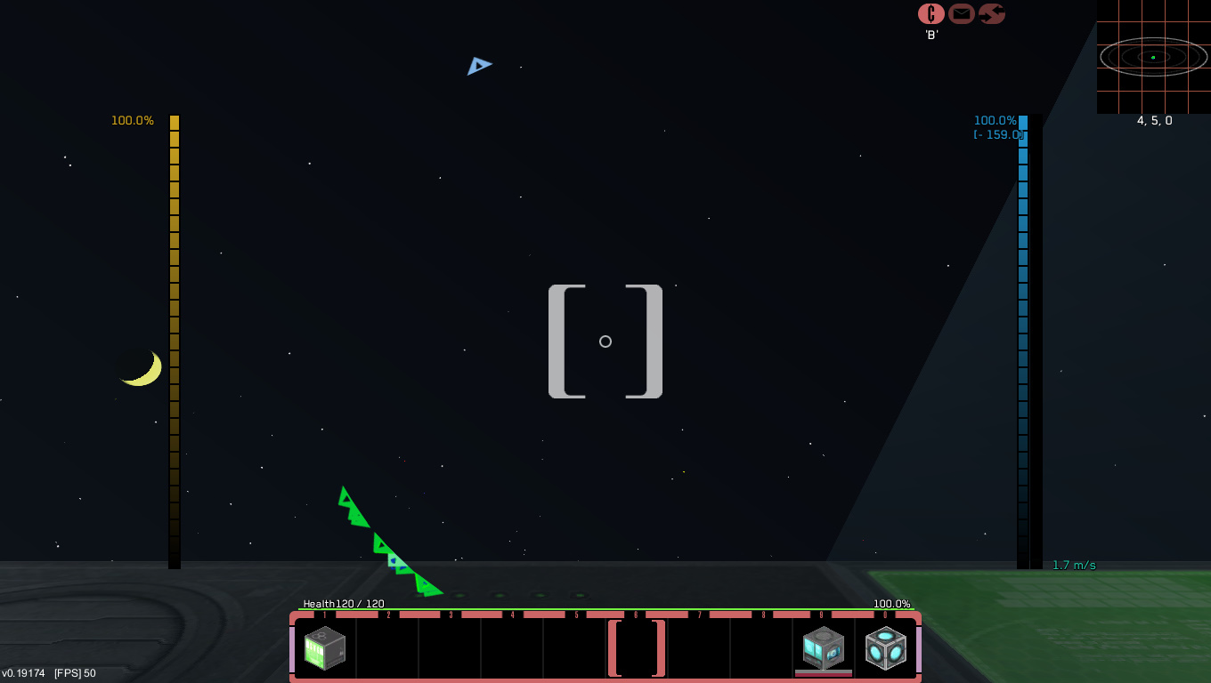
    Here are some pics:​


    For more information click here:


    latest version: 3.1

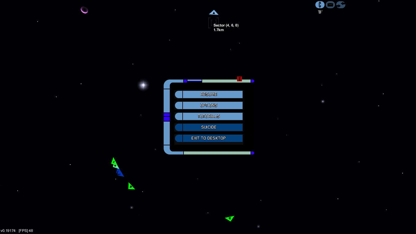
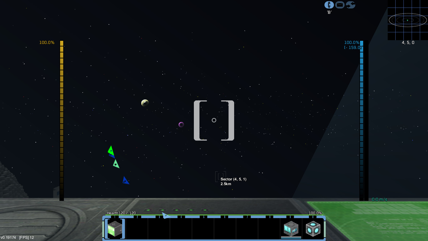
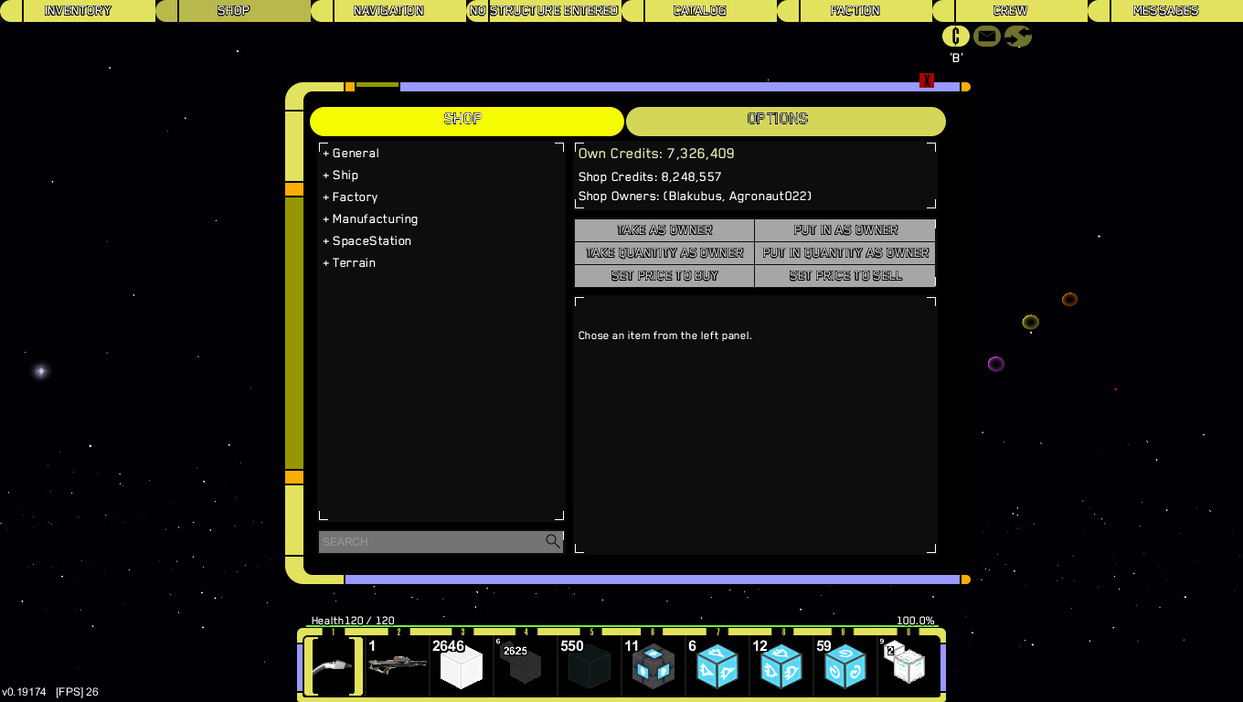
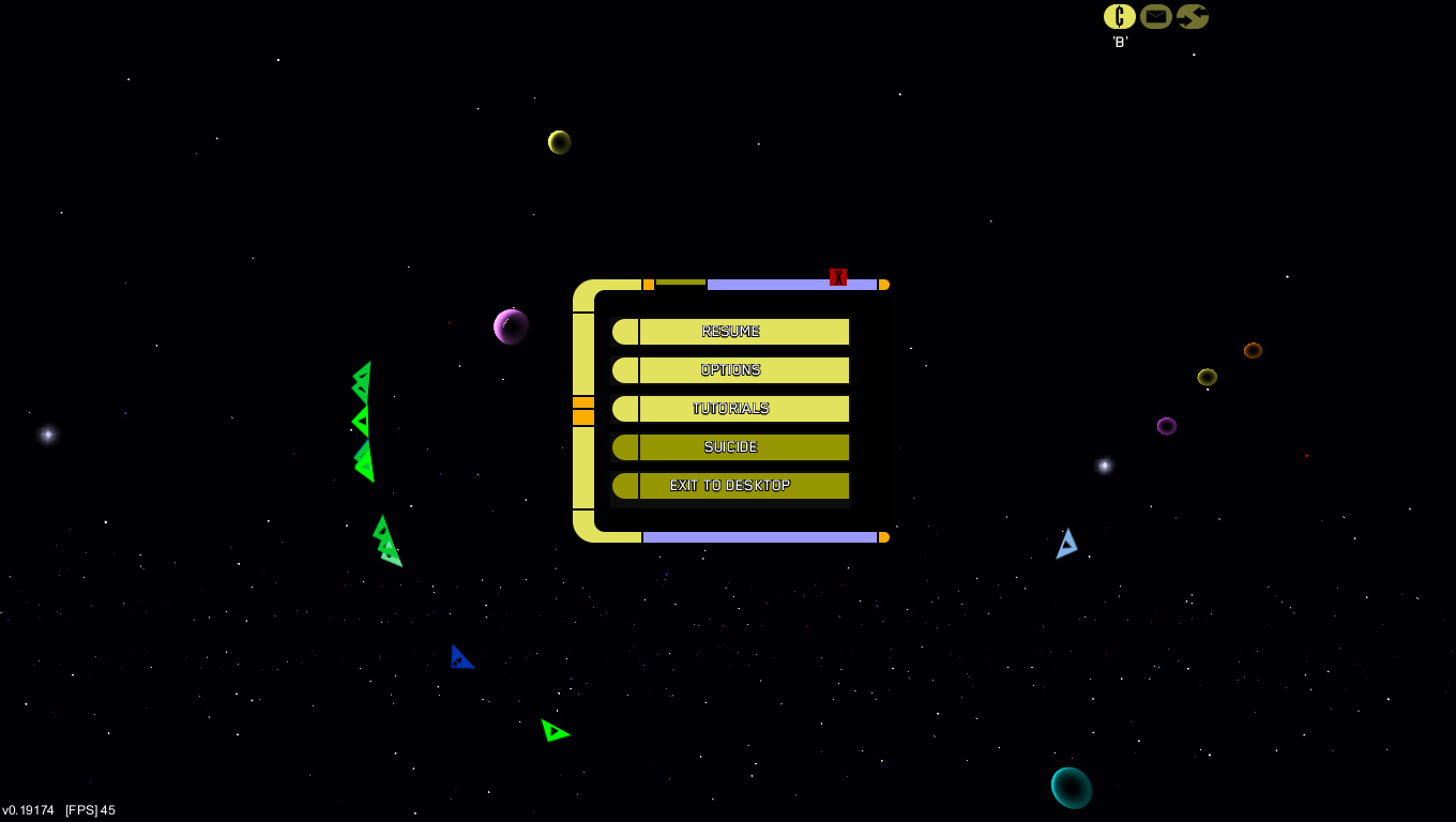
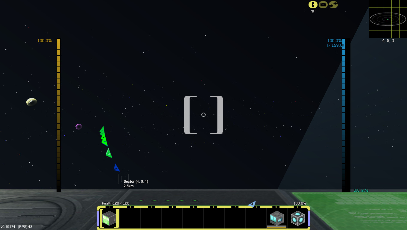
    The second GUI is the LCARS GUI - VOYAGER BLUE.
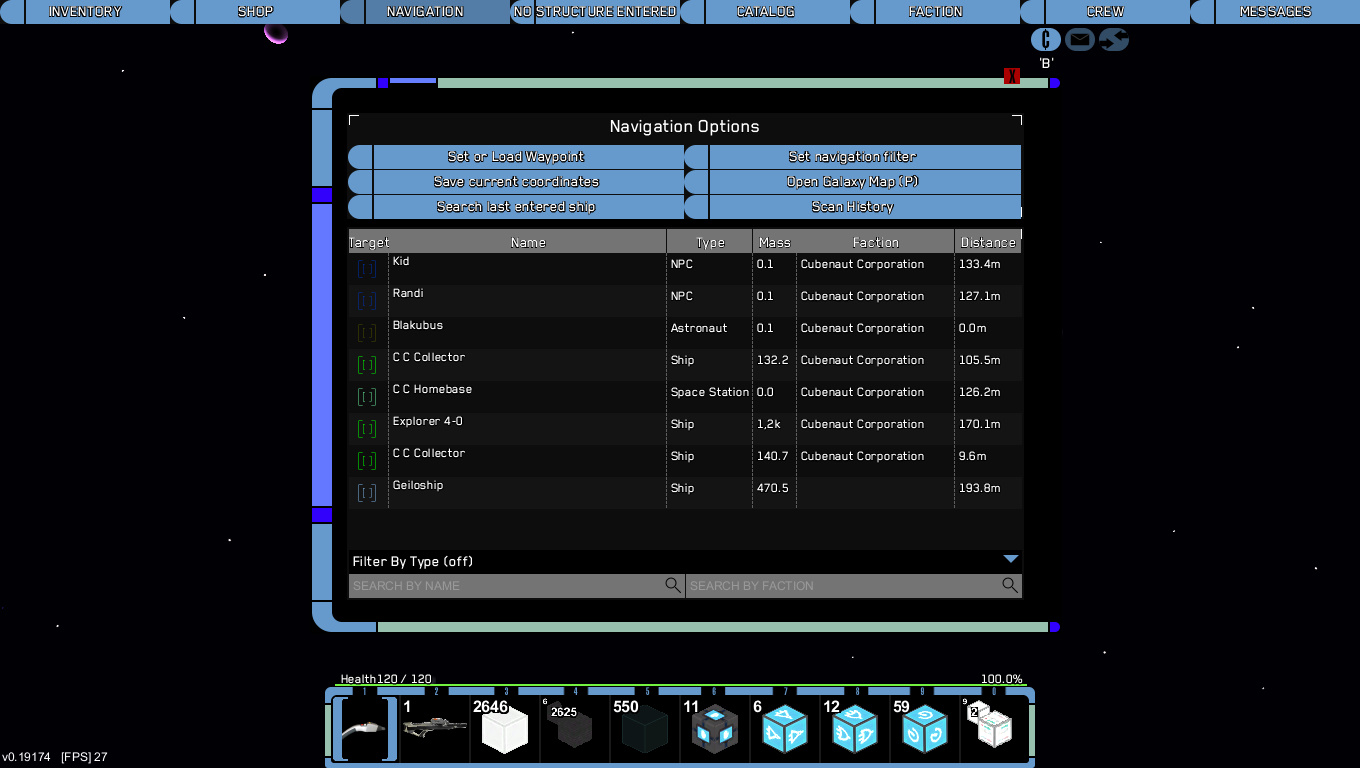
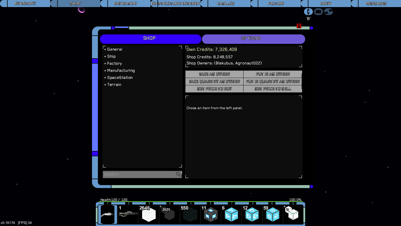
    Here some pics:
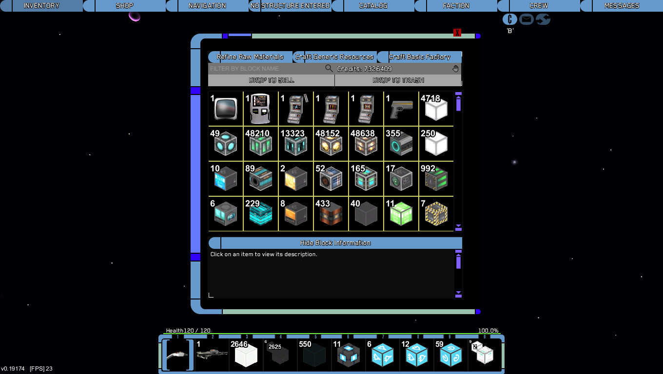


    For more information about the VOYAGER BLUE GUI klick here:​


    latest version: 3.1

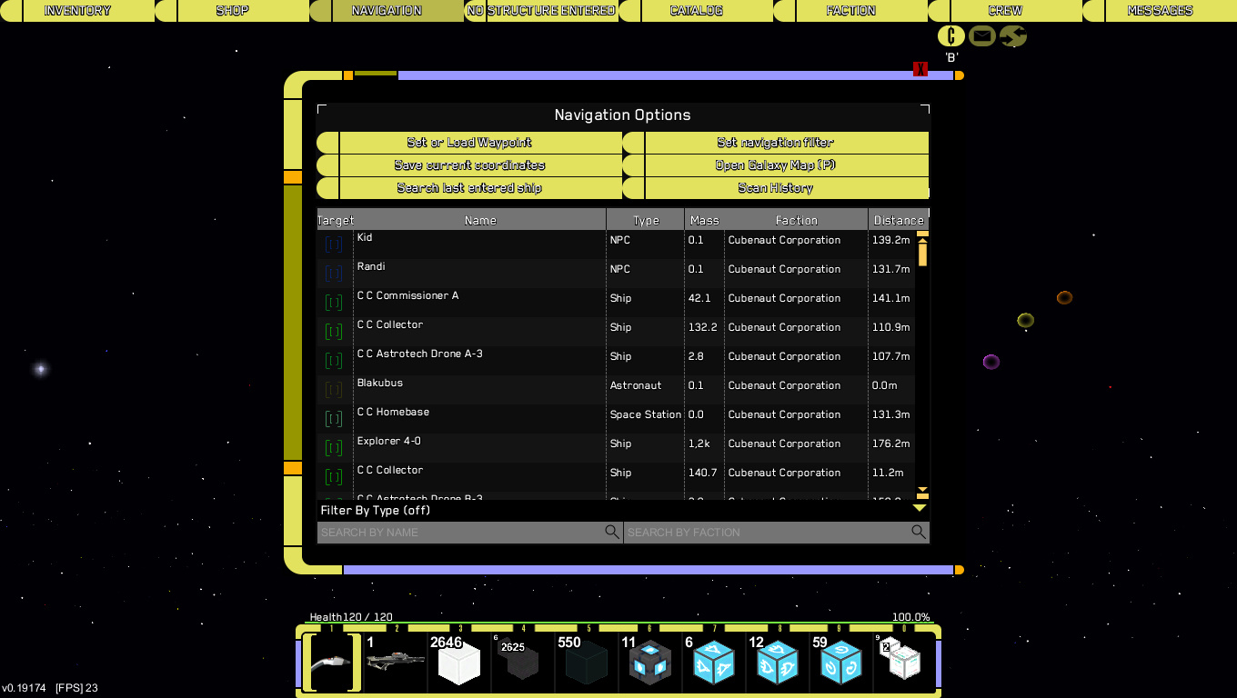
    The third GUI is the LCARS GUI - DEEP SPACE YELLOW.
    Here some pics:


    For more information about the DEEP SPACE YELLOW GUI klick here:


    latest version: 3.1​

    Hope you like my work. I want to make the GUIs better and better so leave suggestions for me in the comments, report bugs or any other issues and have fun playing StarMade!

    Live long and prosper!

     
    Last edited:
    Joined
    Jun 19, 2014
    Messages
    1,756
    Reaction score
    162
    • Purchased!
    • Top Forum Contributor
    • Legacy Citizen
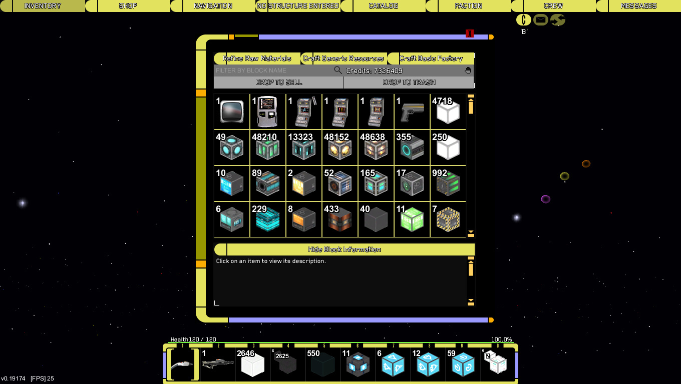
    The actual inventory needs some cleaning, but the flight HUD is perfect. The rounded edges for the hotbar might need a bit of tweeking to not make other icons overlap it, but for the rest it indeed is perfect.

    What I meant by cleaning:
    It looks a bit busy right now. Some things also aren't properly smoothed, like the actual inventory. It currently is a bit jagged by the edges.

    But this is a first version, and keeping that in mind it is really, reslly nice. Keep the general style, it is unique and very nice to look at.
     
    Joined
    Feb 26, 2014
    Messages
    270
    Reaction score
    54
    • Purchased!
    • Community Content - Bronze 1
    • Legacy Citizen 4
    Hey Trekkies

    In this thread I show you my two LCARS GUIs based on the LCARS system from Star Trek.
    At first there is the original LCARS GUI! Here are some images:


    For more informations click here:


    The second GUI is the LCARS GUI - VOYAGER BLUE!
    Here some pics:


    This is a new GUI and I am not sure you like it so tell me in the poll if you like it or not and tell me should I go on or are there now enough LCARS GUIs? :)
    For more information about the VOYAGER BLUE GUI klick here:


    Hope you like my work :D I want to make the GUI better and better so leave suggestions for me in the comments. Report bugs or any other issues. And have fun playing StarMade!

    Live long and prosper!
    Oh come on really 2 now i have to chose between my favorite colour and my preferred startrek these are awesome it would be cool to see some others maybe DS9 style tos there are many kinds that you could do have you ever thought about a texture pack since this GUI+up to date star trek texture pack= ultimate star made for me please keep these coming even though it means i have to choose -_- but as i said please make more they are awesome i doubt i will go to a different GUI ever since these came out well done. oh yeah and the laser it's very cool what you did by turning it into a phaser i wonder if you will change the other on they should not be too hard to find since the rocket launcher could be the portable photon torpedoes launcher seen in ST voyager elite force the sniper could be a phaser rifle and so on just i can not say anything but well done as a trekkie myself when i seen this my starmade just got even more fun.
    peace and long life!
     
    Joined
    Jun 19, 2014
    Messages
    1,756
    Reaction score
    162
    • Purchased!
    • Top Forum Contributor
    • Legacy Citizen
    Haha, didn't notice there were 2 colour versions. Anyway, feedback stays the same.
    I just stopped by to say that blue has got to be my favorite. It is a nice, fresh colour and it fits well with the game IMO.
     
    • Like
    Reactions: Blakubus

    Reilly Reese

    #1 Top Forum Poster & Raiben Jackpot Winner
    Joined
    Oct 13, 2013
    Messages
    5,140
    Reaction score
    1,365
    • Legacy Citizen 8
    • Thinking Positive
    • Purchased!
    I cant believe Starfleet has not updated their 1960 operating system yet. You would think it would cause issues >_>
     

    Kojinus

    Feline Overlord
    Joined
    Oct 14, 2014
    Messages
    62
    Reaction score
    22
    • Purchased!
    I like it! :D

    Only I have the same concern as FunnyBunny14, the overlapping on the inventory and shop screens (and all affiliated sections) have overlap on the buttons and text and it looks a little weird.
     
    Joined
    Feb 24, 2014
    Messages
    160
    Reaction score
    11
    Awesome GUI. Agreed with FunnyBunny and Kojinus. Definitely on the right track here!
     
    • Like
    Reactions: Blakubus
    Joined
    Jun 10, 2014
    Messages
    18
    Reaction score
    24
    Thanks for all the suggestions and the positive feedback! I try to take care of the small problems the GUI has, but these are my first steps doing something like graphic design, so I have not much experience in some things.
    I started doing a little antialising like you proposed. I also know that the inventory is a bit messy, but to change this I maybe have to change the whole inventory and that can be exhausting and time consuming and I don't really know how to approach it. But I will do the best I can to make the GUI as good as you want it. ;)
    I am also working on a third style of the LCARS GUI, but that will be the last one so you don't need to decide on too many of them. ;)

    If in these text are some grammar or vocabulary mistakes please notice that I am from Germany and I am still going to school, so some mistakes can occur. ;)

    An update for the 2 released styles of the LCARS GUI will come soon and I also will try to update them for the new StarMade GUI.

    Have fun playing Starmade. Live long and prosper! :)
     
    Joined
    Feb 26, 2014
    Messages
    270
    Reaction score
    54
    • Purchased!
    • Community Content - Bronze 1
    • Legacy Citizen 4
    Thanks for all the suggestions and the positive feedback! I try to take care of the small problems the GUI has, but these are my first steps doing something like graphic design, so I have not much experience in some things.
    I started doing a little antialising like you proposed. I also know that the inventory is a bit messy, but to change this I maybe have to change the whole inventory and that can be exhausting and time consuming and I don't really know how to approach it. But I will do the best I can to make the GUI as good as you want it. ;)
    I am also working on a third style of the LCARS GUI, but that will be the last one so you don't need to decide on too many of them. ;)

    If in these text are some grammar or vocabulary mistakes please notice that I am from Germany and I am still going to school, so some mistakes can occur. ;)

    An update for the 2 released styles of the LCARS GUI will come soon and I also will try to update them for the new StarMade GUI.

    Have fun playing Starmade. Live long and prosper! :)
    can you give us a hint for what the third one will be since i can not wait
     
    Joined
    Jun 10, 2014
    Messages
    18
    Reaction score
    24
    can you give us a hint for what the third one will be since i can not wait
    In the first LCARS GUI almost anything was in a red hue. In the second one anything was blue. So the third one will be mainly y..... ;)
    Hope this helped you Dragon :)
    Please notice that I redesigned the first post and also added some development pics of the third GUI (click the third spoiler). :D
     
    Joined
    Feb 26, 2014
    Messages
    270
    Reaction score
    54
    • Purchased!
    • Community Content - Bronze 1
    • Legacy Citizen 4
    really like your new GUI but what next you said you were not going to be making anymore lcars GUIs but are you stopping GUIs in general since i would have loved to see a borg or a klingon GUI since you do them REALLY well hope you do well in what ever next you do

    Qapla peace and long life
     
    Joined
    Jun 10, 2014
    Messages
    18
    Reaction score
    24
    really like your new GUI but what next you said you were not going to be making anymore lcars GUIs but are you stopping GUIs in general since i would have loved to see a borg or a klingon GUI since you do them REALLY well hope you do well in what ever next you do

    Qapla peace and long life
    I am really happy that you like all my GUIs. It's great to have you as a fan :)
    I will not stop making GUIs, but I think there are enough LCARS GUIs I uploaded :) Someone also suggested me to make a klingon GUI and I like the idea. Maybe I will make a romulan or borg GUI too. :) There already is a borg GUI made by BigEdge, but he unfortunaly had to cancel his project and I don't know wether he will start over the GUI.

    My next project will probably be a StarMade Flat GUI (work in progress). It will just be the normal StarMade GUI in an modern, flat design. Maybe you know flat designs from Windows 8 or Android (since version 4), so it will look a bit like they do. A thread for the Flat GUI will come soon, so if you are interested check it out :) There also will be some pics of the GUI. Hope to see you there. Live long and prosper :)
     
    Joined
    Apr 25, 2013
    Messages
    1,076
    Reaction score
    186
    • Purchased!
    • Legacy Citizen
    • Legacy Citizen 2
    I like the gui a lot but I think using the laurel branch for targeting aids on the flight screens is a really unappealing idea. Try just using some of those LCARS blank-curvy-bar thingies instead. Or, for other ideas, check out the GUI in Star Trek Voyager Elite Force.
     
    Joined
    Feb 26, 2014
    Messages
    270
    Reaction score
    54
    • Purchased!
    • Community Content - Bronze 1
    • Legacy Citizen 4
    just wondering if anyone elses GUIs no longer works with the latest version because if not i hope i gets fixed
     
    Joined
    Jun 10, 2014
    Messages
    18
    Reaction score
    24
    Version 2.0 is out now!
    All three LCARS GUIs has been updated. They are now compatible with the new StarMade GUI. Pictures of the updated version will come soon. I hope you like it.

    The next GUI I will work on will be a Klingon GUI. After that I want you, yes YOU, to decide which GUI I should do next. A Romulan GUI? A Borg GUI? Something else GUI? Stop making GUIs? Oh I will never stop! Even if everyone hates my work!
    So don't forget you, yes YOU, decide which GUI comes after the Klingon one, but I will make a official poll in the Klingon GUI thread I think... we will see.

    That's all I wanted to say. I always write long posts, man. That's not good!

    Anyway hope you like the update and you are excited to see new GUIs. Live long and prosper!
     
    Joined
    Feb 26, 2014
    Messages
    270
    Reaction score
    54
    • Purchased!
    • Community Content - Bronze 1
    • Legacy Citizen 4
    Version 2.0 is out now!
    All three LCARS GUIs has been updated. They are now compatible with the new StarMade GUI. Pictures of the updated version will come soon. I hope you like it.

    The next GUI I will work on will be a Klingon GUI. After that I want you, yes YOU, to decide which GUI I should do next. A Romulan GUI? A Borg GUI? Something else GUI? Stop making GUIs? Oh I will never stop! Even if everyone hates my work!
    So don't forget you, yes YOU, decide which GUI comes after the Klingon one, but I will make a official poll in the Klingon GUI thread I think... we will see.

    That's all I wanted to say. I always write long posts, man. That's not good!

    Anyway hope you like the update and you are excited to see new GUIs. Live long and prosper!
    like all your ideas maybe you could do some star wars ones but more preferably maybe some obscure star trek ones the borg romulan and klingons ideas must happen i would love to see those but how about a jem'hadar or cardassian GUi those or maybe even species 8472 they might look cool.

    though i have been experiencing problems with your latest GUIs well voyager blue version 2.1 i am not sure if this is just me but it keeps crashing whenever i try to load up with it on any ideas on how to fix it or could it possibly be with the GUI itself i hope not they really are great keep it up

    Qapla
     
    Joined
    Jun 10, 2014
    Messages
    18
    Reaction score
    24
    like all your ideas maybe you could do some star wars ones but more preferably maybe some obscure star trek ones the borg romulan and klingons ideas must happen i would love to see those but how about a jem'hadar or cardassian GUi those or maybe even species 8472 they might look cool.

    though i have been experiencing problems with your latest GUIs well voyager blue version 2.1 i am not sure if this is just me but it keeps crashing whenever i try to load up with it on any ideas on how to fix it or could it possibly be with the GUI itself i hope not they really are great keep it up

    Qapla
    Yes I know this bug. It comes from the menu panel GUI but with the 2.02 update it should be working now. I am sorry I forgot to test the 2.01 version and forgot that the bug could came again...

    Well anyway I am working on the Klingon GUI now, but I like your ideas of the other GUIs too. I will finish the Klingon one and than let the community decide which next. I like your ideas very much so we will see which one I want to make.
     
    • Like
    Reactions: Dragon2000
    Joined
    Feb 26, 2014
    Messages
    270
    Reaction score
    54
    • Purchased!
    • Community Content - Bronze 1
    • Legacy Citizen 4
    i know its a bit late but is there a bug with 2.03 starfleet GUI voyager blue since it has crashed on me about 5 times now when i have loaded up starmade if you can tell me if it is just me or something else and can not wait for the klingon GUI