Kupu's thread

    Joined
    Aug 14, 2013
    Messages
    2,811
    Reaction score
    960
    • Councillor 3 Gold
    • Wired for Logic
    • Top Forum Contributor
    Don't the current ones have emissives? I was sure this was a thing already... (should of been).

    Consider it planned.
    Just tested, they do have emmisives
    Hmmmm, I guess they do have emission but are just REALLY dark in some occasions even when there is still a full open block.

    Edit: Wedges are no better.
     
    Last edited:
    • Like
    Reactions: nightrune

    kupu

    Colouring in guy.
    Joined
    Jul 4, 2013
    Messages
    1,405
    Reaction score
    1,560
    • Schine
    • Likeable Gold
    • Arrrty Gold
    Hello friends,

    It feels like an eternity since i last shared any insight into what i'm currently working on...

    Here's a quick and dirty work in progress shot of blocks in-game. Most blocks here don't have any material maps and are to be considered "unfinished".

    For those curious on how much the new set will differ, i hope this gives a little more insight. As i've said previously most of the general designs won't radically change (unless they are terrible *cough* undeathinator). Efforts are being made to preserve the rational of every block you've previously placed. Ships will not need to be refitted due to texture changes.

    New textures are a little bolder, generally a little larger in scale and (really noticeable in-game) better quality. Quite a few have broken out of their solid borders, or at least swapped them up for something a little less clunky where required (lights :3 ).


    A single image is not quite enough to showcase it all effectively... but i think it's important you know progress is happening. So there you go!

    As always, thanks for your patience!
     

    Ithirahad

    Arana'Aethi
    Joined
    Nov 14, 2013
    Messages
    4,150
    Reaction score
    1,330
    • Purchased!
    • Top Forum Contributor
    • Legacy Citizen 8
    Vertically connecting server boxes! That alone is a huge improvement. The changes to pipe tiling are nice too...

    I'm not sure if I like the heavy inside shadows, though. They just feel... weird.
     

    kiddan

    Cobalt-Blooded Bullet Mirror
    Joined
    May 12, 2014
    Messages
    1,131
    Reaction score
    358
    • Top Forum Contributor
    • Legacy Citizen 4
    • Purchased!
    Hello friends,

    It feels like an eternity since i last shared any insight into what i'm currently working on...

    Here's a quick and dirty work in progress shot of blocks in-game. Most blocks here don't have any material maps and are to be considered "unfinished".

    For those curious on how much the new set will differ, i hope this gives a little more insight. As i've said previously most of the general designs won't radically change (unless they are terrible *cough* undeathinator). Efforts are being made to preserve the rational of every block you've previously placed. Ships will not need to be refitted due to texture changes.

    New textures are a little bolder, generally a little larger in scale and (really noticeable in-game) better quality. Quite a few have broken out of their solid borders, or at least swapped them up for something a little less clunky where required (lights :3 ).


    A single image is not quite enough to showcase it all effectively... but i think it's important you know progress is happening. So there you go!

    As always, thanks for your patience!
    My personal thoughts on some of the textures:


    General theme: I really like the whole smooth metal panel look on everything, especially the decorative computers.

    Plex Door: Still seems quite plain, which is somewhat good, but a few tiny hinges or something would be interesting...

    Ingot: I love the normal-mapping you did on them! They capture the giant ingot look very well.

    Logic: Looks perfect with the drawn-on bloom.

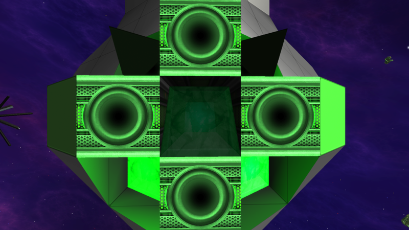
    Warp stuff: The side texture looks awesome, but the top seems a bit overly simplified. Something like the corners of the shield capacitor could turn out nice.

    Pipes: Very nice and shiny, still has it's all-purpose look and I like the faint patterns on them.

    Advanced armour: I like how the edges are more subtle but still noticeably different from the existing standard and basic armour!


    Great work kupu ! I'm really looking forward to the texture-overhaul update, and to see what you come up with for the undeathinator! :)
     

    kupu

    Colouring in guy.
    Joined
    Jul 4, 2013
    Messages
    1,405
    Reaction score
    1,560
    • Schine
    • Likeable Gold
    • Arrrty Gold
    I'm not sure if I like the heavy inside shadows, though. They just feel... weird.
    This is from the normal map, not something that would show up unless in strong sun light i don't think. It's also one of the few blocks shown that is using a normal map so its strong shadows really do stand out. As things continue those are small tweaks we will make to ensure they all have the same sort of contrast.

    My personal thoughts on some of the textures:

    ~snip~

    Warp stuff: The side texture looks awesome, but the top seems a bit overly simplified. Something like the corners of the shield capacitor could turn out nice.
    Thanks for the feedback. This is something i'm still undecided on... the outer frame of the block might change. It's something i'll look into more when testing more textures on existing ships. :)
     
    • Like
    Reactions: kiddan
    Joined
    Dec 22, 2015
    Messages
    15
    Reaction score
    2
    Hello friends,

    It feels like an eternity since i last shared any insight into what i'm currently working on...

    Here's a quick and dirty work in progress shot of blocks in-game. Most blocks here don't have any material maps and are to be considered "unfinished".

    For those curious on how much the new set will differ, i hope this gives a little more insight. As i've said previously most of the general designs won't radically change (unless they are terrible *cough* undeathinator). Efforts are being made to preserve the rational of every block you've previously placed. Ships will not need to be refitted due to texture changes.

    New textures are a little bolder, generally a little larger in scale and (really noticeable in-game) better quality. Quite a few have broken out of their solid borders, or at least swapped them up for something a little less clunky where required (lights :3 ).


    A single image is not quite enough to showcase it all effectively... but i think it's important you know progress is happening. So there you go!

    As always, thanks for your patience!

    I like the direction of development very much, especially that there is more structure in the textures and the colours feel less flashy. One of the arguments against Starmade always was that if you don't really know what your doing the resulting ships will look "better" and more professional in a game like SE - even though in the long run your ships look a bit generic and your creativity is more limited there. I'm happy that this is steadily becoming less of a point. :)

    I don't like the new ingots. I think where the old ones were too rough, these are too smooth. In my opinion they look a bit like a piece of plastic.
     

    Daeridanii

    Detail Devil
    Joined
    Jan 16, 2016
    Messages
    115
    Reaction score
    138
    • Community Content - Bronze 2
    • Legacy Citizen
    I tried to come up with something I didn't like about the textures so I could offer improvements. I couldn't.

    Great job, Kupu! I must say I especially like the border for the shields - it makes them look more like an integral part of you ship, rather than just a blob of rotating fans. (Not implying the old textures looked blobby, these are just a lot better.) ;)
     
    Joined
    Sep 12, 2014
    Messages
    90
    Reaction score
    44
    • Purchased!
    • Community Content - Bronze 1
    • Legacy Citizen 4
    Kupu, can you tell me anything about these weird artifacts that appear on blocks after I've been playing for a while? It's difficult to see in this gif, but it's much more noticeable ingame.
     

    nightrune

    Wizard/Developer/Project Manager
    Joined
    May 11, 2015
    Messages
    1,324
    Reaction score
    577
    • Schine
    • Top Forum Contributor
    • Thinking Positive
    Kupu, can you tell me anything about these weird artifacts that appear on blocks after I've been playing for a while? It's difficult to see in this gif, but it's much more noticeable ingame.
    That looks like graphics card or power supply issues.
     

    kupu

    Colouring in guy.
    Joined
    Jul 4, 2013
    Messages
    1,405
    Reaction score
    1,560
    • Schine
    • Likeable Gold
    • Arrrty Gold
    Kupu, can you tell me anything about these weird artifacts that appear on blocks after I've been playing for a while? It's difficult to see in this gif, but it's much more noticeable ingame.
    Are they the same shapes as the crystal ore textures? A little hard to tell exactly from the gif.
     

    AtraUnam

    Maiden of crashes
    Joined
    Oct 15, 2013
    Messages
    1,121
    Reaction score
    869
    • Railman Gold
    • Competition Winner - Small Fleets
    • Wired for Logic Gold
    How crazy could you go with the normal maps on the pipe texture? Is it possible for us to get near round looking pipes?
     
    Joined
    Jun 26, 2013
    Messages
    161
    Reaction score
    192
    • Purchased!
    hi kupu great work with the new textures, my only critic concern the jumpdrive module, the top texture seems to simple in my opinion

    i noticed that in v0.199.132a jumpdrive modules are orientable but scanner antenna aren't. shouldn't it be possible to have the scanner antenna orientable ?
     

    Exozen

    C-D SOLDIER
    Joined
    Jul 7, 2013
    Messages
    151
    Reaction score
    230
    • Purchased!
    • Competition Winner - Small Fleets
    • Legacy Citizen 4
    <3 the new textures, Kupu. I'm absolutely in love with the gravity module! It's clean, smooth, and perfectly detailed.

    Not so much a fan of the decorative server and switchboard though; they seem a little too busy. Perhaps you could remove those vertical lines with the bump things near the edge of the texture? or maybe reduce the bumps to just top/bottom & mid.

    And the metal plating on the shield capacitor's edges feels off. The way it pops out so much with the 2-dimensional 3D angles make the block appear bent when you stare at it. I think it could be fixed if the side edge wasn't hidden behind the top towards the center. (I might just be looking at the whole block wrong.)

    Sorry for the criticism, other than that, everything's simply amazing :D


    Also... is there any chance all the weapon/tool modules will fit together smoothly in some shape or form if placed in a line? Maybe give them all matching edges, with the center focused on being different?

    sorry for asking for such a big request.
    -Exozen