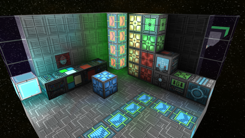
Hulls in realistic texturepack
- Thread starter Byamarro
- Start date
if you meant the one line up the middle then no you aren't the only one that thinks its stupid looking.
therimmer96
The Cake Network Staff Senior button unpusher
If you have a problem with the textures, fix it, and show screen shots of something you think would look better. the new textures are a drastic improvement over the old ones.
- Joined
- Oct 12, 2013
- Messages
- 198
- Reaction score
- 32
Its a lot better than the old texture, those hulls looked like a bunch of iron bars screwed together by 3-year-olds.
EDIT: OK, I'll bite*. its my new signature.
*user does not claim to have any idea what saying "I'll bite" means.
EDIT: OK, I'll bite*. its my new signature.
*user does not claim to have any idea what saying "I'll bite" means.
Last edited:
therimmer96
The Cake Network Staff Senior button unpusher
That post is even better with your sig :DIts a lot better than the old texture, those hulls looked like a bunch of iron bars screwed together by 3-year-olds.
I personally don't like how it's tiled for a single direction, this creates inconsistency. You could have long or short lines depending on the structure. The base texture itself is great though if it was broken up better.
Lecic
Convicted Lancake Abuser
I actually kind of liked the old hulls. The normal looked like a bunch of scrap thrown together for makeshift armor, while hardened looked better constructed.Its a lot better than the old texture, those hulls looked like a bunch of iron bars screwed together by 3-year-olds.
The textures themselves were bad, yeah, but I liked the "vibe" of sorts they had.
I felt the same way about the old textures so I did something about it.I actually kind of liked the old hulls. The normal looked like a bunch of scrap thrown together for makeshift armor, while hardened looked better constructed.
The textures themselves were bad, yeah, but I liked the "vibe" of sorts they had.
*Insert Shameless Self Plug* http://starmadedock.net/threads/true-64x64-default-pack.345/

New textures are better than old because new ones are in high res + normalmap. I'm speaking that new textures of hulls looks bad by design.If you have a problem with the textures, fix it, and show screen shots of something you think would look better. the new textures are a drastic improvement over the old ones.
II may suggest I would change them to tiles.
Like there: http://i341.photobucket.com/albums/o396/Tankman40k/starmade-screenshot-0001_zps7fd7c2bb.png~original
It will be easy to make and will just looks better. While it will be still easy to build with it.
Anyway hardened hulls looks good. And they looks like they are really hardened.
PS: I liked old textures too. Maybe Schema could add new hull type? Let's name it... Scrapp Hulls? And give them old texture of hulls but in high quality+normals.
Keptick
Building masochist
I personally think that it looks great and even better than hardened hull when used on big scale structures. Hardened hull looks more... hardened. Normal looks like some generic building material, as it should be. As therimmer mentioned, it looks much, much, MUCH better than the old regular hull.
HOWEVER, if I was Kupu I'd chop that middle line in two and stick the two halves on both sides of the block. It would make more sense and delimit blocks better.
HOWEVER, if I was Kupu I'd chop that middle line in two and stick the two halves on both sides of the block. It would make more sense and delimit blocks better.
