Theck's texture pack

    Joined
    Aug 11, 2013
    Messages
    86
    Reaction score
    9
    Hi there, first topic (and message) on the forums :P

    I was reading about modding StarMade and I've seen how to make custom texture for the blocks, something easy and simple enough to start. As I've said, the objetive of this project is to learn how textures work and do some photoshoping just for fun.

    My idea it's to make a more "realistic" but simplier textures for the blocks. There's a first version of the hull parts:


    I'll update this topic as soon as I have new blocks and I'll show some ships with the default and this pack.
     
    Joined
    Aug 11, 2013
    Messages
    86
    Reaction score
    9
    The same ship with the default and texture pack to compare:


    And a closeup:
     
    Joined
    Aug 6, 2013
    Messages
    405
    Reaction score
    47
    A little too flat, in my opinion. Not enough contrast so the color differences of the textures kinda blend together at a distance.

    Good luck.
     
    Joined
    Jul 4, 2013
    Messages
    30
    Reaction score
    0
    • Legacy Citizen 2
    • Legacy Citizen
    A good attempt, for certain, but.. The textures are sorta flat. They don\'t stand out much, and it leaves the ships hull looking sorta empty, and almost childish.
     
    Joined
    Aug 11, 2013
    Messages
    86
    Reaction score
    9
    Thank you for your words, It\'s nice to see someone takes a look to your work ;)

    I know about the flatiness (does it can be said this in english?) and it\'s something that\'s not wrong for me, in \"real life\" when you see something like a boat from certain distance you see the hull as a unique surface, even when it\'s composed from various pieces of hull. When you are close, then you can see the pieces.

    When I\'ve started I\'ve done a tileable metal texture to make the ships\' hull seem one piece. Then I\'ve I\'ve changed my mind and I wanted to mimic more the default pack when the hull are like different pieces with bolts. But I though in the future you\'ll not see the bolts and then I\'ve tried to make them look like plates with an space of \"sealing\" between.


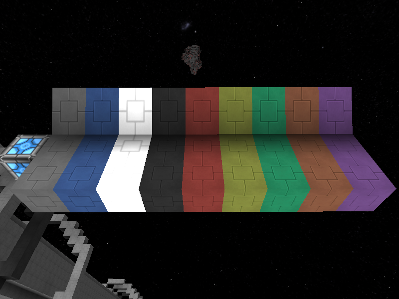
    Meanwhile, I\'ve started with the hardened hull. I think I\'ve tried a docen shapes, with gradients and other light tricks to make them look thick, and I\'ve been deleting all of them. Next you can see my best approach. As with the hull, the idea it\'s to mimic de default pack. I\'ve modified only the grey hull, you can compare with the default one in the blue color.


    EDIT: All the hardened hull colors:
     
    Joined
    Aug 6, 2013
    Messages
    405
    Reaction score
    47
    I think what you did for the hardened hull would be better suited for the normal hull.

    The hardened hull is presented as one unifying playe, while the normal hull is a bunch of small plates welded and bolted together, so the smaller square patter, in my opinion, would suit the normal hull better.

    Also, if you added the same contrast of the hardened hull to the other texture, it would stand out a lot more and look, again, my opinion, a lot better.


    Still looks great overall though,
     
    Joined
    Aug 11, 2013
    Messages
    86
    Reaction score
    9
    Many thanks Lazarus. If you take a look to the hardened hull you\'ll wee that it\'s like 4 plates unified in one shape, but still divided in 4 sectors. My idea was to present the hardened hull like a lot of thick plates. Another idea I had it\'s to make an unique big plate, maybe I\'ll try in a future.

    But today I\'ve started with the Anti Matter Cannon. The frontal part it\'s only a proof of concept, but for the other sides I think I have something I like, and then, I\'m showing you ;)


    ¿What do you think? Remember, don\'t look to the front panel, It\'ll change a lot.
     
    Joined
    Aug 6, 2013
    Messages
    405
    Reaction score
    47
    Yeah, I have many versions of each texture ive created for my texturepack. Just for the hull blocks alone, I have 6 versions each. So making different varients and perhaps releasing them with your pack so people can pick and chose would be a nice addition. But at the end of the day, it is your pack, so whatever you like best, stick with it.

    As for your AMC texture. It looks very good. FAR better then what I can do, that is for sure. I am doing pure pixel-by-pixel texturing.

    Keep up the good work.
     
    Joined
    Jun 24, 2013
    Messages
    4
    Reaction score
    0
    this definetly has a nice almost elegant smooth style and i love it
     
    Joined
    Aug 11, 2013
    Messages
    86
    Reaction score
    9
    Thanks for the comments guys.


    @lazarus78 all you can see it\'s a mix of pixel art with some effects. For example in the AMC only the blu ray effect and the shadow on the edges are photoshop effects, the rest are pixel by pixel images.
     
    Joined
    Aug 11, 2013
    Messages
    86
    Reaction score
    9
    Thank you @An3dy

    Some time since last update, I\'ve not been able to find time to continue and I\'m not sure how the front and back panels will be, but I\'m triying some ideas:


    Front


    Back


    I don\'t really like them, but I\'ts said that the inspiration has to find you at work ;)