Yes, it does look better now, the 5 filter buttons at the top are a nice thing to have.
That 3D rotatable view would be a great tool to figure out which one is what, I'm not sure how long it would take to program but I think it would be a necessity to have anyway ^^
If you're planning to clean it up some more, please do so and I'll talk to the council/schine about it.
This is pretty impressive, really nice idea, well presented too. I would not change a thing in the base of your system however i have some ideas which would make it even more functional.
First of all making this system work like a menu screen where you can edit all that in a battle scenario would complicate things and wouldn't be responsive enough, probably the reason for the comments on potential issues when lag is present. That's why i think this system would work better if it would be part of the entered structures HUD.
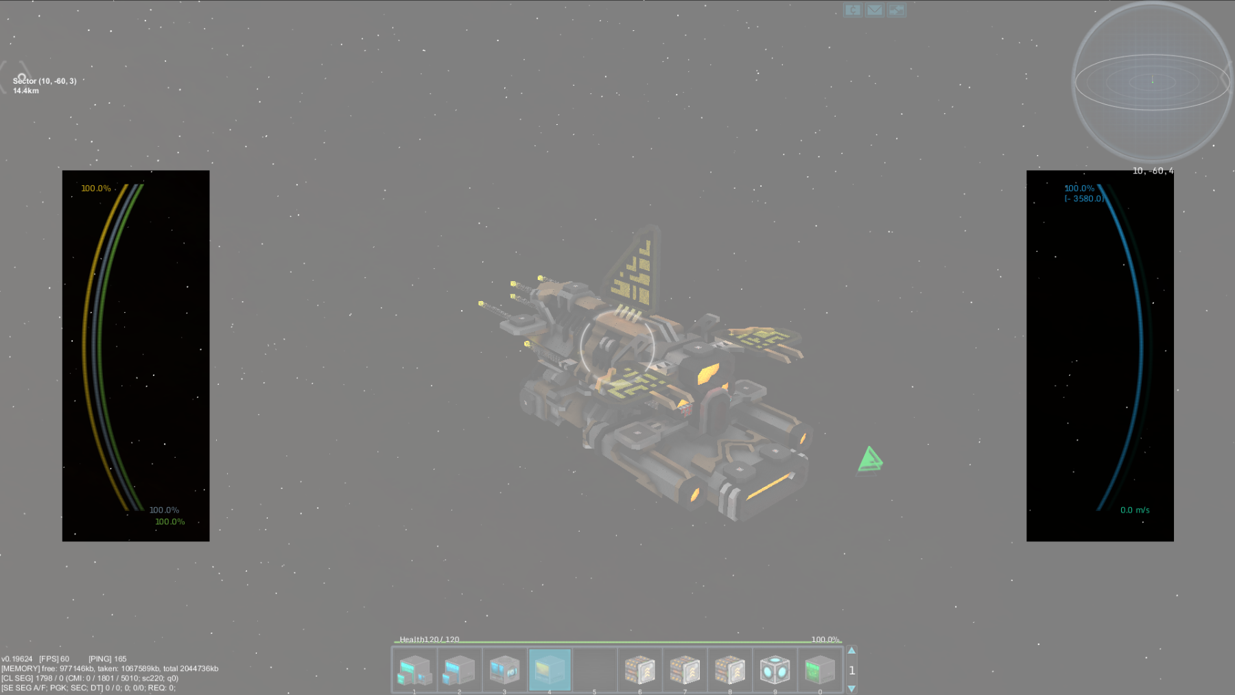
Currently i think the HUD is inconvenient in many ways. For example when near a well populated Station where many different ships are present which all have their own figters and drones and everything the screen you get is a mess. Something like this:
If i were to convert this into a battlefield where all this would be present it would be a chaos. Changes already need to be made on this field and i think this system could help out with it a lot.
Another thing which would need some changes before all this can happen is the ship status screen. Right now i think it's pretty inconvenient. The human eye does not like to follow important information on screens which is spread in such wide areas especially when there is many other things to focus on in battle scenarios like to follow movement of other vessels which is again something the player does not get enough feedback to do effectively and i will talk about this too later on. The HP, Armor, Shields and the Energy, Velocity status bars
shoudn't be placed like this. It would be much better if all this information would be packed neatly at one place on the screen and it should not take up so much area of it. This is something many popluar competitive games utilize for a good reason. If many information needs to be displayed on screen of a certain thing it's a bad idea to have it all scattered becasue this makes it harder to follow when you have to focus on more than for example just the amount of shield you have left and the amount of energy you can use but also the position of other vessels relative to yours. In this example because of the current positions of these informations you have to constantly switch between 3 different focus points. If the status bars would be at one place it would be reduced by one. Also this would make room for many other important informations like the ones the O.V.E.R.V.I.E.W. system could provide presented by the OP.
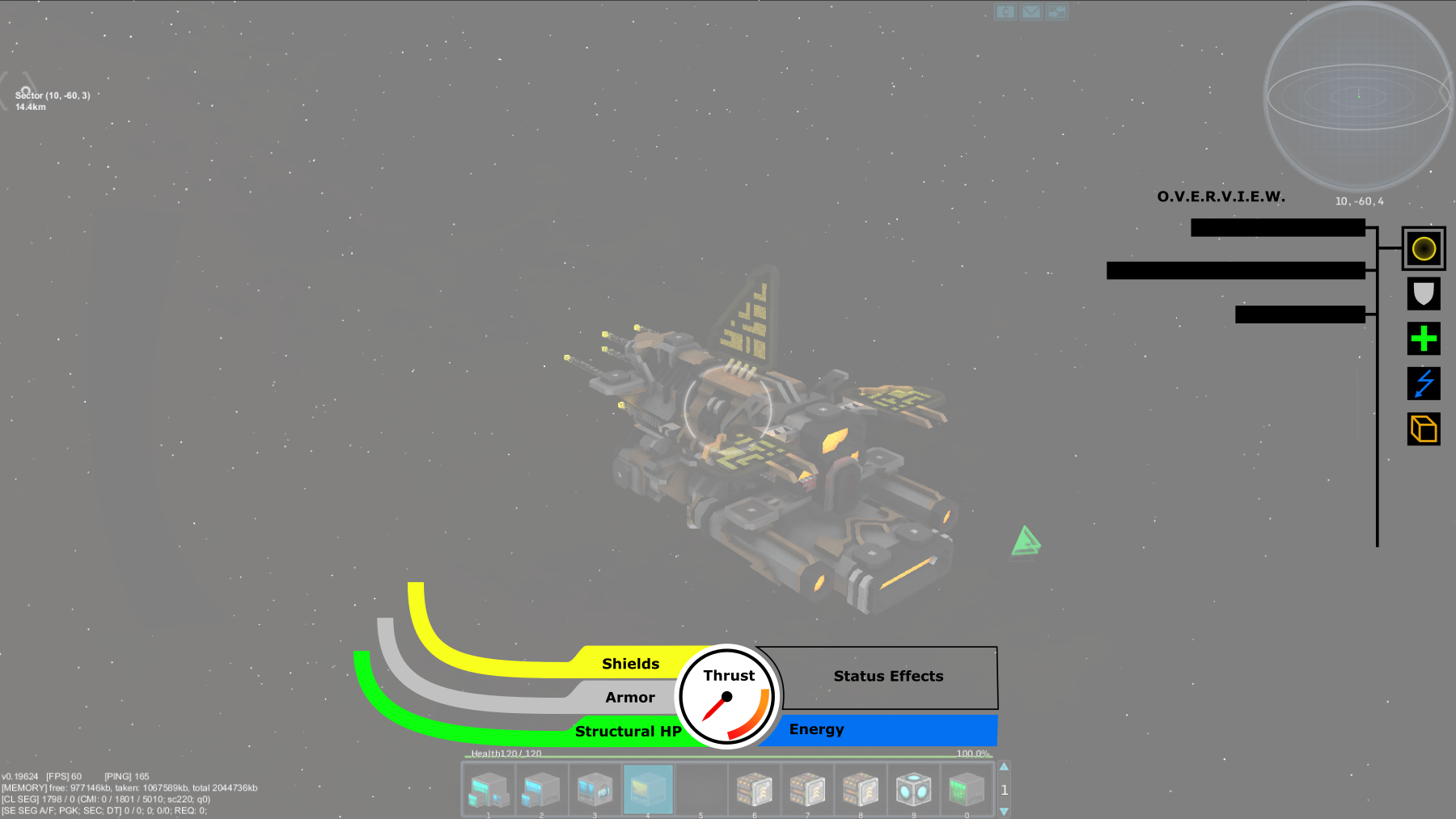
If this system could be part of the HUD it would be way more convenient to follow and operate. In battle scenarios undocking of different drone fighters and such and their management could be done without the loss of focus on the battle and other things. I imagined the positions of the HUD elemnts and the method they would operate like this:
Of course this isn't anything accurate or finalized just a basic concept.
There have been many comments on the 3D preview as well that it could cause laggs and stuff like that. If the system could work like this and a proper 3rd person camera would be implemented which could provide direction adjustements in it's view the system could work by simply highlighting the docked entities on the ship so they could be operated by a drag and drop like manner. You click on a highlighted entity on the ship and just drag it to a group on the O.V.E.R.V.I.E.W. panel. It would be simple, fast, responsive and would work without much lagg. It looks so essential i can hardly believe it missing from the game for so long.
Before all this can happen however like i said the HUD needs a redesign.
Ship status information needs to be neatly packed in one place on the screen
A proper 3rd person camera view needs to be implemented which enables full controll of the ship in it's view.
They way entities are shown on the HUD needs some redesign too.
The 3rd person camera view would be a help not just for this system to work but it's also something which would be essential in battle scenarios. In battles knowing your allies and your enemies position relative to each other is a pretty important thing, proper maintain of formations, being aware of which part of the ship is getting damaged and so on, could be way more transparent if there would be a proper 3rd person view which could be controlled properly.
Another thing which would be a really nice thing to see on the HUD are velocity indicators. Manouvering through the universe is pretty confusing right now in my opinion. You can get used to it but it lacks feedback to the player on what exactly ships are doing in terms of movement. Simple velocity indicators of other entities and your own ship relative to each other and to the galactic north for example would be really nice. There are many examples for this in other space games with 3 directional movement.
All in all i really like the idea of the O.V.E.R.V.I.E.W. system and it would be really neat to see it work in such a user-friendly way and the HUD could benefit from some changes too.
This is pretty impressive, really nice idea, well presented too. I would not change a thing in the base of your system however i have some ideas which would make it even more functional.
First of all making this system work like a menu screen where you can edit all that in a battle scenario would complicate things and wouldn't be responsive enough, probably the reason for the comments on potential issues when lag is present. That's why i think this system would work better if it would be part of the entered structures HUD.
Currently i think the HUD is inconvenient in many ways. For example when near a well populated Station where many different ships are present which all have their own figters and drones and everything the screen you get is a mess. Something like this:
If i were to convert this into a battlefield where all this would be present it would be a chaos. Changes already need to be made on this field and i think this system could help out with it a lot.
Another thing which would need some changes before all this can happen is the ship status screen. Right now i think it's pretty inconvenient. The human eye does not like to follow important information on screens which is spread in such wide areas especially when there is many other things to focus on in battle scenarios like to follow movement of other vessels which is again something the player does not get enough feedback to do effectively and i will talk about this too later on. The HP, Armor, Shields and the Energy, Velocity status bars
shoudn't be placed like this. It would be much better if all this information would be packed neatly at one place on the screen and it should not take up so much area of it. This is something many popluar competitive games utilize for a good reason. If many information needs to be displayed on screen of a certain thing it's a bad idea to have it all scattered becasue this makes it harder to follow when you have to focus on more than for example just the amount of shield you have left and the amount of energy you can use but also the position of other vessels relative to yours. In this example because of the current positions of these informations you have to constantly switch between 3 different focus points. If the status bars would be at one place it would be reduced by one. Also this would make room for many other important informations like the ones the O.V.E.R.V.I.E.W. system could provide presented by the OP.
If this system could be part of the HUD it would be way more convenient to follow and operate. In battle scenarios undocking of different drone fighters and such and their management could be done without the loss of focus on the battle and other things. I imagined the positions of the HUD elemnts and the method they would operate like this:
Of course this isn't anything accurate or finalized just a basic concept.
There have been many comments on the 3D preview as well that it could cause laggs and stuff like that. If the system could work like this and a proper 3rd person camera would be implemented which could provide direction adjustements in it's view the system could work by simply highlighting the docked entities on the ship so they could be operated by a drag and drop like manner. You click on a highlighted entity on the ship and just drag it to a group on the O.V.E.R.V.I.E.W. panel. It would be simple, fast, responsive and would work without much lagg. It looks so essential i can hardly believe it missing from the game for so long.
Before all this can happen however like i said the HUD needs a redesign.
Ship status information needs to be neatly packed in one place on the screen
A proper 3rd person camera view needs to be implemented which enables full controll of the ship in it's view.
They way entities are shown on the HUD needs some redesign too.
The 3rd person camera view would be a help not just for this system to work but it's also something which would be essential in battle scenarios. In battles knowing your allies and your enemies position relative to each other is a pretty important thing, proper maintain of formations, being aware of which part of the ship is getting damaged and so on, could be way more transparent if there would be a proper 3rd person view which could be controlled properly.
Another thing which would be a really nice thing to see on the HUD are velocity indicators. Manouvering through the universe is pretty confusing right now in my opinion. You can get used to it but it lacks feedback to the player on what exactly ships are doing in terms of movement. Simple velocity indicators of other entities and your own ship relative to each other and to the galactic north for example would be really nice. There are many examples for this in other space games with 3 directional movement.
All in all i really like the idea of the O.V.E.R.V.I.E.W. system and it would be really neat to see it work in such a user-friendly way and the HUD could benefit from some changes too.
I'm no sure if the O.V.E.R.V.I.E.W. can be integrated into the HUD that easily, especially in cases of ships with many docked entities and players with smaller screens, but it would be great if Schine could pull that off.
I must say I think the rest is a bit ambitious and maybe even further pushes the micromanagement stigma that we want to avoid. It would be nice to know what your docked entities are. Generating a tree type diagram would be very helpful. I don't exactly see the point of display filters for shields, power or armor, since most entities will have this in their own structure or gaining it from the mothership. How often in combat our out are we questioning how much shielding is left on a specific turret. TBH I think that would be better applied to any drones you have deployed instead.
Just my thoughts. Lancake seems to agree with a lot of this. I like it. Maybe your example is more complicated than most, but I want to avoid spending dev time on a feature that only becomes fully utilized in cases like the one presented.
I don't exactly see the point of display filters for shields, power or armor, since most entities will have this in their own structure or gaining it from the mothership. How often in combat our out are we questioning how much shielding is left on a specific turret.
For ships above the power soft cap it can make sense to have self-powered and maybe even self-shielded turrets. The shield overview would allow us to quickly deactivate shields that are down anyway to save energy. We could activate plex-door domes or just rotate the ship to protect a turret until its shields have regenerated. Cutting off power supply to turrets can save valuable energy for powering thrusters and shields to get out of an otherwise deadly situation. Station owners could easily prevent docked ships from draining all the station's energy.
The armor overview is mostly there for the sake of completeness, but it also helps with judging the general health of a ship and its turrets. Also, I don't think implementing it would be much effort, it should mostly be copy&pasting the code from the structure overview.
It is unfortunately never as simple as that. I would need confirmation that large battles last long enough, and that managing power/shields and watching armor values during combat would actually be beneficial in large scale combat. If you don't have time to look at the UI in the first place then why bother making it. Don't get me wrong, I like a lot about this, and giving the player control is cool. I just want to make sure this feature isn't wasted everywhere except capital ship battles.
It is unfortunately never as simple as that. I would need confirmation that large battles last long enough, and that managing power/shields and watching armor values during combat would actually be beneficial in large scale combat. If you don't have time to look at the UI in the first place then why bother making it. Don't get me wrong, I like a lot about this, and giving the player control is cool. I just want to make sure this feature isn't wasted everywhere except capital ship battles.
Herm... but it's not only for combat situations :/
The current docked entity overview in the structure tab is extremely laggy, crappy and unreliable. It'll need to be changed at some point anyways, and this suggestion offers the best replacement I've seen so far.
Since I think we need more options for AI configuration and these don't fit into the interface anymore, I added a few changes (see edit in the OP). Basically, replace AI/turret buttons with buttons to save/select/delete configurations and add a right-click menu for resetting turrets, undocking entities, entering a core and accessing AI settings.
My impression of this interface was that it would be effective in designing, testing, and tweaking a ship before it was sent into regular service and combat. A smaller ship would 'set it & forget it' (no different than choosing settings in any other game, all very routine).
In faction battles with larger ships and fleets, the complexity is not something I would consider to be an issue for the pilot. This is the interface of:
the Chief Engineer. Long live crews, and the game-mechanics that give them a purpose.
No one wants to be a token crew-member who is given a menial role during battle so the ranking faction members don't trip over them. If people are to be enticed to take a secondary position in a crew they need a real purpose and a chance to make a crucial difference in battle. Having a console that could not be operated by a captain in battle is actually a plus in that regard.
'We need you Scotty, get our ship running again or we are all dead.'
the Tactical Officer. The captain makes the calls, Tac-Ops makes it happen.
The captain's role will generally be the Helm and Commander for the ship and it's crew. Their interface should ideally be verbal, on a chat channel with their officers. The Tactical/Science Officer will be tasked with all the button-mashing required to change the ship-system setting on the fly as the situation devolves and report critical damage. The tactics will change and in turn the tactical officer will respond by shifting modes, activating defensive systems that are needed or shutting down systems that prove redundant, manage drone squadron deployments or anything else the captain wishes to delegate.
Starmade has already included so much depth that is lacking in other titles...it would be shame to let it all go to waste. The pieces are all there, the question is how to fit them together.
This site uses cookies to help personalise content, tailor your experience and to keep you logged in if you register.
By continuing to use this site, you are consenting to our use of cookies.