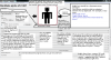
I attached a picture to this, with most of my ideas, but here it is:
Server list updated and moved:
It would be nice for servers that just have ip addresses. If I have 5 servers with ip's, it gets annoying remembering which is which.
New and Updated colour scheme:
Kinda like the website would be nice, atm is kinda mis-matched.
Character Updated:
A display showing your character skin, so if you make your own you don't have to go in and out of game, but restart the launcher.
Multiple Launchers:
Is a problem. If we could, it would be nice, it just needs pop-ups.
Pop-up removal
Instead of an up-link pop-up, just 2 bars to make easy and slightly more recommended.
Move settings:
It could easily be moved to the "Settings" button at the top...that's kinda the purpose I think.
Staff ship picks:
(Completely Optional, just to make the launcher look nicer)
Ok, so idk the exact number, but say we have 10 staff members. Each would choose 2 ships to help inspire aspiring builders. Now we have 20 pictures, 1 from each ship. If we switch the picture every day, that's almost 3 weeks of new and updated community content, just to inspire you. Someone might pick a hangar on a lovely carrier, and I might like a feature and mix it up so it works for my cargo carrier.
Character List:
I have heard rumors that your uplink can protect 2 names. It would be nice if you could have it set up so you can easily switch characters. You could have a limit of maybe 5 characters, and when logged in only 2 would be "favourite".
When logged out, the favourite characters would still be listed, but not usable.
News feed update:
Instead of the big box (which personally sucks cause it doesn't resize for your screen, and its annoying moving the sidebar to see all the picture, like the gui in the dev update) You could have headlines in a list. Clicking on the headline would either take you to the actual post or open a pop-up that takes about 85-95% of the screen. The box would be draggable, resizable, and the best part, the contents (pictures and words) would resize so it fits in the <>.
That's all for now. Sorry for any spelling errors, as my computer doesn't want me to type right now.
Attachments
-
 41.2 KB Views: 21
