Interior Design Thread & Masterclasses

    Joined
    Jun 28, 2013
    Messages
    97
    Reaction score
    32
    • Community Content - Bronze 1
    • Purchased!
    • Legacy Citizen 5
    I see so little about interior design on the forum, so I thought I'd post a little something. This thread is to share interiors and to talk about how they're best made.

    Other threads concerning themselves with interior:

    Yes. It rotates.
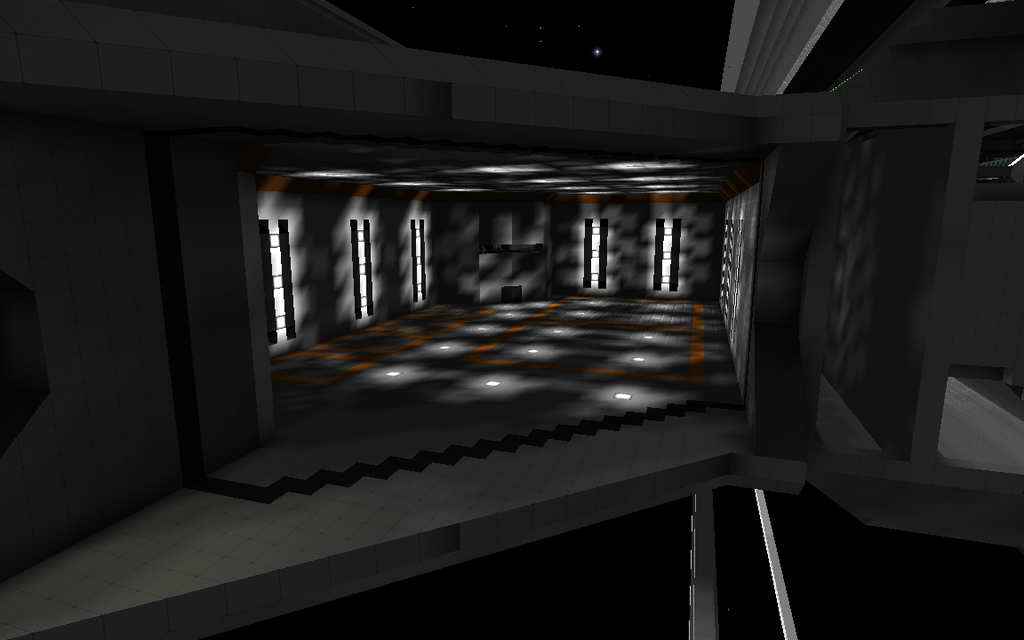
    Features a light switch and overview over the hangar.
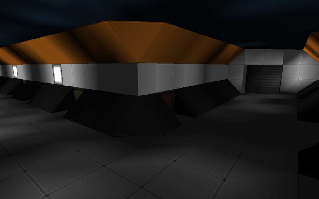
    This hallway is subject to depressurization when the hangar doors open. The turrets are anti-personnel.

    Some insights in interior design:
    1. It's good to plan out the height and position of your floors. For this ship I use a floor height of 13 in some places, 8 in others, and 15 in others still. I wish I'd have done that differently, but I already started building before I ever considered this.
    2. Make sure the interior makes at least some sense. Don't put the infirmary halfway across the ship from the hangar in case a fighter pilot needs treatment for example.
    3. Make sure you stick with a consistent theme but vary things enough to make everything seem like its own place. If people confuse engineering with living quarters you're doing it wrong.
    4. If your ship is large enough for people to get lost in, try adding places of significance; landmarks, if you will. This will help people roaming the ship to create an internal map of the ship. The planet in my first screenshot is a good example.
    5. Try to keep the number of crew in mind when designating rooms. It makes no sense to have living quarters or bunks for ten people and provide a canteen big enough for 30 while only having restrooms for two. I'm not too proud of the way I'm handling that in this project but being aware of it helps a great deal.
    6. Avoid symmetry. My ship isn't very wide, but if you have a wide ship and make it X-axis symmetrical people will lose their way. My ship is long and high, so I'm making sure not to make it Z-axis or Y-axis symmetrical. Even in my case I'm designating some rooms differently, such as shared showers replacing part of the living quarters on only one side of the ship and having a conference room replace two of the offices.
    I'm open to feedback in the images I've shown. I'd appreciate it if you'd share what you think about them.
     
    Last edited:

    Jake_Lancia

    Official Source of Blame
    Joined
    Oct 2, 2013
    Messages
    859
    Reaction score
    1,434
    • Legacy Citizen 10
    • Competition Winner - Small Fleets
    • Community Content - Silver 2
    Your rooms are splendid. The amount of detail packed into them is excellent.

    As a fellow interior designer, I agree with all the above points, and also have a few of my own to share to prospective interior designers too:
    1. Don't be afraid to vary the height of rooms and corridors. In most of my interiors, I allow only 3m space between the floor and ceiling to conform to real-world standards, but even within this boundary it is possible for me to create complex structures by changing the height of parts of the room. Even in the same room, varied height can create the feeling of a larger room while, at the same time, maximising space for detailing and possibly allowing complex rooms like a multi-tiered engineering room.
    2. Vary your lighting. Lots of bright white lighting is fine in medbays or areas of the ship where the crew needs to see a lot, but it is possible to give rooms and corridors a certain feel just by varying the light colors and/or levels. For example, a medbay could be bright white lighting all over, but a maintenance corridor or lower-decks systems room would be rather dark and have very little in the way of bright colored lights to show the fact that they are on the dark, dirty lower decks and aren't as looked-after as say, the bridge. Also, red lighting would show an area as being in alert, or damaged, and is sometimes also used in engine rooms.
      An early maintenance shaft design
      A small weapon control room
      Crew rooms
      Computer/AI core
      Control room
    3. Use different colors and types of hulls to your advantage when making corridors and rooms. Mixing standard with basic hulls can give the impression of detail without changing colors, but changing colors anyway also makes more detail, without the need to build another object into the walls. Other non-hull blocks like motherboards, circuits and rocks can also enhance the detail in certain situations.
    4. Never underestimate the importance of rails, even in interiors. Rail doors can make for some easy-to-make 'wow' effects that would make your interior stand out from the others.
    5. Detail, detail, detail. Make sure there is enough detail to draw in viewers, but not too much or it will oversaturate.
      A simple design such as this contains enough detail to make it look good, but not too much as previously stated.
    6. Don't make corridors too long. A single long, unbroken corridor is the single worst thing an interior designer can do, as they are completely devoid of any detail or landmarks that could help people identify where they are on the ship.
    7. Make sure your rooms are fit for purpose. If you build a meeting room, make sure it has seats for the crew, as well as tables to rest on, and perhaps a few raised set pieces to draw viewers' eyes to, for example.
    8. Make the bridge truly grand. Okay, that one was a bit of a joke, but seriously, the bridge of a ship has to look like a bridge. It must have chairs, computer consoles somewhere, and either a viewscreen or a window into space. That way the feeling of a bridge can really be created. Also factoring in height can allow creative designers to create multi-tiered bridges with different sections dedicated to different ship systems.
    And that's the end of my interior masterclass :D May I suggest this thread be made into an Interior Design Masterclass thread? :D
     
    Joined
    Jun 28, 2013
    Messages
    97
    Reaction score
    32
    • Community Content - Bronze 1
    • Purchased!
    • Legacy Citizen 5
    There isn't any other interiors-dedicated thread as far as I can tell so sure. I'll put it in the title if this thread amasses a good amount of advice.
     

    Lecic

    Convicted Lancake Abuser
    Joined
    Apr 14, 2013
    Messages
    5,115
    Reaction score
    1,229
    • Thinking Positive Gold
    • Purchased!
    • Legacy Citizen 11
    There isn't any other interiors-dedicated thread as far as I can tell so sure. I'll put it in the title if this thread amasses a good amount of advice.
    There was the "ultimate RP interior room list" or whatever, but that hasn't been updated in forever.
     
    Joined
    Jun 28, 2013
    Messages
    97
    Reaction score
    32
    • Community Content - Bronze 1
    • Purchased!
    • Legacy Citizen 5
    I'll see if I can't do something with that also. I'll link the threads if I find them.
     
    Joined
    Feb 26, 2014
    Messages
    154
    Reaction score
    185
    There was the "ultimate RP interior room list" or whatever, but that hasn't been updated in forever.
    I would like to add, that thread has also a somewhat different focus than this one.


    There are indeed some nice tips posted here. Just the thing with the long hallways seems somewhat unavoidable for me because i developed a habit placing big turrets on the far ends of my ships with full acces from the interier. And technically this goes right between the engines. So not much else that needs to be put in there besides maybe one or two maintenance tunnels.
    Good thing i still have my elevator.


    And because we are supposed to share, here's a bit of what i am currently working on:
    (Though when looking at the other stuff, i feel like i should try improve a bit)


    Jake_Lancia

    Official Source of Blame
    Joined
    Oct 2, 2013
    Messages
    859
    Reaction score
    1,434
    • Legacy Citizen 10
    • Competition Winner - Small Fleets
    • Community Content - Silver 2
    I would like to add, that thread has also a somewhat different focus than this one.


    There are indeed some nice tips posted here. Just the thing with the long hallways seems somewhat unavoidable for me because i developed a habit placing big turrets on the far ends of my ships with full acces from the interier. And technically this goes right between the engines. So not much else that needs to be put in there besides maybe one or two maintenance tunnels.
    Good thing i still have my elevator.


    And because we are supposed to share, here's a bit of what i am currently working on:
    (Though when looking at the other stuff, i feel like i should try improve a bit)


    You seem to have a good grasp on basic interior layouts. I like that.

    The thing is with long corridors, if they're not broken up with something along those corridors (like rooms coming off it, or long objects running down it) it can get quite boring, and I've seen quite a few designers fall into that trap. That's why I tend to avoid them.
     

    Jake_Lancia

    Official Source of Blame
    Joined
    Oct 2, 2013
    Messages
    859
    Reaction score
    1,434
    • Legacy Citizen 10
    • Competition Winner - Small Fleets
    • Community Content - Silver 2
    Reactor's are the best!

    TEACH ME SENPAI!

    Srsly tho, reactors are one thing I struggle with, pls gib advice :D

    Oh, and another bit of advice I have come up with for prospective interior designers:

    -Don't be afraid to use system blocks as decoration in an interior. Some can achieve incredible effects if used right. Power capacitors have a soft green glow so use that to your advantage. Effect modules look somewhat like ammunition, and power generators can be used in the RP reactors too.
     
    • Like
    Reactions: Lecic

    Reilly Reese

    #1 Top Forum Poster & Raiben Jackpot Winner
    Joined
    Oct 13, 2013
    Messages
    5,140
    Reaction score
    1,365
    • Legacy Citizen 8
    • Thinking Positive
    • Purchased!
    TEACH ME SENPAI!

    Srsly tho, reactors are one thing I struggle with, pls gib advice :D
    This particular reactor is a large room with an ice crystal wedge and normal ice crystal "sparks" within a contained area. On the sides and floor are nice thrusters and other mechanical stuff even some capacitors on the side.

    Now this isn't as fancy as say a rail beacon pulse reactor but it gets the idea of a reactor done.
     
    • Like
    Reactions: Jake_Lancia

    ASM

    Joined
    Oct 14, 2013
    Messages
    67
    Reaction score
    160
    • Community Content - Bronze 2
    • Legacy Citizen 6
    • Purchased!
    Already stated by Jamster0000 above, "You don't have to absolutely use lights to light up your ship"

    This is a computer room being lit by "Power Capacitors" behind grills.

    - Don't forget about rail elevators, you can safe a bit of space for systems just by using elevators for transit between 2 floors rather than stairs/ramps

    Example, this elevator shaft lead directly to the bridge on my ship from the core room while passing by 2 more floors.

    -Flooring and roofing patterns are important, they can help turn very bland floor/roof into something nice to look at.
    -You must not forget windows.

    Example above is what I've done using patterns for my med-bay

    -Core-rooms also deserve decorations, I know they are not what they used to be, but they still deserve a special place.


    As you can see, there are not many light blocks within the interior of my ship, yet they still get lit by embedding White crystals into those White lines on the roof of the med-bay.


    Just a few more pictures I want to show, funny how the bridge is literally being lit by those "Charged Varat Circuits" that is being used for control stations :P also a few Crystals.

    Hope this helped- ASM Out.
     

    jontyfreack

    Pipe-God-Emperor of starmade
    Joined
    Nov 29, 2013
    Messages
    603
    Reaction score
    773
    • Legacy Citizen 9
    • Community Content - Silver 2
    starmade-screenshot-0119.png well this is something that I wanted to show.
    it is a good thing to break up interior panels with a different hull type, because this helps to keep even your floors interesting.
    and it is good to have rooms that you can use for something, but can be used as something different at the same time. such as this room, generally I use it as storage, but in an rp case is use it as either crew quarters or a barracks.
    (sorry if my punctuation or grammar is bad)
    well one thing that I want to suggest to people is to break up panels and areas, even if you only want one colour, you can break up areas with a bit of texture variety to give you ship or station a more "real" feel.
    also don't feel like you have to break up every panel, in some cases it looks "stupid" for everything to be broken up, so it is nice to have some plain areas that allow the eye to rest.