cockpit-overlay for the screen. Could it even save FPS?

    NeonSturm

    StormMaker
    Joined
    Dec 31, 2013
    Messages
    5,110
    Reaction score
    617
    • Wired for Logic
    • Thinking Positive
    • Legacy Citizen 5
    hey guys blurb here, the current hud, is old, a reminder of beatlebear's time, starmade has come a long way from then, SO WHY DO WE HAVE THE SAME HUD. I am suggesting that the default hud is designed in a joint collaboration between bench and Kupu, kupu because he is the schine arts guy and bench cause he made THIS AWESOME HUD ------> http://starmadedock.net/content/shipyards-hud.1056/ . I am also wondering will we ever have 3D blocks, they have been added to minecraft, and they look awesome, so imagain how awesome they would look in starmade. also REPLACE THE SUNS WITH THESE ---> http://starmadedock.net/content/firey-balls-of-fire-mod-replacement-for-bloomed-suns.753/ THEY LOOK SO GOOD,
    blurb357,
    signing out
    +1

    I would like to have a real cockpit. Something that reminds you are flying a ship, not floating in space.

    I imagine: Enterprise Shuttle HUD, SG1-Todesgleiter-HUD, SGA-PuddleJumper-HUD, ...
    Basically a transparent screen-overlay...

    Would it be possible to re-scale the render-frame size behind that screen-overlay? It could save a few fps and we can still display not-so-fps heavy stuff like simple text outside this area somewhere in your HUD where it doesn't clutter up your clear view into space.

    Why it could save FPS: maybe because of less pixels (some less on top, bottom, right or left.)
     
    Joined
    Jun 28, 2013
    Messages
    574
    Reaction score
    153
    You mean something like these

    with actual structure and 3d models and info panels and stuff, or just a plain old hud overlay
    ?
     
    • Like
    Reactions: aceface

    NeonSturm

    StormMaker
    Joined
    Dec 31, 2013
    Messages
    5,110
    Reaction score
    617
    • Wired for Logic
    • Thinking Positive
    • Legacy Citizen 5
    Either. As long as the player does not need to interact with it it does not matter if it is 3D or just a picture.

    There may be a high-map (bump map) for shadows (would be much easier to calculate then blocks or 3D), but that would be completely sufficient:

    In this case the bottom 10-20% does not need to render.

    ---

    Additional, could there be areas which show different angles in different resolution (less rays to trace with 1 for each pixel)?
    Or does it not work this way with performance (less px = more fps)?

    You don't need to have to see all details on the side, but get a quick overview what is there and some guidance with orientation.
     
    Joined
    Jun 28, 2013
    Messages
    574
    Reaction score
    153
    Either. As long as the player does not need to interact with it it does not matter if it is 3D or just a picture.

    There may be a high-map (bump map) for shadows (would be much easier to calculate then blocks or 3D), but that would be completely sufficient:


    In this case the bottom 10-20% does not need to render.

    ---

    Additional, could there be areas which show different angles in different resolution (less rays to trace with 1 for each pixel)?
    Or does it not work this way with performance (less px = more fps)?

    You don't need to have to see all details on the side, but get a quick overview what is there and some guidance with orientation.
    Just remember... the game now supports oculus, so some 3d models may be needed.
     

    NeonSturm

    StormMaker
    Joined
    Dec 31, 2013
    Messages
    5,110
    Reaction score
    617
    • Wired for Logic
    • Thinking Positive
    • Legacy Citizen 5
    Kupu replied, just not here :)

    @blurb357 The GUI is something i've wanted done ever since i've been on the team. It's so intrinsic to the games presentation and is currently underselling Starmades merits. Recent shifts in projects have put me and bench in talks about this subject. Nothing has been confirmed.

    @NeonSturm While this is not really a thread i'd want to devote to GUI stuff, i will make one note, i'd personally rather not see a cockpit frame. It puts everyone into the same ship / HUD regardless of ship design or play style. It would prevent custom bridges or custom cockpits and would require yet another "custom config" to turn it off.

    What i would rather see as a solution are a set of immersive cockpit elements that can be moved, resized and hidden in a drag and drop fashion in a "gui layout" menu. In short, striking a balance between non-diegetic and meta designs so players can still feel like they are in a cockpit while maintaining their block built bridges / cockpits.
    I agree, but I can't wait.

    If somebody just puts this (image from prev posts) HUD on bottom (instead of block selection and power bar and puts block "#key #ID# Name Block Name" in a list and makes shield shown as circle-diagram, I will instantly use it :)
     
    Joined
    Jun 28, 2013
    Messages
    574
    Reaction score
    153
    Kupu replied, just not here :)


    I agree, but I can't wait.

    If somebody just puts this (image from prev posts) HUD on bottom (instead of block selection and power bar and puts block "#key #ID# Name Block Name" in a list and makes shield shown as circle-diagram, I will instantly use it :)
    Yeah, I was in that thread :D
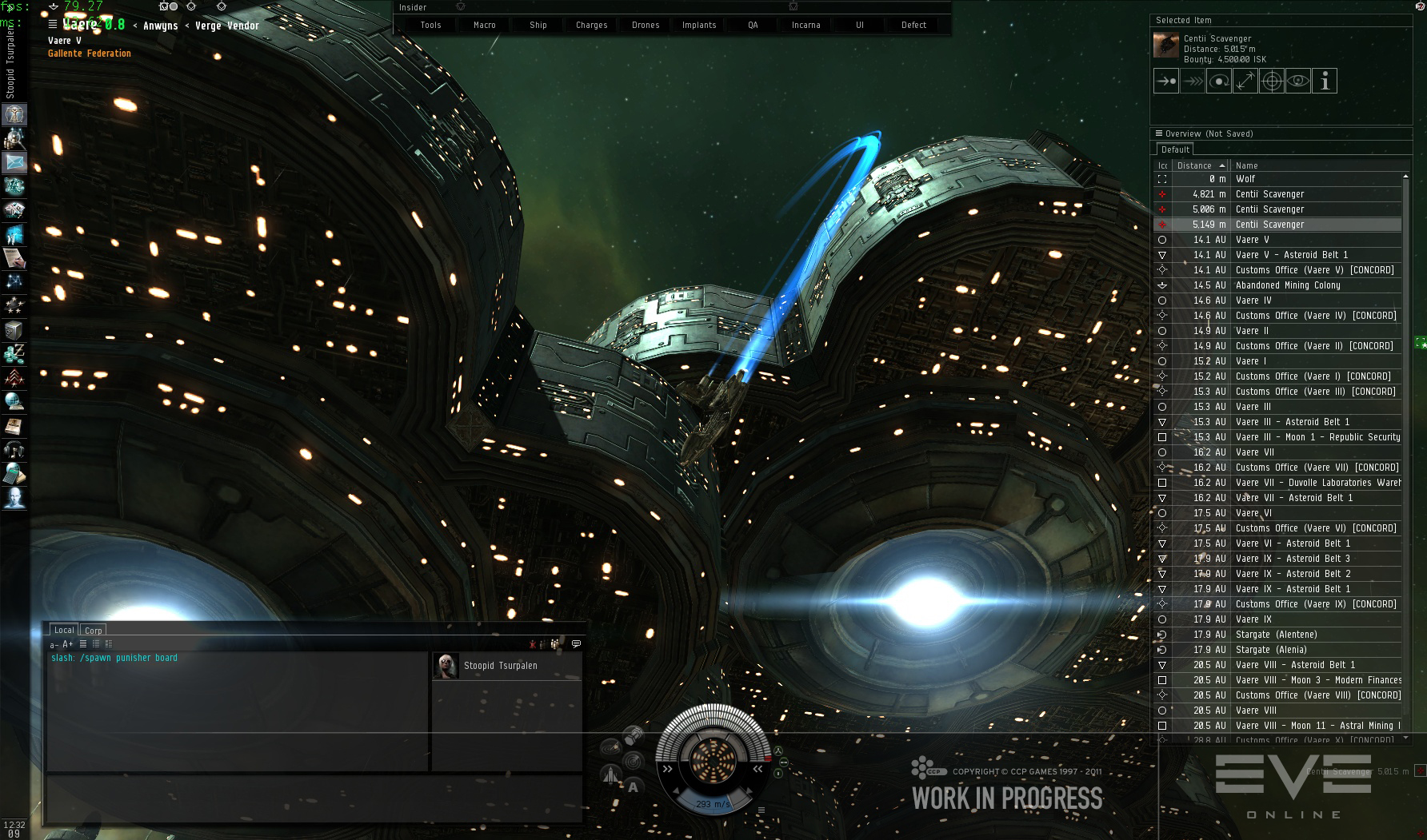
    So... something like an eve online-style HUD where you can drag brackets around and customize the colors then?
     

    NeonSturm

    StormMaker
    Joined
    Dec 31, 2013
    Messages
    5,110
    Reaction score
    617
    • Wired for Logic
    • Thinking Positive
    • Legacy Citizen 5
    For the peoples which don't know what we are speaking about:
    I really like these side-bars :)
    I have played Eve for about 10 days, but I didn't like the FPS and missed the creative part.
    If stations would have had at least more interior where you can walk... but every-time I want to walk in my cockpit Eve crashed.
    You also require so much research before you get to the fun game part...​

    I guess it wasn't exactly my game, but the interface was really awesome. Also search for X3-TerranConflict HUD pics!
     
    Last edited:
    Joined
    Aug 15, 2013
    Messages
    436
    Reaction score
    39
    • Legacy Citizen 5
    • Purchased!
    • Community Content - Bronze 1
    The hud that @WaffulMann showed was the type of hud I had in mind, also perhaps changing the font used in the options ect.

    ?
     
    Joined
    Jun 28, 2013
    Messages
    574
    Reaction score
    153
    For the peoples which don't know what we are speaking about:


    I really like these side-bars :)
    I have played Eve for about 10 days, but I didn't like the FPS and missed the creative part.
    If stations would have had at least more interior where you can walk... but every-time I want to walk in my cockpit Eve crashed.
    You also require so much research before you get to the fun game part...​

    I guess it wasn't exactly my game, but the interface was really awesome. Also search for X3-TerranConflict HUD pics!
    OKAY JUST STOP RIGHT THERE.
    Take a cheap frigate. Fit it with micro warp drives. Go to low sec. Warp to 100km from gates. Watch those campers try to catch you.
    Also if someone's locking you in a frigate, warp to a planet, align to where you came from, and when they warp in after you warp off again.
    At least that's how my first low/nullsec experience went. Actually saw a battleship once.
    Also a good way for noobs to have fun--but be careful, those interceptors can really catch you.
     

    DrTarDIS

    Eldrich Timelord
    Joined
    Jan 16, 2014
    Messages
    1,114
    Reaction score
    310
    It would really be nice to just have more control over the HUD's XML calls. but that's API work I guess...
     

    jayman38

    Precentor-Primus, pro-tempore
    Joined
    Jul 13, 2014
    Messages
    2,518
    Reaction score
    787
    • Purchased!
    • Thinking Positive
    • Legacy Citizen 4
    I definitely prefer active and useful hud elements over graphics overlays.

    With standard graphics accelerators (NVidia and AMD), simple graphics overlays don't really reduce the graphics load at all. It's just another polygon to render among millions.

    I would like to see different options for different hud elements available, so you can mix and match to your preference. Some people might prefer rotating dials. Some might prefer bar graphs. Others simply want text output. (I prefer the use of both bar graphs and text for clarity.)


    Broken Record Mode: Hud settings should be a per-ship thing, so that each ship has its own distinctive HUD layout.
     

    DrTarDIS

    Eldrich Timelord
    Joined
    Jan 16, 2014
    Messages
    1,114
    Reaction score
    310
    Broken Record Mode: Hud settings should be a per-ship thing, so that each ship has its own distinctive HUD layout.
    You kan KIND OF do this right now! Big crystal wall in front of your camera, display modules to output numeric of shields and energy (WHY NOT SPEED YET!!?!?!)

    Still I see what you actually mean, and I agree, drag-n-drop +scale vector hud you could customise to some degree would be awesome. drag n drop in configure mode Like desktop "widgets."

    I'm just annoyed that i can't figure out how to alter the text locations on the current status wigets, nor can I rotate them. (piechart} {straight bar} {numeric/text} and {graph} widgets that can be linked to any of the ship statuses and moved would be THE BOMB.
    Edit: Also option of "fish tank" "rotating gyro" and "gradient plane" would be nice to see fro minimap possibilities.
     

    Blaza612

    The Dog of Dissapointment
    Joined
    Nov 16, 2013
    Messages
    787
    Reaction score
    209
    • Legacy Citizen 4
    The current HUD icons (the systems you select) could be dragged to different parts of the flight HUD, to have the HUD interact with what you've selected more than it currently does. ^_^
     
    Joined
    Jun 20, 2013
    Messages
    26
    Reaction score
    31
    • Legacy Citizen
    • Community Content - Bronze 1
    • Purchased!
    Broken Record Mode: Hud settings should be a per-ship thing, so that each ship has its own distinctive HUD layout.
    The problem I see with this would be the incredible increase in meta-data that would have to be created in order to store this and transmit it between people. Even assuming it's client side only, you would require meta-data saved for every single ship currently in the universe, which adds up very quickly.

    That being said, a customizable HUD would be very nice to have, being able to pick and choose what information you want displayed and where, but a client-side, *global* HUD arrangement would be the far more likely candidate.
     

    NeonSturm

    StormMaker
    Joined
    Dec 31, 2013
    Messages
    5,110
    Reaction score
    617
    • Wired for Logic
    • Thinking Positive
    • Legacy Citizen 5
    The problem I see with this would be the incredible increase in meta-data that would have to be created in order to store this and transmit it between people. Even assuming it's client side only, you would require meta-data saved for every single ship currently in the universe, which adds up very quickly.
    Perhaps only store meta-data for ships which are big enough => 3 ship-block bytes = 1 bit PUBLIC meta-data.
    The game could store some bits of meta-data for each player for some time.

    If it gets damaged ingame and loses blocks the game could give you some time to repair it before it starts losing it's meta-data in a clean-up process.

    If you re-enter a ship you have set yourself, you can run your local-database metadata-repair-program while entering the cockpit.