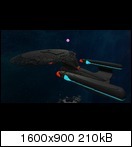
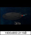
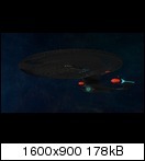
Star Trek - Galaxy-Class

    Joined
    Sep 22, 2013
    Messages
    5
    Reaction score
    11
    At first I want to thank GaeasSon, who uploaded the Spaceframe I'm using.
    http://starmadedock.net/content/galaxy-class-spaceframe.636/

    I didn't uploaded it at the server I'm playing (it's not allowed ;) ), I have build it completely new with screenshots I made in singleplayer.
    As I finished the frame, I started to wedge and fill the complete hull, what is a painfull work - and Im still working on it.
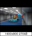
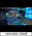
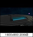
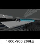
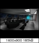
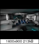
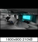
    I also started with the interior, as you can see at the following pictures.
    The only thing thats finished at the moment are the warp engines; at all other things Im still working on it.

    My goal is to fill the hull complete with interior with all rooms you know from the TV-Show, doesnt matter what shields, energy, weapon power it will have.
    The scale is 1:1 so it has a length of 642m. I sadly cant fill the whole 42 decks, cause it will look very bad. At the moment it will fit in 22 Decks, but they will look great (I hope ;) )
    Im using a lot of blueprints from Star Trek and Fan-Arts of the interior and of course original screens from the TV-Show.

    But enough said, here are the pictures.


    Ship:


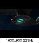
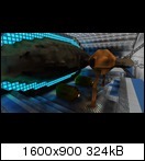
    Main deflector dish


    Inner room of deflector dish


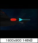
    Warp engine


    Warp coils in warp engine


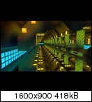
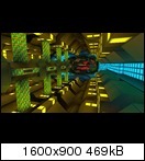
    Main engine room with warp core


    Main shuttle bay with a Delta-Flyer insinde (not ready)


    Conference room


    Main bridge


    I will continue this thread if I have new things to post.

    PS: Sorry if my english is not good, it's not my native language ;)
     
    Joined
    Jul 29, 2013
    Messages
    1,173
    Reaction score
    494
    • Competition Winner - Small Fleets
    • Top Forum Contributor
    • Legacy Citizen 5
    Looks go so far. Hard to get a good level of detail on Star Trek ships. Gute Arbeit!
     

    jayman38

    Precentor-Primus, pro-tempore
    Joined
    Jul 13, 2014
    Messages
    2,518
    Reaction score
    787
    • Purchased!
    • Thinking Positive
    • Legacy Citizen 4
    Awesome! I love it.

    Optional Recommendations that I think would add further authenticity to the completed bits:

    1. Replace the vertical posts of the main warp core with jump drive modules. They have the animated texture that is meant to look like a warp core.

    2. Give the main bridge more brown, orange, and yellow accents. Example: The tactical station on the "wing" that curves up over the captain's chair has wood paneling, so I recommend switching that whole structure from grey to brown.

    3. Place long lines of beacon light blocks inside the middle of the engine nacelles to simulate a high-energy plasma stream. If the structure permits, maybe find a way to snake beacon lights all the way from the nacelles down to near the engine room.

    4. Move the lights from the conference table to the ceiling. The conference table was generally feature-free. Also, the conference table should generally be a lighter color (maybe grey?), and the floor should have a richer color (maybe red?)

    5. The chairs should generally be brown or orange, to simulate (simulated?) leather.

    6. Going back to the tactical station on the bridge, try to replace some of the plain grey cubes in the center with upward-facing computer decorations to simulate a computer terminal (the tactical station itself).

    7. On the bridge, in the back with all the computer stations, I recommend moving the decoration computers that are currently sitting on the floor up one meter, replacing the bottom layer of display blocks. Where the decoration computers used to be, I recommend placing a blast door, to represent a spot that can be "cleared" to allow someone to sit down at that station. Futhermore, directly behind this blast door block, I recommend placing a plex door or blast door wedge to simulate a chair.

    8. If the project permits, I recommend creating logic some where that will open the blast door under the computers described in suggestion 7 and close the plex door chair, when desired. That way, the logic can switch the station between a "standing" station without a chair (the door wedge is "open" so it is not seen) and a "sitting" station (the chair wedge is "closed" so it appears, and the wall door block is opened) as the user desires.
     
    Joined
    Sep 22, 2013
    Messages
    5
    Reaction score
    11
    Thanks for that response =)

    1. Replace the vertical posts of the main warp core with jump drive modules. They have the animated texture that is meant to look like a warp core.
    That's a good idea. I still have changed it. Looks really good - only at the bottom of the core is the animation of the block in the wrong direction, cause i cant rotate the block.

    2. Give the main bridge more brown, orange, and yellow accents. Example: The tactical station on the "wing" that curves up over the captain's chair has wood paneling, so I recommend switching that whole structure from grey to brown.

    4. Move the lights from the conference table to the ceiling. The conference table was generally feature-free. Also, the conference table should generally be a lighter color (maybe grey?), and the floor should have a richer color (maybe red?)
    This things came in the future. First I want to create the inner structure so I get a feeling for the design, space and looking. Then I change all colours, so it will looks like the original Galaxy-Class.

    Also at the tactical station. There I will later place the weapon computers, cause I place them allways on authentic places. The "front" of the station will become black wedges.


    7. On the bridge, in the back with all the computer stations, I recommend moving the decoration computers that are currently sitting on the floor up one meter, replacing the bottom layer of display blocks. Where the decoration computers used to be, I recommend placing a blast door, to represent a spot that can be "cleared" to allow someone to sit down at that station. Futhermore, directly behind this blast door block, I recommend placing a plex door or blast door wedge to simulate a chair.
    Have changed it a little bit. Now there is a black wedge "inside" the bottom blocks in wall. That I can move with the rail system so it looks like the chair is inside the station, what afaik was real in the TV-Show.
    Later I will make new pictures of it.
     
    Last edited:
    • Like
    Reactions: jayman38

    jayman38

    Precentor-Primus, pro-tempore
    Joined
    Jul 13, 2014
    Messages
    2,518
    Reaction score
    787
    • Purchased!
    • Thinking Positive
    • Legacy Citizen 4
    ...I still have changed it. Looks really good - only at the bottom of the core is the animation of the block in the wrong direction, cause i cant rotate the block....
    You might have to create a secondary entity with jump module blocks and dock it upside-down under the crystal containment core. That way, the animation will go in the right direction. (up towards the crystal containment core, just like in the TV show)
     
    Joined
    Sep 22, 2013
    Messages
    5
    Reaction score
    11
    Update. Yesterday i created a logic-system to eject the warp core for an emergency.

    You might have to create a secondary entity with jump module blocks and dock it upside-down under the crystal containment core. That way, the animation will go in the right direction. (up towards the crystal containment core, just like in the TV show)
    So simple and I didnt think about it, lol.
     
    • Like
    Reactions: jayman38
    Joined
    Jun 26, 2013
    Messages
    247
    Reaction score
    359
    • Competition Winner - Small Fleets
    • Legacy Citizen 3
    • Community Content - Bronze 2
    Looks great so far! I just finished watching TNG so this was pretty cool to see. It's gonna look really great once you recolor everything. Gut gemacht!