More Immersive Main Menu

    Should this be added/replaced with the current Main Menu?

    • Yes

      Votes: 3 21.4%
    • Yes, but suggestion needs tweaking

      Votes: 0 0.0%
    • Don't Know

      Votes: 3 21.4%
    • No

      Votes: 8 57.1%

    • Total voters
      14
    • Poll closed .

    JumpSuit

    Lost-Legacy Director
    Joined
    Feb 5, 2015
    Messages
    343
    Reaction score
    93
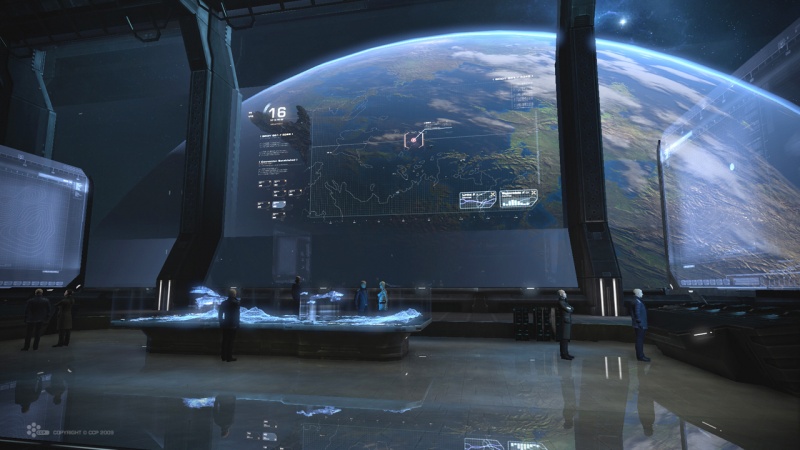
    Well this is another briliant idea being thrown onto the work table for others to see. A more immersive Main Menu would be nice rather than the bland 'click and go'. I enjoy Main Menus where your an actual entity going from a place in one 'Main' room to the otherside of the room to access a Computer terminal or A Map that shows what a place looks like before traveling to it. An example of this is from a recently decomissioned game callled: Dust 514. Here is an image of what one such room looks like from the game and what I am refering to:

    The game itself was originally from PS3. With this, theres 1 big room with entitys for aestheics and a main map in the center with computer terminals for access to certain things. Server list could be accessed from one computer terminal and when the player selects a server you could view what the server's galaxy looks like from the central map view in the center of the room as shown above (or something similar done).
     
    Last edited by a moderator:
    • Like
    Reactions: blurb357 and nogg

    Reilly Reese

    #1 Top Forum Poster & Raiben Jackpot Winner
    Joined
    Oct 13, 2013
    Messages
    5,140
    Reaction score
    1,365
    • Legacy Citizen 8
    • Thinking Positive
    • Purchased!
    RIP Dust 514.

    But tbh I don't think Starmade needs this atm.
     
    Joined
    Jul 18, 2016
    Messages
    53
    Reaction score
    15
    i agree with Thadius, its a great idea, but not at the moment. perhaps sometime farther in the games development?
     

    JumpSuit

    Lost-Legacy Director
    Joined
    Feb 5, 2015
    Messages
    343
    Reaction score
    93
    RIP Dust 514.

    But tbh I don't think Starmade needs this atm.
    RIP that good game, your probably right about that, but like I said, just throwing that out there. You never know, either needed or not, it is of course better than the Main Menu we have now. The Main Menu we have now seems off, like it isn't right or something.
    i agree with Thadius, its a great idea, but not at the moment. perhaps sometime farther in the games development?
    I don't mind farther down the line, either now or later will suite.
     
    Joined
    Jul 26, 2013
    Messages
    36
    Reaction score
    7
    when the player selects a server you could view what the server's galaxy looks like from the central map view in the center of the room
    Could you clarify that a little? Are you talking about an image showing the different faction territories? If so, I don't entirely see how that would help anyone, unless the player wants to avoid all maps with a certain faction. What if the server has factions in two or more galaxies? The resolution of the thumbnail would be too small to give an adequate image. It would just look like a blur.

    Or, do you mean you want a screenshot of the home sector of the player? If so, that would be highly resource intensive for a server, to generate a screenshot of a different sector for each player that plays on the server. What if the player has assets in multiple systems, what sector does the game screenshot?

    I do like the "control room" idea, actually. I always feel a little more immersed in the story line when I start off in a control room, rather than just having a "start" button. A start button game always makes me feel withdrawn from the action, while the control room makes me feel as though I'm actually there, right in the middle of everything.
     

    JumpSuit

    Lost-Legacy Director
    Joined
    Feb 5, 2015
    Messages
    343
    Reaction score
    93
    Could you clarify that a little? Are you talking about an image showing the different faction territories? If so, I don't entirely see how that would help anyone, unless the player wants to avoid all maps with a certain faction. What if the server has factions in two or more galaxies? The resolution of the thumbnail would be too small to give an adequate image. It would just look like a blur.

    Or, do you mean you want a screenshot of the home sector of the player? If so, that would be highly resource intensive for a server, to generate a screenshot of a different sector for each player that plays on the server. What if the player has assets in multiple systems, what sector does the game screenshot?

    I do like the "control room" idea, actually. I always feel a little more immersed in the story line when I start off in a control room, rather than just having a "start" button. A start button game always makes me feel withdrawn from the action, while the control room makes me feel as though I'm actually there, right in the middle of everything.
    Well its basically another version of A galaxy map. And yes it could be perceived as faction territories or just a view of the overall starting galaxy. It shouldn't be to hard for the server to create a visual representation of the overall galaxy, it could go about doing this by when saving the entire world save the galaxy map at that time it was being saved, thus upload it to where whenever someone wants to see what the server looked like it would be possible. not the most efficent way of doing it as people build on after the auto-save but thats what auto-saves are for.
    I do agree with you, I love control rooms instead of the 'start' buttons, It shouldn't be to hard to recreate a basic cotrol room and with every update schine could add to the control room with a touch here and there, and eventually come up with a pretty nice looking room at the end of either alpha or beta stages with immersive mechanics to starting off before entering a server. Also useful for tutorials to be introduced to the player and when done with all tutroials you have access to the mutiplayer parts. Although people wouldn't like not skipping the tutorials thus an option to do so is open of course.
     
    Last edited by a moderator:

    Spoolooni

    Token Chinese
    Joined
    May 23, 2014
    Messages
    179
    Reaction score
    70
    • Legacy Citizen 2
    It would be cool to be able to set your own loading screen backdrop.
     
    • Like
    Reactions: kupu

    Spoolooni

    Token Chinese
    Joined
    May 23, 2014
    Messages
    179
    Reaction score
    70
    • Legacy Citizen 2
    that has nothing relating to my suggestion.
    I know, I don't agree with wasting development time on rainbow sprinkles to achieve what MMO's like Warframe do, so I suggested an easier alternative to the blurred backdrop we currently have.
     

    kupu

    Colouring in guy.
    Joined
    Jul 4, 2013
    Messages
    1,405
    Reaction score
    1,560
    • Schine
    • Likeable Gold
    • Arrrty Gold
    This sounds like a nightmare for almost no benefit.

    I've not played Dust 514, so i can't speak for it's efficacy. However physically walking between different consoles to access a different menu structure sounds like it would get tedious very quickly.

    There are lots of user experience reasons i'd want to avoid it too;

    - is it efficient or quicker than what we have?
    - Does it add to the experience every time you load the game?
    - Starmade would have to load a specific world before even getting to a menu to load another.
    - Could a graphical setting be crashing you before reaching a menu to change it easily?
    - Would we need any control or mechanics tutorials before getting to the controls or tutorial menu?
    - Is starmade a flashy game in which strolling around virtual "menus" would be a spectacle in itself?

    It's also incredibly diagetic.

    - Why would all players need to be in this location before hand in a sandbox world (with starting experiences varying from server to server).
    - Where would it be?
    - How would it look and for what purpose?

    The Main Menu we have now seems off, like it isn't right or something.
    I'd be keen to hear some expanded feedback on this though. :)
     

    Reilly Reese

    #1 Top Forum Poster & Raiben Jackpot Winner
    Joined
    Oct 13, 2013
    Messages
    5,140
    Reaction score
    1,365
    • Legacy Citizen 8
    • Thinking Positive
    • Purchased!
    This sounds like a nightmare for almost no benefit.

    I've not played Dust 514, so i can't speak for it's efficacy. However physically walking between different consoles to access a different menu structure sounds like it would get tedious very quickly.

    There are lots of user experience reasons i'd want to avoid it too;

    - is it efficient or quicker than what we have?
    - Does it add to the experience every time you load the game?
    - Starmade would have to load a specific world before even getting to a menu to load another.
    - Could a graphical setting be crashing you before reaching a menu to change it easily?
    - Would we need any control or mechanics tutorials before getting to the controls or tutorial menu?
    - Is starmade a flashy game in which strolling around virtual "menus" would be a spectacle in itself?

    It's also incredibly diagetic.

    - Why would all players need to be in this location before hand in a sandbox world (with starting experiences varying from server to server).
    - Where would it be?
    - How would it look and for what purpose?


    I'd be keen to hear some expanded feedback on this though. :)
    It's more along the lines of the Star Wars Clone Wars game (2003)
     

    jayman38

    Precentor-Primus, pro-tempore
    Joined
    Jul 13, 2014
    Messages
    2,518
    Reaction score
    787
    • Purchased!
    • Thinking Positive
    • Legacy Citizen 4
    Freespace also had something similar, but more basic, where you had a view of a deck of your mothership between missions, where you could click on different doors to go to different "places", such as player management (barracks), game data details (tech room), exiting the game (airlock) and flying the next mission (flightdeck or ready room). While Freespace would "open doors" when you mouse-hovered over them, that is not necessary for a nice immersive experience. I'd like to see this in Starmade. Maybe it could be basically a webpage with "hotspot" clickable polygons that correspond with features in the background image. No physical walking around. Just mousing over and clicking on stuff, largely like we do now with buttons.


    Joined
    Jan 14, 2016
    Messages
    418
    Reaction score
    255
    • Community Content - Silver 1
    • Purchased!
    • Legacy Citizen 8
    For me, the game is the game NOT a glorified loading screen.

    Give me a big fat start button and I will be more than happy.

    I would rather the Devs concentrated on the game!
     

    madman Captain

    Self-appointet Overlord of the Scaffold
    Joined
    Jan 11, 2015
    Messages
    263
    Reaction score
    491
    • Purchased!
    • Community Content - Bronze 2
    • Legacy Citizen 5
    I dont now where is the problem with the main menu ?
    Normaly I start the game, press the button to join the last server I has played and I'm done with the menu.
    This isnt a MOBA where you sit longer times in the menus waiting for games. Soooo... Why you needed it more imersive?
     
    Joined
    Jul 26, 2013
    Messages
    36
    Reaction score
    7
    it could be perceived as faction territories or just a view of the overall starting galaxy. It shouldn't be to hard for the server to create a visual representation of the overall galaxy, it could go about doing this by when saving the entire world save the galaxy map at that time it was being saved,
    One screenshot used by everyone wouldn't be that intensive on server resources, but I still don't see how that would make me want to click Server A rather than Server B. All everyone would see is an image of dots.

    It would be cool to be able to set your own loading screen backdrop.
    That sounds like a better alternative.

    However physically walking between different consoles to access a different menu structure sounds like it would get tedious very quickly.
    I don't think we're talking about a physical generated world. Right now the loading screen is a blurred corridor with buttons on the left side. What if that image was changed to a cockpit of a Starmade created fighter or the bridge of a ship complete with consoles? Clicking on one console would give the player the "continue" button. Another would be for "options," etc. If the airlock is clicked, it will exit the game.

    I would rather the Devs concentrated on the game!
    I completely agree with that one. Once we get this next update, I would rather see all these bugs get forced out before we get new content.
     

    Daeridanii

    Detail Devil
    Joined
    Jan 16, 2016
    Messages
    115
    Reaction score
    138
    • Community Content - Bronze 2
    • Legacy Citizen
    It would be cool to be able to set your own loading screen backdrop.
    I might be going overboard on this, but it might be interesting if there was a "monthly screenshot contest" or something where the winner's screenshot would be the loading screen backdrop.
     

    JumpSuit

    Lost-Legacy Director
    Joined
    Feb 5, 2015
    Messages
    343
    Reaction score
    93
    This sounds like a nightmare for almost no benefit.

    I've not played Dust 514, so i can't speak for it's efficacy. However physically walking between different consoles to access a different menu structure sounds like it would get tedious very quickly.

    There are lots of user experience reasons i'd want to avoid it too;

    - is it efficient or quicker than what we have?
    - Does it add to the experience every time you load the game?
    - Starmade would have to load a specific world before even getting to a menu to load another.
    - Could a graphical setting be crashing you before reaching a menu to change it easily?
    - Would we need any control or mechanics tutorials before getting to the controls or tutorial menu?
    - Is starmade a flashy game in which strolling around virtual "menus" would be a spectacle in itself?

    It's also incredibly diagetic.

    - Why would all players need to be in this location before hand in a sandbox world (with starting experiences varying from server to server).
    - Where would it be?
    - How would it look and for what purpose?


    I'd be keen to hear some expanded feedback on this though. :)
    Well Kupu, I can at least speak for it as I have playered it years ago when it was still in service by CCP Games and I suppose it could get tedious, but when you know where every console is and what they do you can navigate through the control room quickly . I wll try and answer each reason you have listed: For what I imagine a Dynamic and Immersive Menu would work is yes it could possible be loaded into its own world, but that ccould be a users way of customizing their 'area' within the main menu areas as they see fit. And the world could possibley have its on block build distance limit to prevent the main menu world from lagging in itself. I would say it does add to the experience every time they do in fact start the game as it is more I suppose cinimatic? Once game loads you probably spawn in a certain Main Menu area such as a dedicated spawn room or something similar. The 3 user experiences reason at the bottom of your post state relating to a lore basis because thats what lore can do give users a reason to be there. I don't see how people could see StarMade be considered a flasghy game due to its More Interactive Main Menu. Well, there is keybindings that most of the people don't know about that could use those control or mechanics tutroials, one such keybinding most don't know is (the now F1+F6) chunk loading TAB+F6 Keybind. Some people could say it probably is efficent than tis one we got now or not as efficent it depends on how reflexive some people are. Its always possible a graphical setting could crash someone before opening a menu of somesort to even accerss that, but right now the most common crash now is the 'RuntimeException' where shaders crash the game randomly or whenever you log out to the main menu or exit to desktop.
    So In conclusion, This More Interactive suggestion I believe would not become a Nightmare, as people could 1. customize how the layout could be 2. how would design or the controls look? Industrial perhaps or futuristic looking by using those new 3D block functionality like those cotrol consoles (blue), maybe there is a way to give functionality to that now eh? 3. It could have it own small world, just big enough for the default layout could be and ability to expand it how the user wants, and perhaps invite others to join their own spaces to do co-op relating stuff. People just don't see how a more Immersive Main Menu could serve what purpose? It has MANY purposes that with briliant thinkers and a briliant dev team, it is posssible to create a game that is diffrent from the rest of that genre, and a start is making the Main Menu unique in itself.
     
    Last edited by a moderator:

    Nauvran

    Cake Build Server Official Button Presser
    Joined
    Jun 30, 2013
    Messages
    2,346
    Reaction score
    1,195
    • Master Builder Bronze
    • Competition Winner - Small Fleets
    • Legacy Citizen 10
    It would be cool to be able to set your own loading screen backdrop.
    like this?


    This fancy stuff is just editing a picture somewhere in the starmade folder, can't recall the name but it's something like background.jpg.
    The new picture needs to be the same resolution as the old one.
    install this to remove the shitty blur stuff Darker, warpless main menu
     
    Last edited:
    • Like
    Reactions: Captain Tankman
    Joined
    Jan 14, 2016
    Messages
    418
    Reaction score
    255
    • Community Content - Silver 1
    • Purchased!
    • Legacy Citizen 8
    I might be going overboard on this, but it might be interesting if there was a "monthly screenshot contest" or something where the winner's screenshot would be the loading screen backdrop.
    That could be good, or just a simpler way of changing ( or rotating backgrounds )

    Backgrounds could be shared in the community content, bigger factions could produce their own. I think that is about as much "immersion" I'd like for the main menu.

    I would like to see a profile system where players could easily set up a number of different profiles with options for skins, etc. A simple drop down and you could choose between spaceman Tom, Dick or Harry.